What is Data visualization?
"Data visualization is the process of displaying data/information in graphical charts, figures and bars. It is used as means to deliver visual reporting to users for the performance, operations or general statistics of an application, network, hardware or virtually any asset." from techopedia.com
"Computer-based visualization systems provide visual representations of datasets designed to help people carry out tasks more effectively."
"don’t need vis when fully automatic solution exists and is trusted." from Prof. Tamara Munzner
Webster defines Visualization as:
- formation of mental visual images
- the act or process of interpreting in
visual terms or of putting into visible form
Hamming: "The purpose of computing is insight not numbers"
What are the advantages? (adapted from [Ware 2000])
- ability to comprehend vast amounts of
data
- allows the perception of unanticipated
emergent features
- problems with the data itself can often
be quickly recognized
- helps to see both large-scale and
small-scale features of the data
- facilitates hypothesis formation
How do we make good visualizations? (adapted from [Tufte 1983])
- show the data
- allow the viewer to focus on the
substance rather than the methodology, graphic design, technology of
the production, etc.
- avoid distorting what the data
- present many numbers in a small space
- encourage the eye to compare
different pieces of data
- reveal the data
at several levels of detail, from a broad overview to the fine
structure
- serve a clear
purpose: description, exploration, tabulation, or decoration
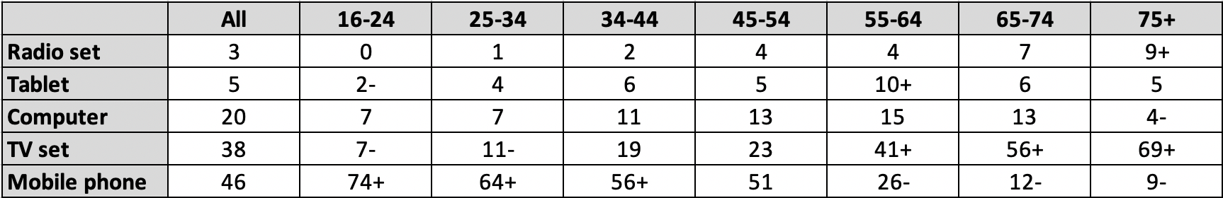
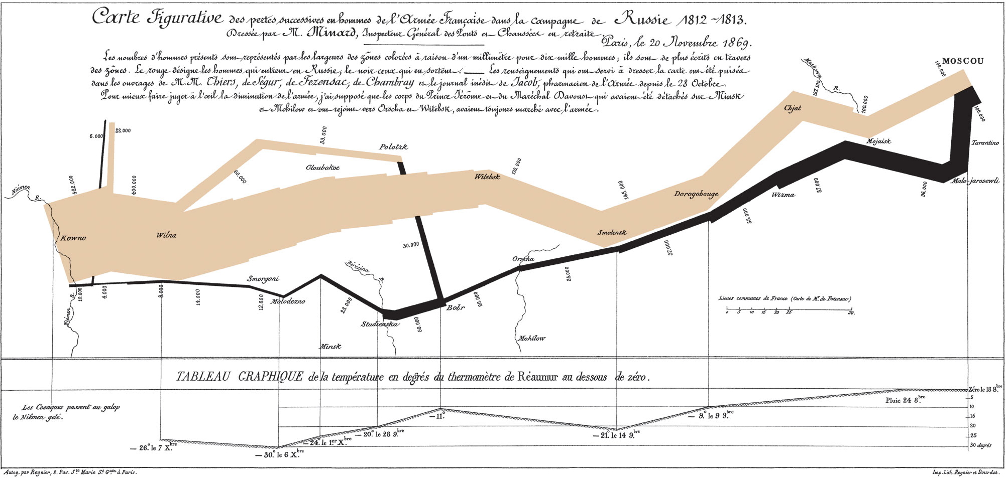
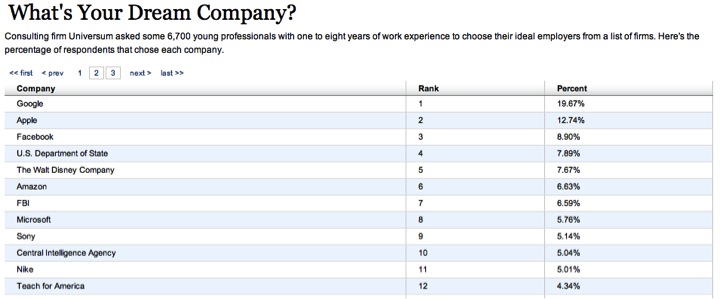
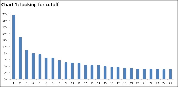
Lets start off with a recent comparison.
We can show the same information in text, in
a table (itself a
visualization), and in a chart.
Among all adults in the UK,
when asked which one of
these things (Radio set, Tablet, Computer, TV
set, or Mobile phone)
they would miss most if it was taken away,
the overall rankings were 3% for Radio, 5% for Tablet, 20% for Computer, 38% for TV,
and 46% for Mobile phone.
However, among ages
16 to 24 the rankings were 0% for Radio, 2%
for Tablet, 7% for Computer, 7% for TV,
and 74%
for Mobile phone.
Among
ages
75+
the rankings were 9%
for Radio, 5% for Tablet, 4% for
Computer, 69% for TV, and 9% for Mobile phone. ...
and for something a bit more dynamic
https://www.youtube.com/watch?v=jbkSRLYSojo
https://www.ted.com/talks/gary_flake_is_pivot_a_turning_point_for_web_exploration
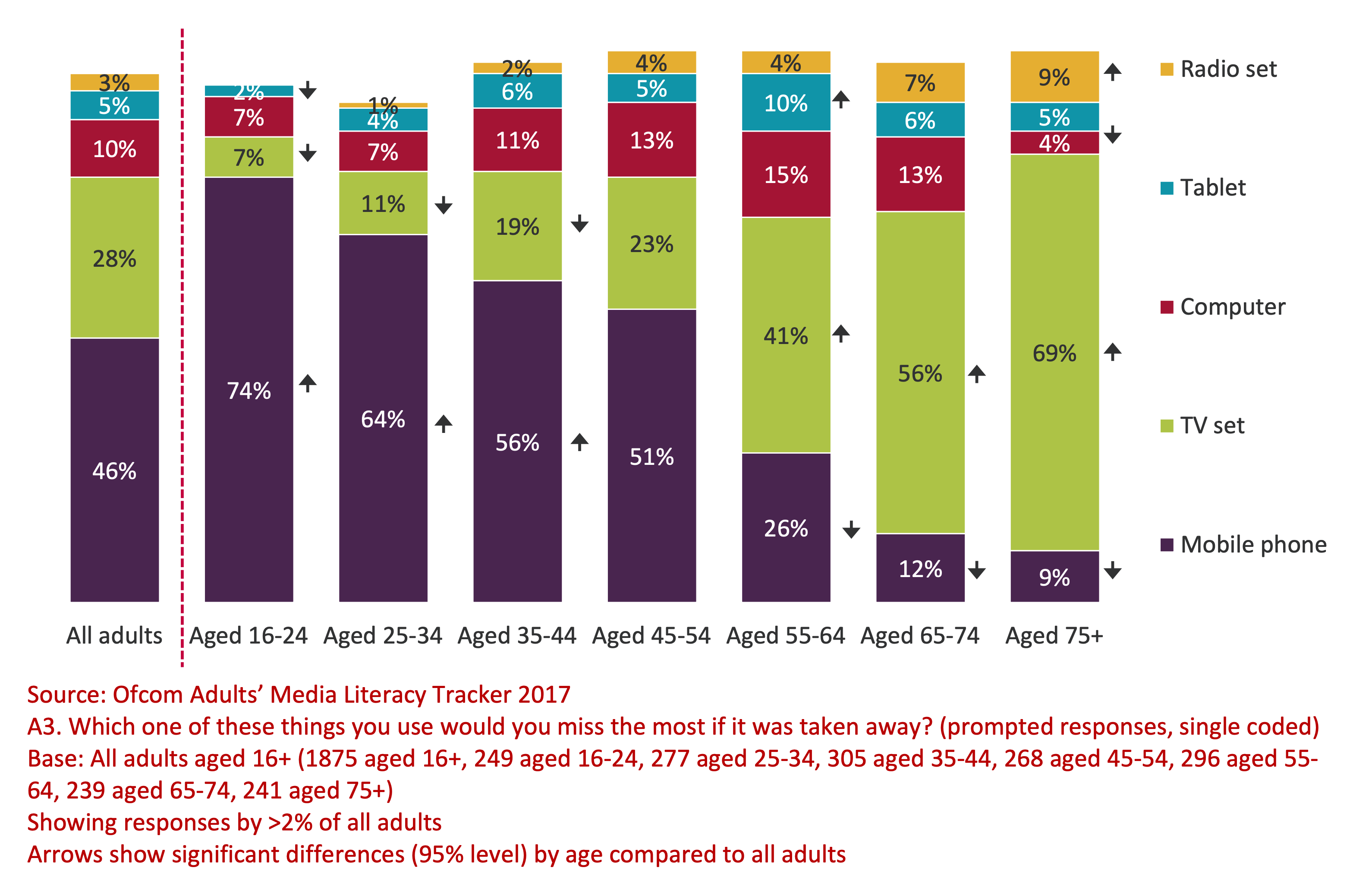
We are going to start by looking at some early visualizations:
Charles Joseph Minard's 1861 graphic
showing Napoleon's losses during his 1812 march to and from Moscow -
possibly the best statistical graph ever drawn ... why?
The image is discussed in detail on p41 of The
Visual Display of Quantitative Information
The chart show 6 variables
- size of the army
- location on a 2D surface
- direction of the army's movement
- temperature
- location of major river crossings
What is Visual Analytics?
"Visual Analytics is the science of analytical reasoning facilitated by interactive visual interfaces. People use visual analytics tools and techniques to synthesize information and derive insight from massive, dynamic, ambiguous, and often conflicting data, provide timely, defensible, and understandable assessments; and communicate assessment effectively for action. The overall goal is to detect the expected and discover the unexpected. "
This course will also deal with Visual Analytics - using
interactive visualizations to enhance the analysis of large amounts of
data - that is, the visualization is not the end-product but rather it
is the means by which people can understand complex phenomena
So, what is the difference between InfoVis and VAST: no clear border
Example: Scatterplot and visual features
Tables:
Here is a table from the US Environmental Protection Agency from a
few years ago. What are the problems with this table?
National Carbon_Monoxide
Emissions in 2002
| Source Sector |
Total Emissions |
| Electricity Generation |
652,314 |
| Fires |
14,520,530 |
| Fossil Fuel Combustion |
1,499,367 |
| Industrial Processes |
2,414,055 |
| Miscellaneous |
33,786 |
| Non Road Equipment |
22,414,896 |
| On Road Vehicles |
62,957,908 |
| Residential Wood Combustion |
2,704,197 |
| Road Dust |
0 |
| Solvent Use |
3,294 |
| Waste Disposal |
2,018,496 |
A better version of the table (font, background, alignment):
National Carbon_Monoxide Emissions
in 2002
| Source Sector |
Total Emissions
|
| Electricity
Generation |
652,314
|
| Fires |
14,520,530
|
| Fossil Fuel
Combustion |
1,499,367
|
| Industrial
Processes |
2,414,055
|
| Miscellaneous |
33,786
|
| Non Road Equipment |
22,414,896
|
| On Road Vehicles |
62,957,908
|
| Residential Wood
Combustion |
2,704,197
|
| Road Dust |
0
|
| Solvent Use |
3,294
|
| Waste Disposal |
2,018,496
|
Here is a sample table with two values: Yes/No.
Yes
|
No
|
Yes
|
Yes
|
Yes
|
Yes
|
No
|
No
|
No
|
Yes
|
No
|
Yes
|
Yes
|
Yes
|
Yes
|
No
|
No
|
No
|
No
|
Yes
|
Yes
|
Yes
|
No
|
No
|
Yes
|
A better version would be:
Yes
|
-
|
Yes
|
Yes
|
Yes
|
Yes
|
-
|
-
|
-
|
Yes
|
-
|
Yes
|
Yes
|
Yes
|
Yes
|
-
|
-
|
-
|
-
|
Yes
|
Yes
|
Yes
|
-
|
-
|
Yes
|
Using color to highlight the pattern (one color):
Yes
|
No
|
Yes
|
Yes
|
Yes
|
Yes
|
No
|
No
|
No
|
Yes
|
No
|
Yes
|
Yes
|
Yes
|
Yes
|
No
|
No
|
No
|
No
|
Yes
|
Yes
|
Yes
|
No
|
No
|
Yes
|
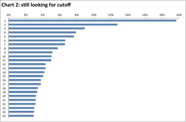
Below is an example of a bar chart from a report to investors published by one of the largest companies in the world.
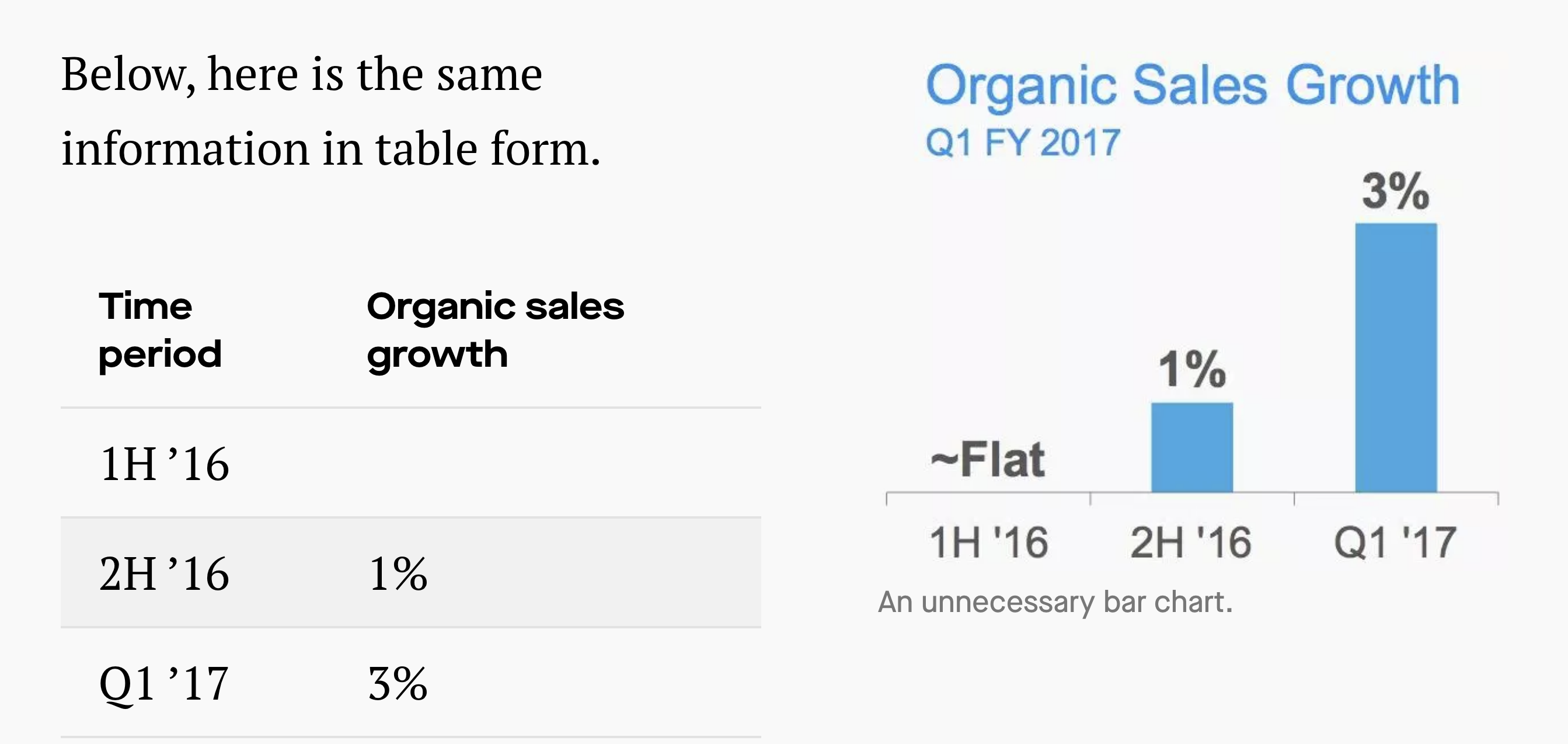
Stop making charts when a table is better.
"Graphs are essentially a visual display of quantitative information along two axes. Visuals are used as a way for our brains to quickly understand information, which is a powerful tool if used correctly. Graphs can show a large amount of data quickly in a way that is easy to process, without distracting people with a bunch of numbers.""
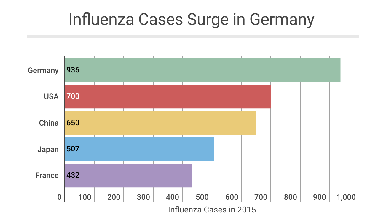
"When debating table vs. graph, ask yourself how the data will be used, consider your target audience, and decide the best way to map out your information. Think about the utility of your visual and let that help drive your decision-making."

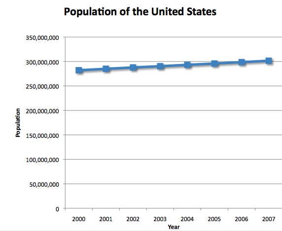
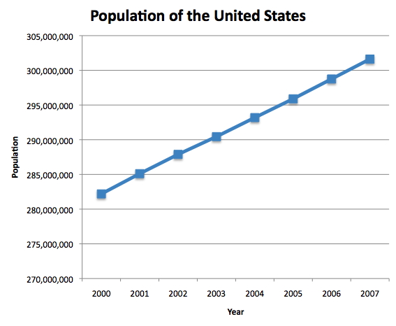
Bar charts:
This is the bar charts of the population of the USA over the last 8 years. The left chart shows how 3D hurts the visualization. The right chart is a less fancy but much more effective in 2D.
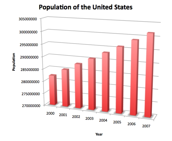
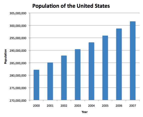
Pay attentions to the y-axis on the following charts of the same data.
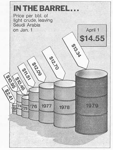
Here is an example how visualization lies: from Time Magazine (4/9/79) via Tufte. Please avoid this.
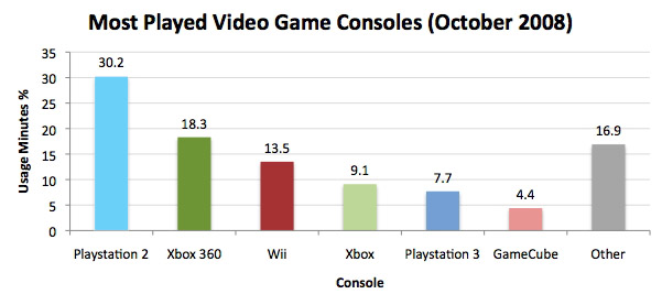
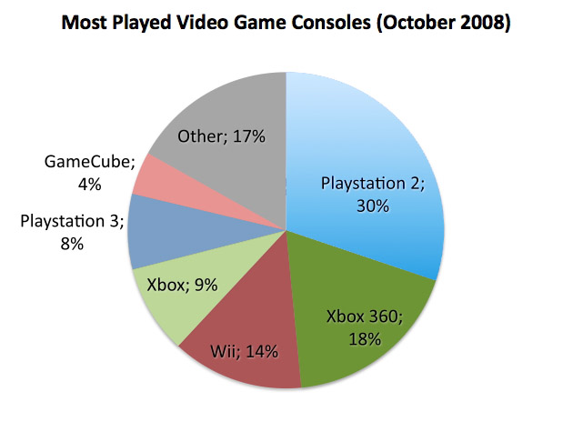
Pie charts:
These examples are charts from a recent version of Excel. 3D distorts the view making it more difficult (less accurate as well) to read the visualization.
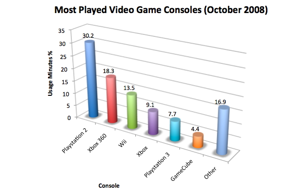
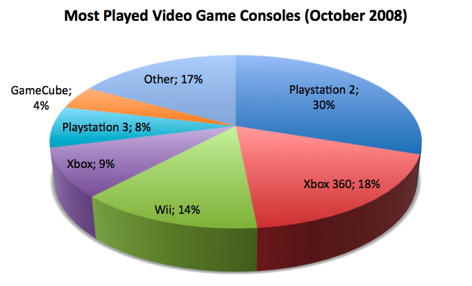
A 2D version is much better. Picking up the right colors is also helpful: we could use colors to relate consoles. For example, Playstation 2 and Playstation 3 are both in (darker and lighter) blue.
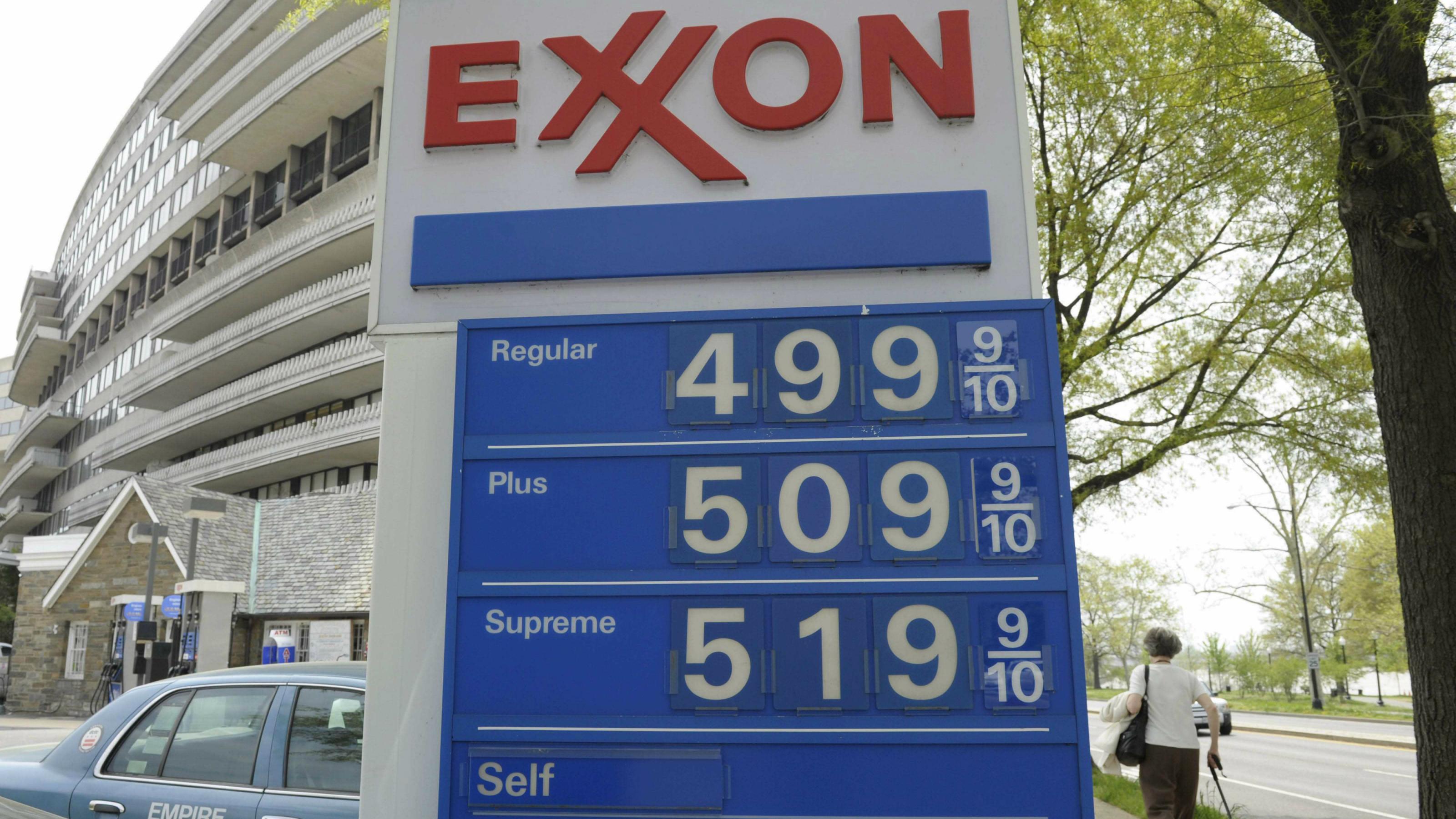
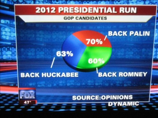
Here is another bad example from Fox news:
More bad visualizations:
Five Ways to Fail at Data Visualization
More examples of bad visualizations can be found at WTF visualizations
Or The 9 Worst Data Visualizations Ever Created

Or MANY more Flowing data: Ugly Charts
Some texts/tables/images on this page were adapted from Visualization and Visual Analytics class at UIC by Prof. Andrew Johnson and
CPSC 547: Information Visualization from Prof. Tamara Munzner, and ohter online sources: Dan Kopf
infogram
COLE NUSSBAUMER.
© Last revised: Jan 31, 2019