High Performance Computing Data: HPC health prediction
The dataset contains ten variables, which are computer health readings for every 5-minute interval within 5 hours, including CPU load, fan speeds, memory usage, and power consumption. In total, we have 20 timesteps of 467 nodes in the cluster. Our target variable for this data is the CPU temperature.Configuration: L16-L16-L12-L12-L8-D8-D4 (L: LSTM, D: Dense)
1) Temporal dependency
Consider the first three layers in the structure above:
- • The first layer is input, there is no pattern we can observed.
- • The second layer shows somewhat a pattern learned in the upper part of the node.
- • The third layer presents more clearly the temporal dependency as we can observe a diagonal pattern.
2) Trade off between accuracy and training time
We experimented three settings:
- • Configuration 1 (8-4-2) has two LSTM layers -- with 8 and 4 nodes respectively, and only one Dense layer containing two nodes.
- • Configuration 2 (8-8-8-4) has two LSTM layers -- eight nodes each, and two Dense layers -- with 8 and 4 nodes respectively.
- • We add another 16-node LSTM layer into Configuration 1 to form a more complex Configuration 3 (16-8-8-8-4).
3) Filtering weights
Notice that the color scales can be select by the users based on their preference.Configuration: L8-L8-D8-D4 (L: LSTM, D: Dense)
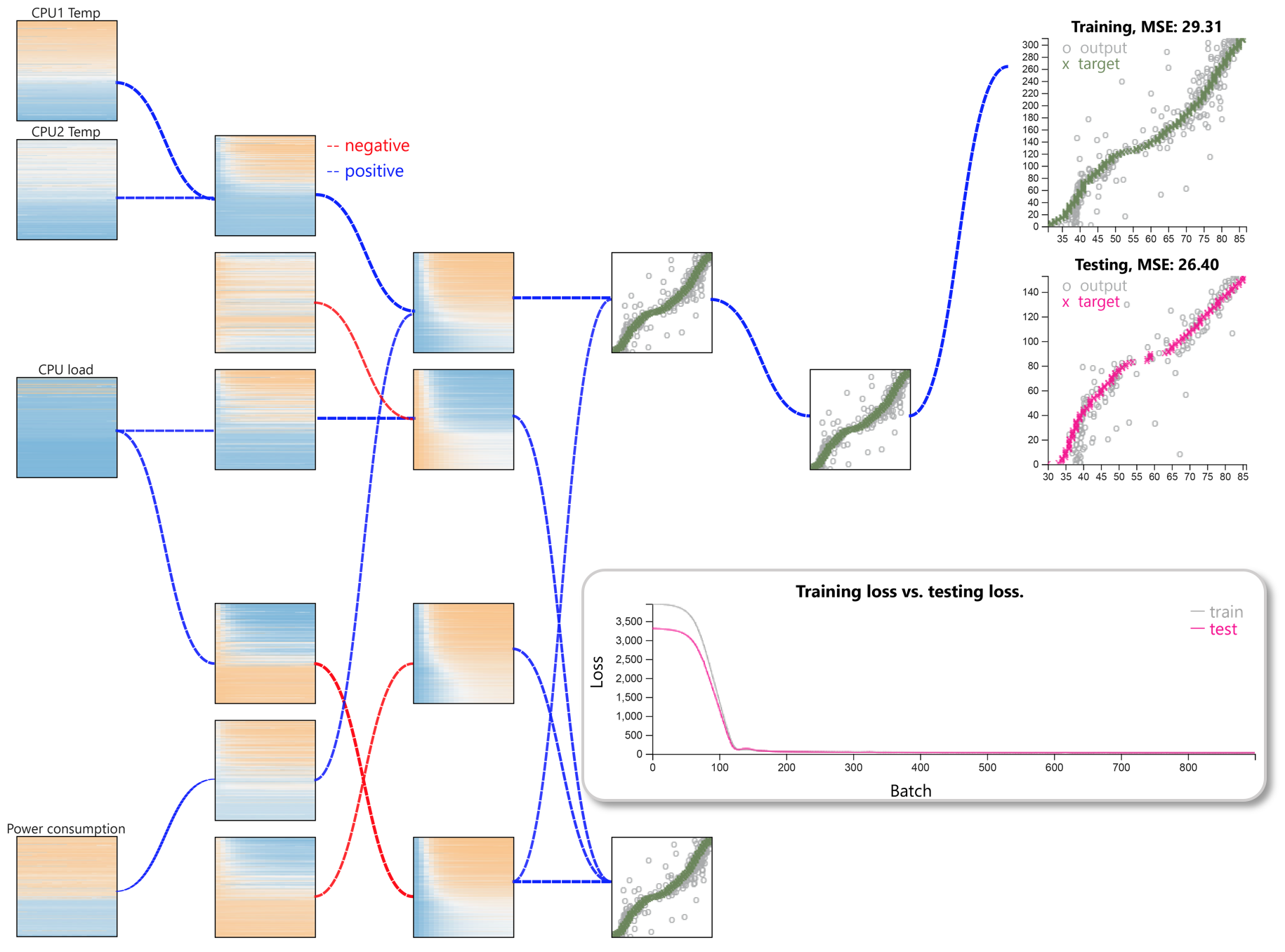
Filtering weights helps to focus on the raw and extracted features with respect to significant
contributions to the final prediction result. The above figure shows the model with the
output gates weight filter threshold set to 0.75.
It shows that the predicted CPU temperature strongly depends on other CPU temperatures, the CPU
load, and the power consumption.
Furthermore, these network contribution also suggest another exploration to improve training
time or prediction performance, or could be both.
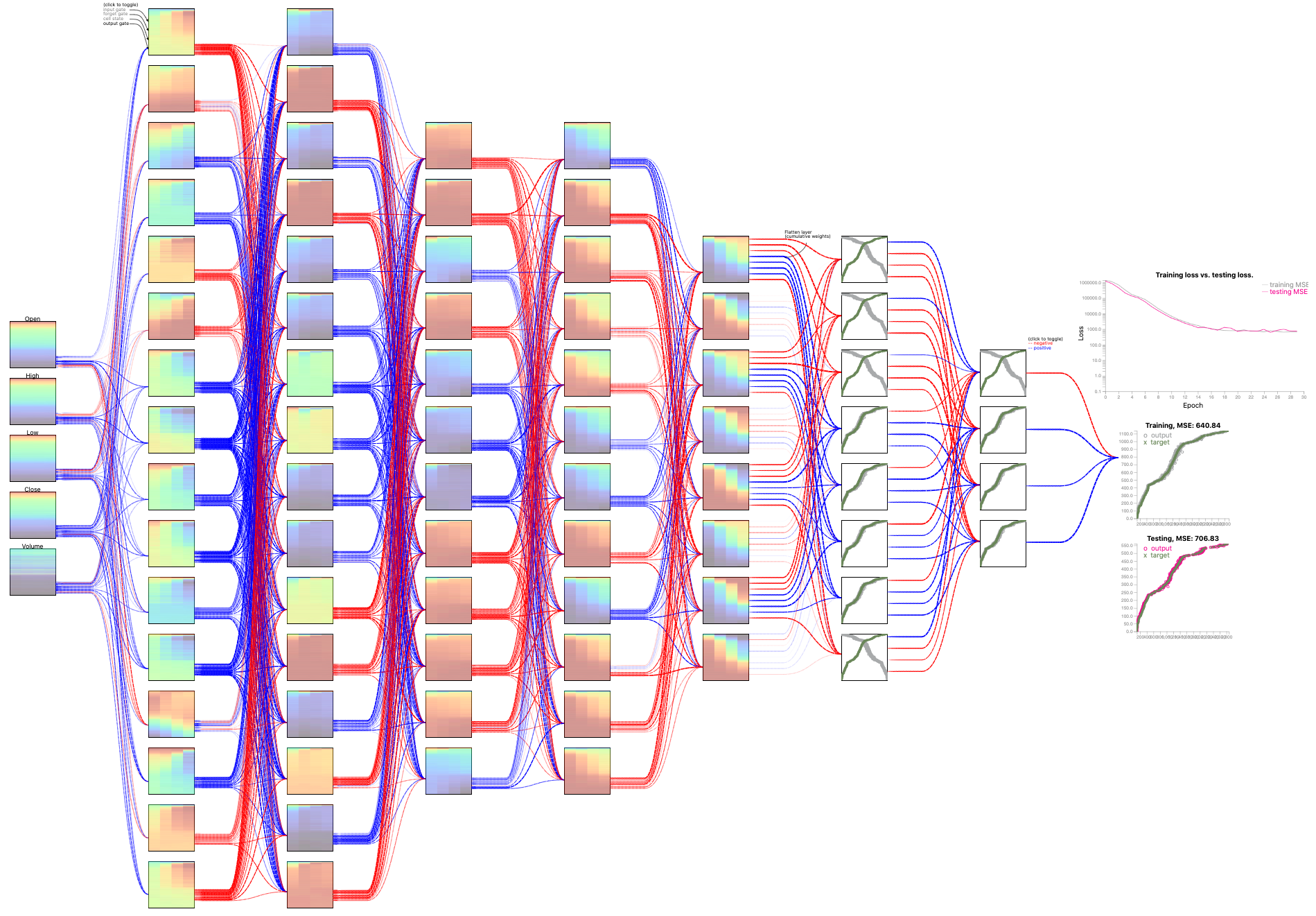
S&P500 Stock Data: Stock price prediction
The dataset covers stock records for five weekdays each week, in the period of 39 years, from 1980 to 2019. Each record contains the timestamp, stock price at “Open”, “High”, “Low”, “Close”, and “Volume” of the stock that day. During the training and testing process, we utilize the attributes of the stock price on Monday, Tuesday, Wednesday, and Thursday to predict Close price for Friday.Configuration: L16-L16-L12-L12-L8-D8-D4 (L: LSTM, D: Dense)
DeepViz model for the S&P500 stock market price dataset through two system snapshots: At the 3rd epoch and at the 10th epoch:
Configuration: L8-L8-D8-D4 (L: LSTM, D: Dense)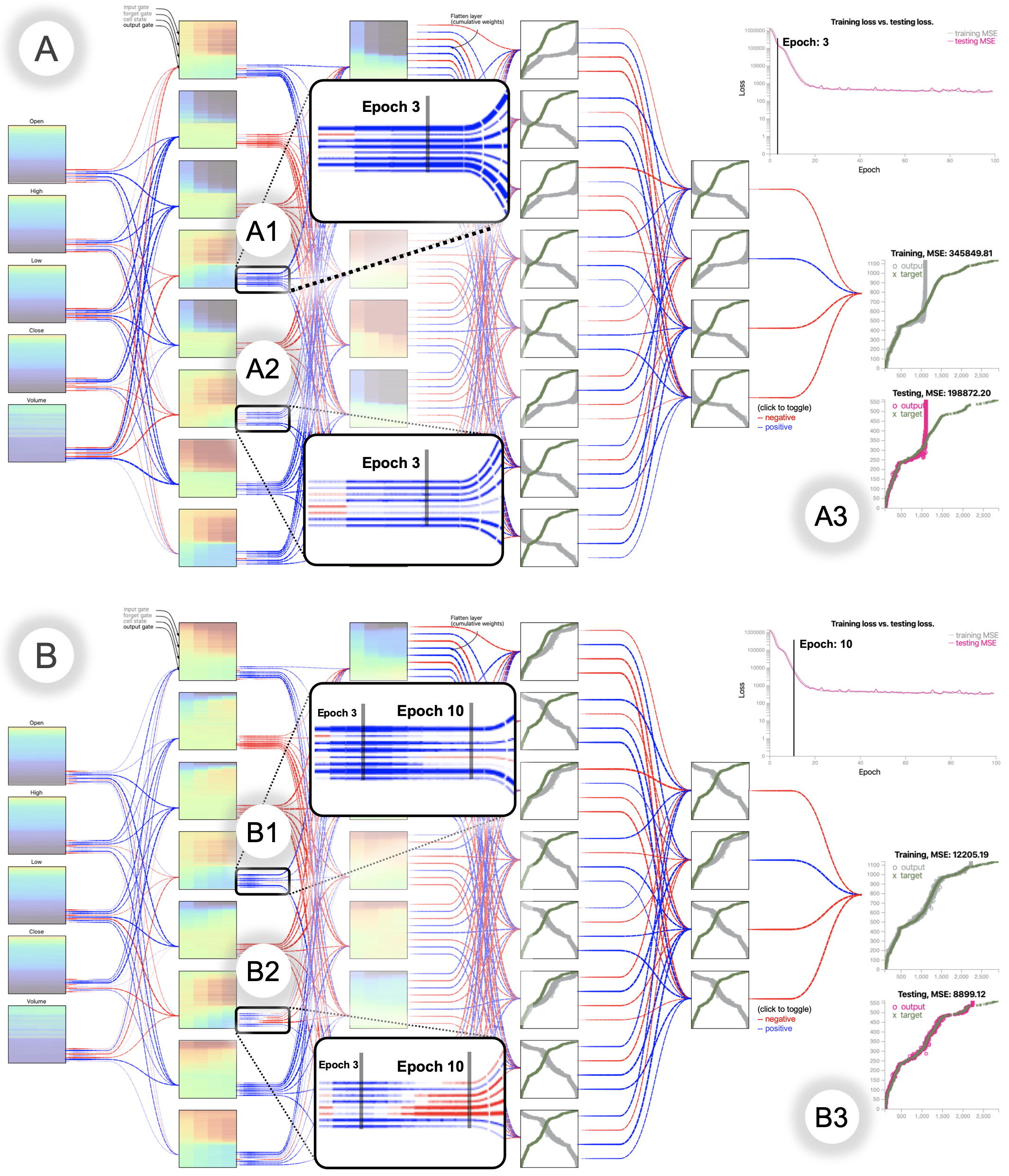 |
1) Evolution of weights
2) Learning process
|
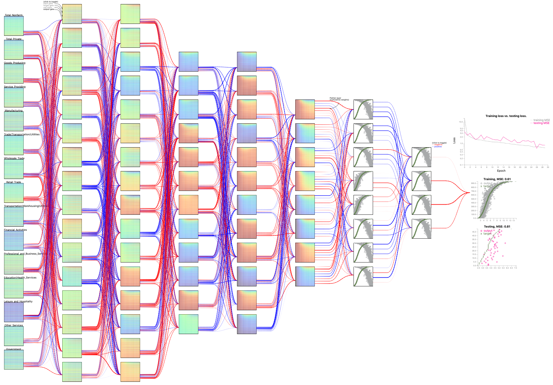
US Employment Data: Unemployment rate prediction
The US unemployment data comprise monthly for 50 states over 20 years, from 1999 to 2018. The data were retrieved from the US Bureau of Labor Statistics. There are 15 in the collected data, including Total Nonfarm, Construction, Manufacturing, Education and Health, and Government. We want to explore the important economic factor associated with the target variable: the monthly unemployment rates of the states.Configuration: L16-L8-L8-D8-D4 (L: LSTM, D: Dense)
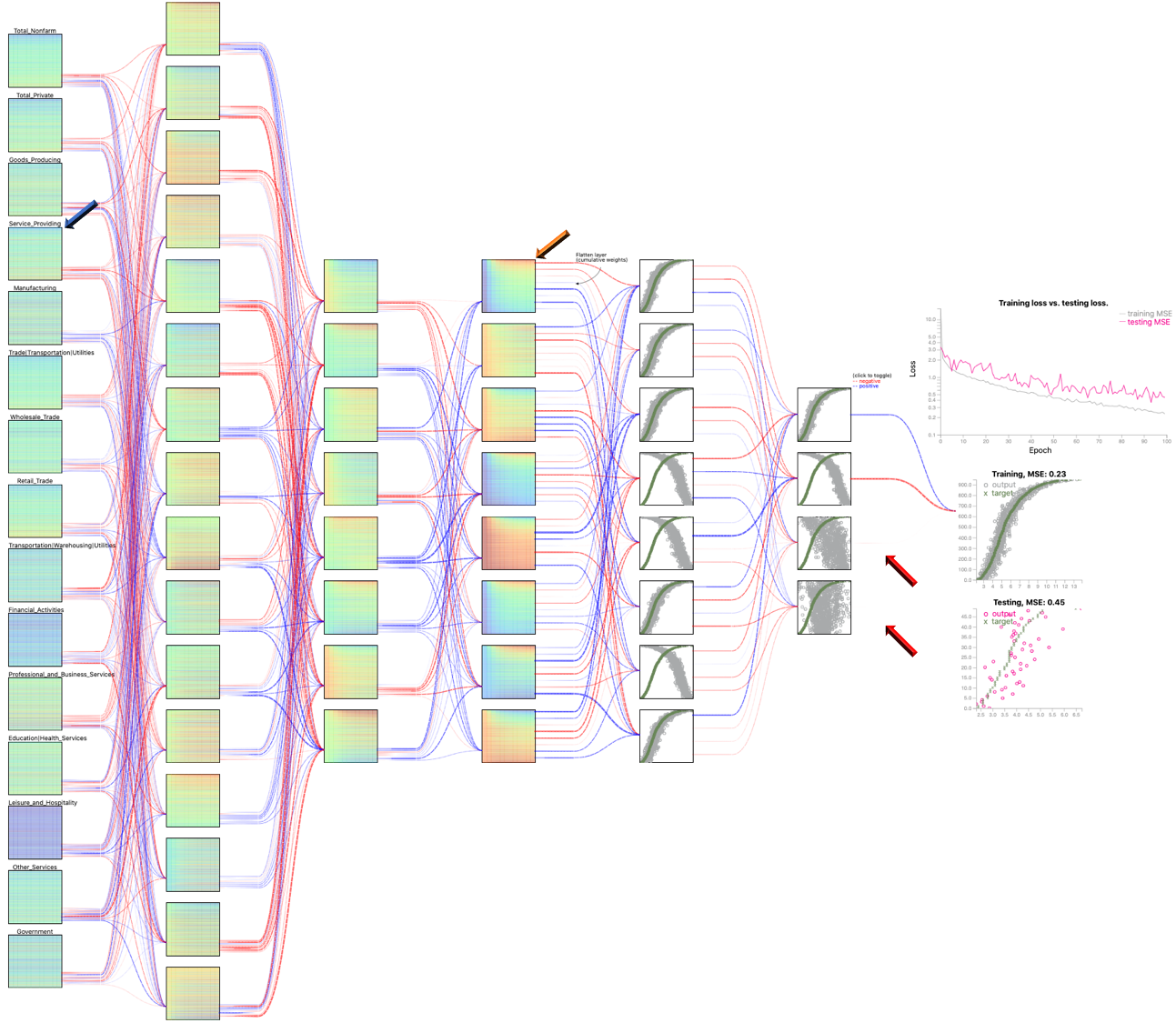
Observation:
In training vs. testing loss plots, the MSE training is smaller than MSE testing as learning and predicting social behavior is a challenging task (compared to the physical or natural series, such as the CPU temperature in the first use case)1) Contributions of significant variables:
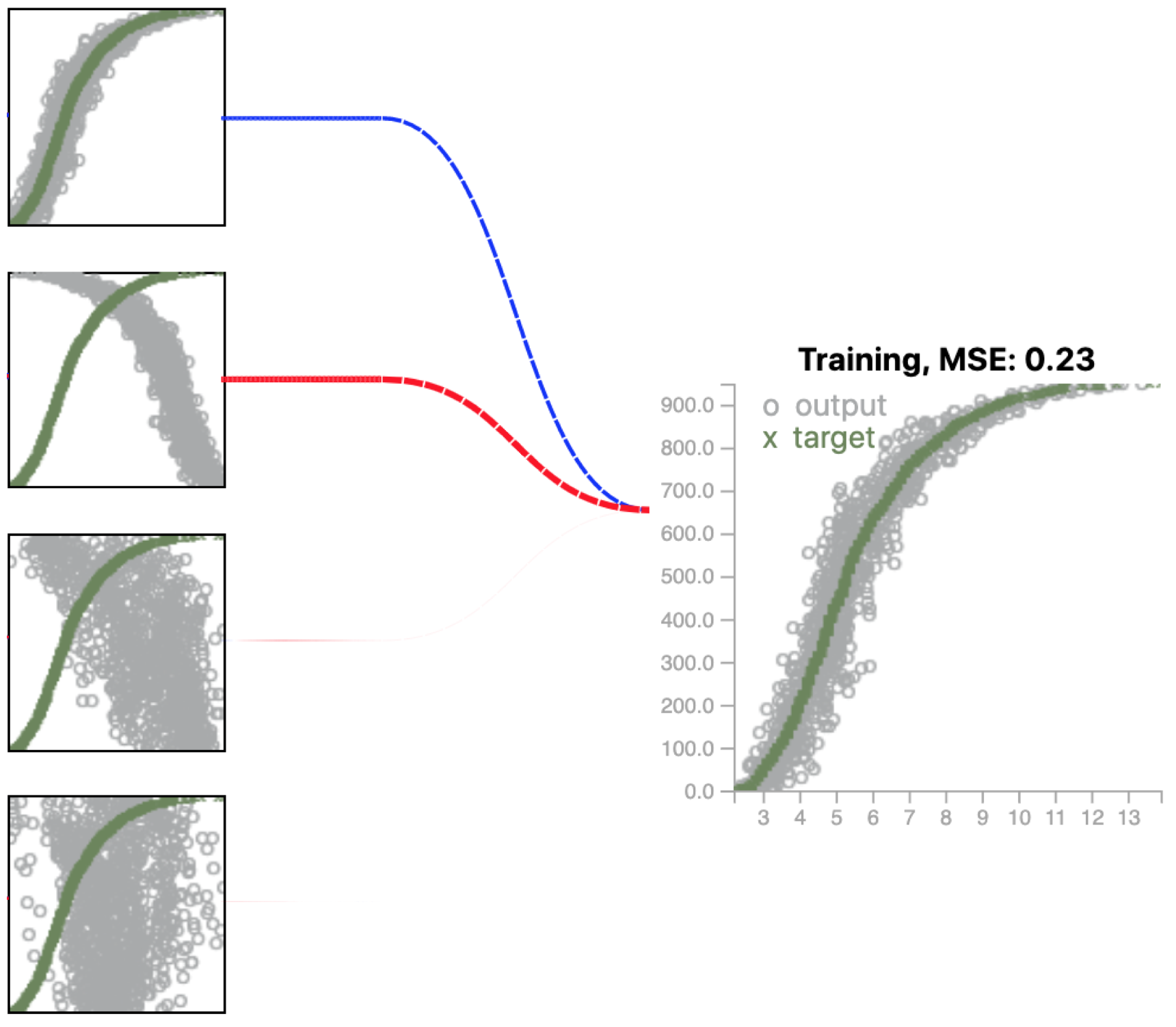
Above is a close up view for the output of L16-L8-L8-D8-D4 configuration.
- • The first node contributes with greatest positive contributions
- • The second node shows the opposite pattern, hence the opposite sign - negative.
- • The last two nodes make marginal contribute as the observed links are really thin. These nodes do not demonstrate any clear patterns to learn.
2) Diagonal pattern:
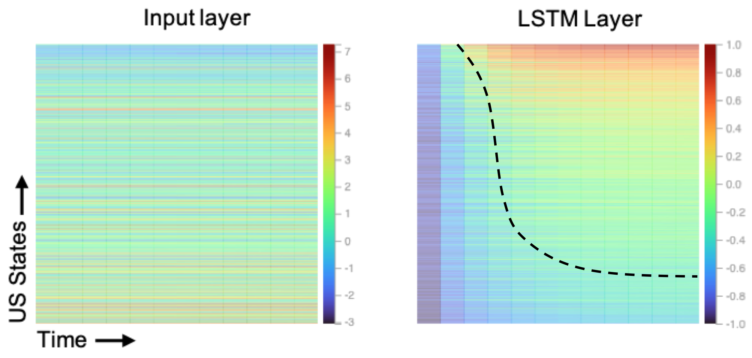
The heatmaps represent original variable (Service_Providing), on the left versus one sample
learned feature at the last LSTM layer (feature 0, on the right).
- • The linear top-down gradient of the input data has been replaced by the diagonal patterns, which resemble the actual value curves (the green curve in the output scatterplot).
- • The diagonal pattern is clearly visible on the right.
- • The more resemblance these patterns are, the better contributions they are into the prediction mechanism.
Other network architectures for this dataset:
Configuration: L16-L16-L12-L12-L8-D8-D4 (L: LSTM, D: Dense)
Configuration: L64-L64-L48-L32-L16-D16-D8-D4 (L: LSTM, D: Dense)