Elevators:
Arrangement of the buttons in relation to the floors
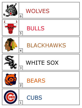
Use nemonics - number/color / icons / music
E.g. at O'Hare airport (Chicago) you have the floor, the team name, colors, and icon, and a (somewhat relevant) song.
We use elevators everyday. Some bad examples:
http://www2.isye.gatech.edu/~jjb/misc/elevators/elevators.html
Here are some other examples:
Analyzing elevator controls using Nielsen-Norman’s Usability Heuristics
Do not forget that 'the first floor' does not mean the same thing to everyone.
Did you experience elevators that work in different ways? Share your stories.
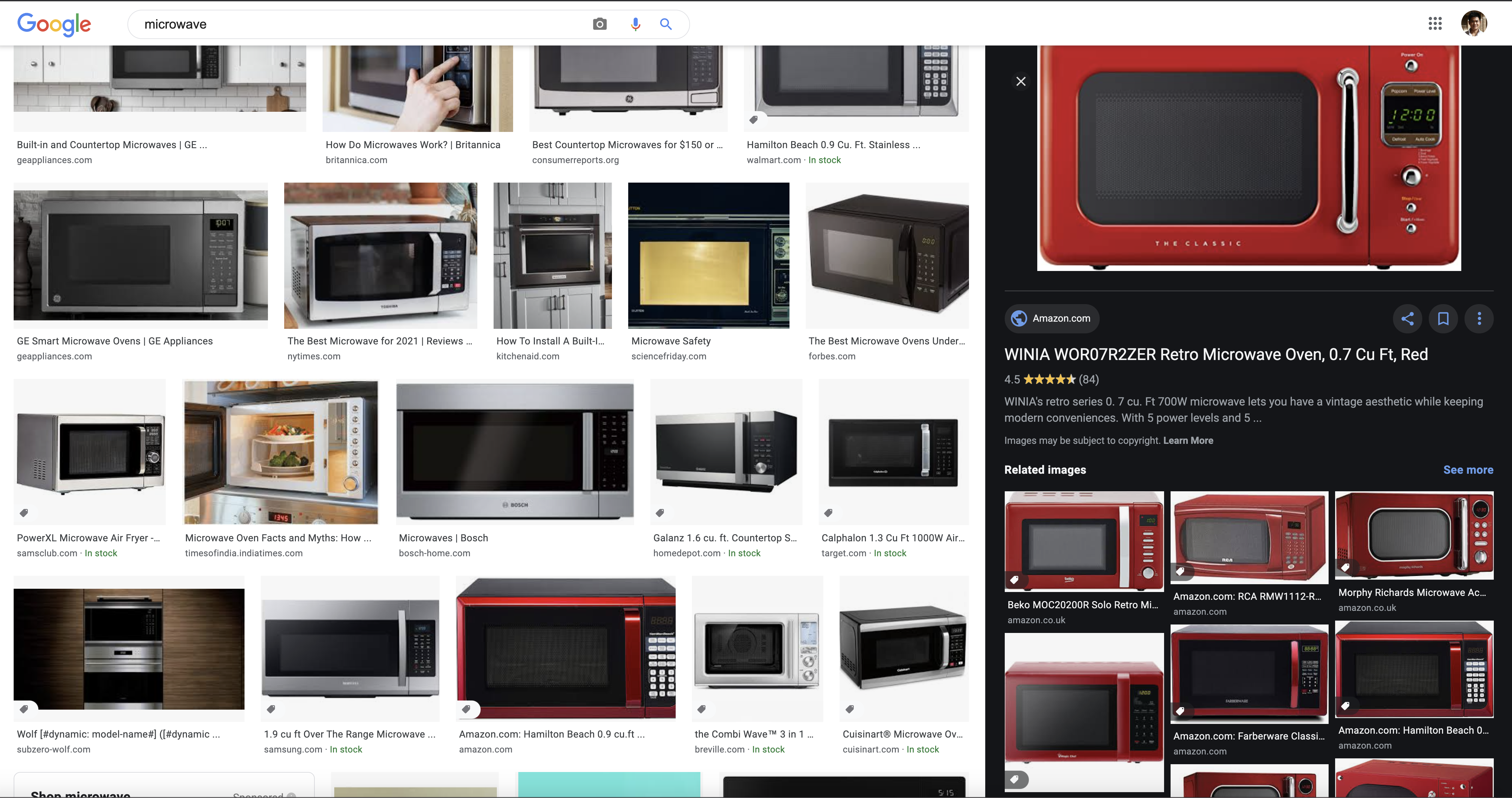
Microwaves:
Recommendations:
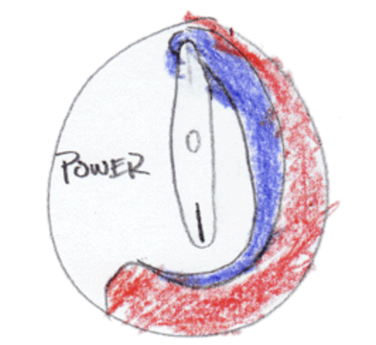
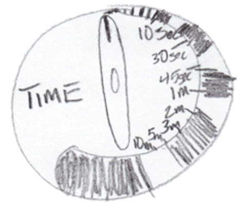
Standardization: Focus on the prominent features (Power and Time).
Customization: Add the secondary features (auto cleaning, cooking programs, etc).
References:
Microwave Ovens: Failure is not an option
Why do Microwave oven UIs fail?
User Interfaces: How Not to Design a Microwave?
Why Do Most Microwaves Have Such A Terrible User Interface?