- determine set of tasks early in design
- choose 'atomic' actions for the tasks
- look at task frequencies --> prioritize tasks

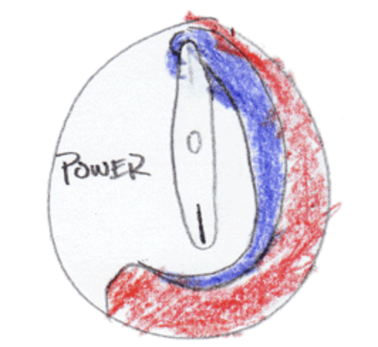
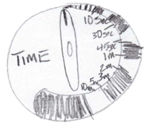
Recognize Diversity


| Advantages | Disadvantages | |
| Direct Manipulation | - visually presents task concepts - allows easy learning - allows errors to be avoided - encourages exploration - affords high subjective satisfaction |
- requires a graphics display and a pointing device |
| Menu Selection | - shortens learning - reduces keystrokes - structures decision making - allows easy support of error handling |
- presents danger of many menus - may slow frequent users - consumes screen space |
| Form Filling | - simplifies data entry - requires modest training - gives convenient assistance |
- consumes screen space |
| Command Language | - is flexible - appeals to 'power' users |
- has poor error handling - requires substantial training and memorization |
| Natural Language | - relieves burden of learning syntax - google smart home? Problems? |
-requires clarification dialogue - is unpredictable |
Direct manipulation -
originally interacting with a computer was direct manipulation at
a low level - moving wires, flipping switches. Direct manipulation
returned in a big way in the 80s (after a lot of basic research
was done in the 60s and 70s) at a higher user level which could
involve using a light pen to touch a location on the screen (70s),
moving a mouse to move a pointer on a screen and clicking the
mouse button to make selections (80s) to more modern alternatives
where the user uses a stylus or their finger to more directly
manipulate the interface itself (2000s).
Definition: A human-computer interaction style which involves continuous representation of objects of interest, and rapid, reversible, incremental actions and feedback

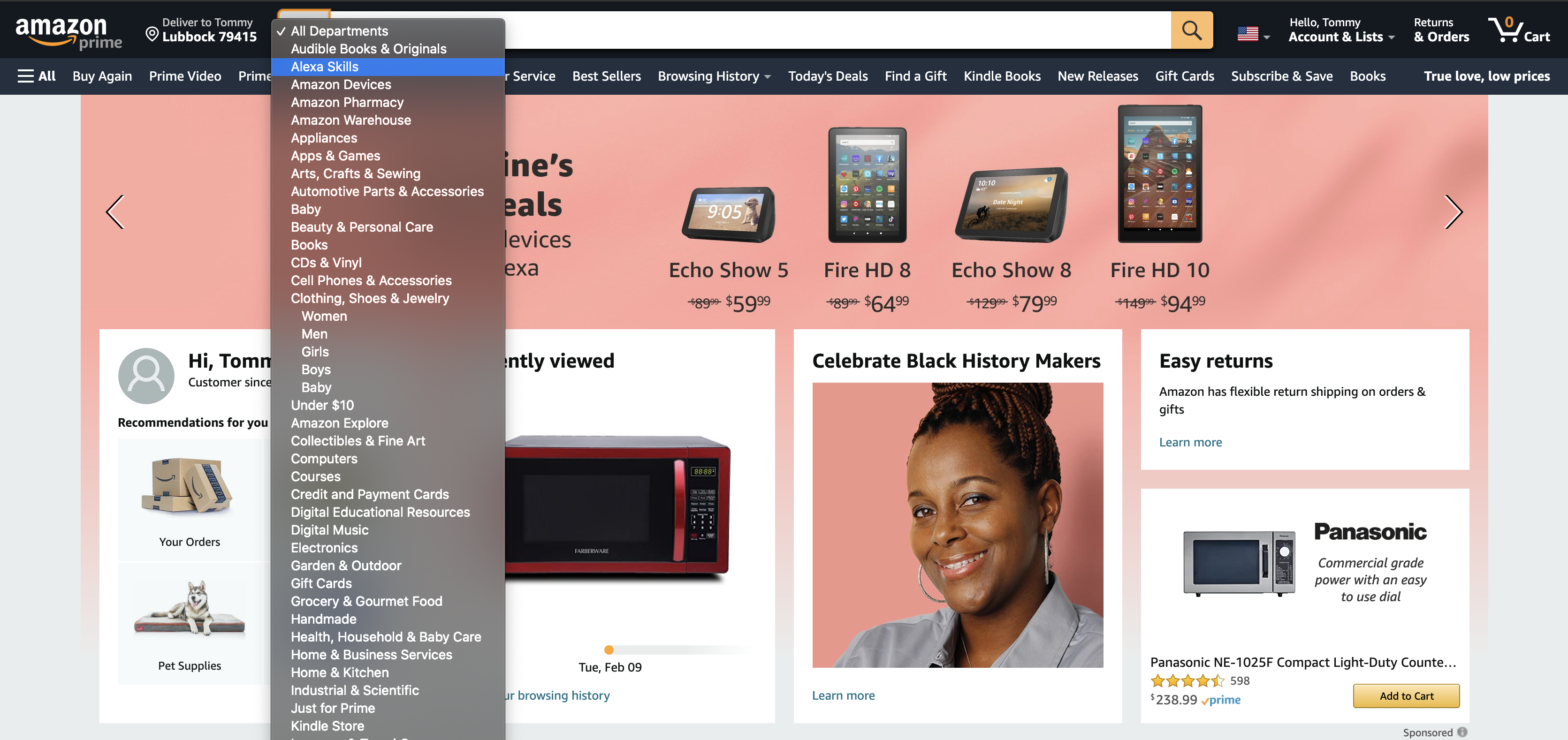
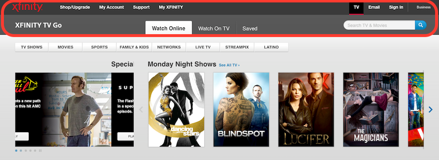
Menu selection is
ubiquitous on computer interfaces today
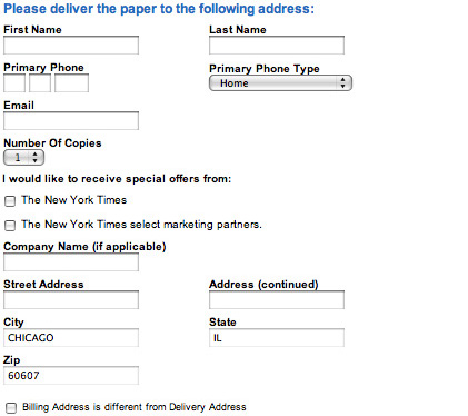
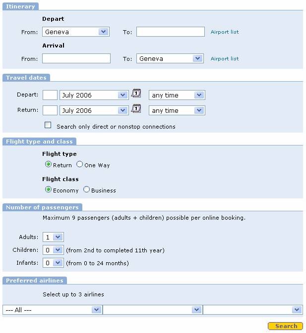
Form fillin is
also ubiquitous on the web, making it easy for people who need
your data to get it in a form that they can easily process.

Command language:
Examples:
- git clone https://github.com/iDataVisualizationLab/HCI-Spring2021.git
- git add -A
- git commit -m "Update syllabus"
- git push
Limitations:
- has poor error handling
- requires substantial training and memorization
Natural language
is commonly used today when getting information via the phone on
movie times or airline flights or the weather, etc.
Siri, HoloLens, Google Glass etc. help smart phone users, and tools like Alexa have moved that into the home and car.
Voice can be very successful in areas of limited/focused vocabulary.
Limitations:
- Voice commands can also be hard to learn and remember.
- More general natural language recognition is harder.
- Talking to your cell phone solves part of the problem of noisy rooms.



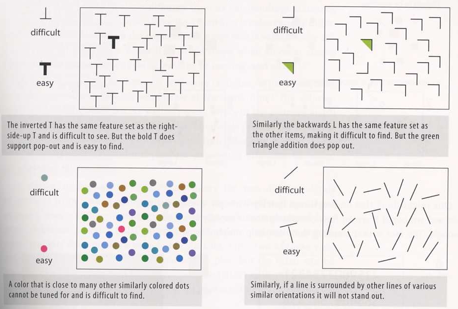
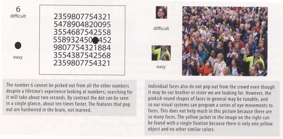
Getting the User's Attention
Retinal variables:
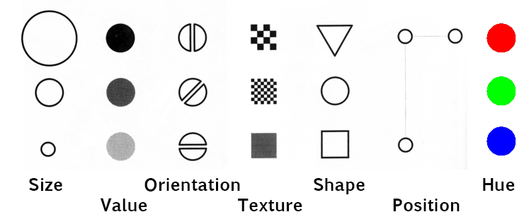
Two types of retinal variables:
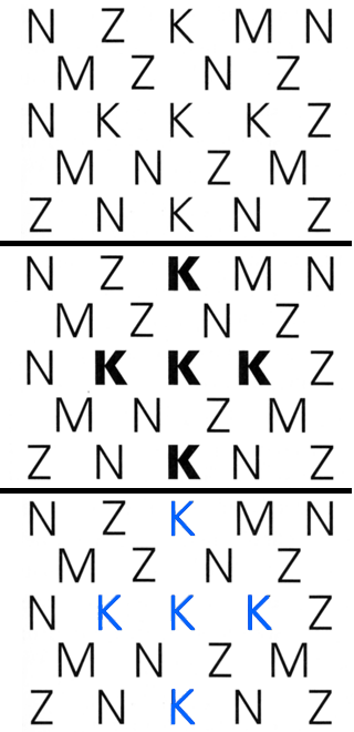
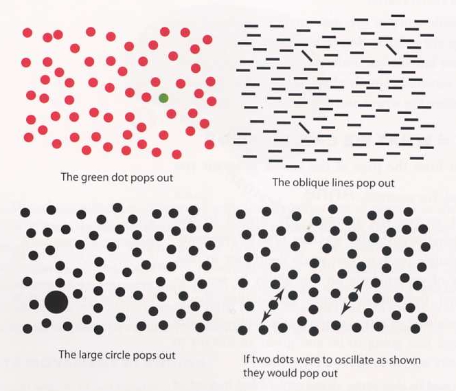
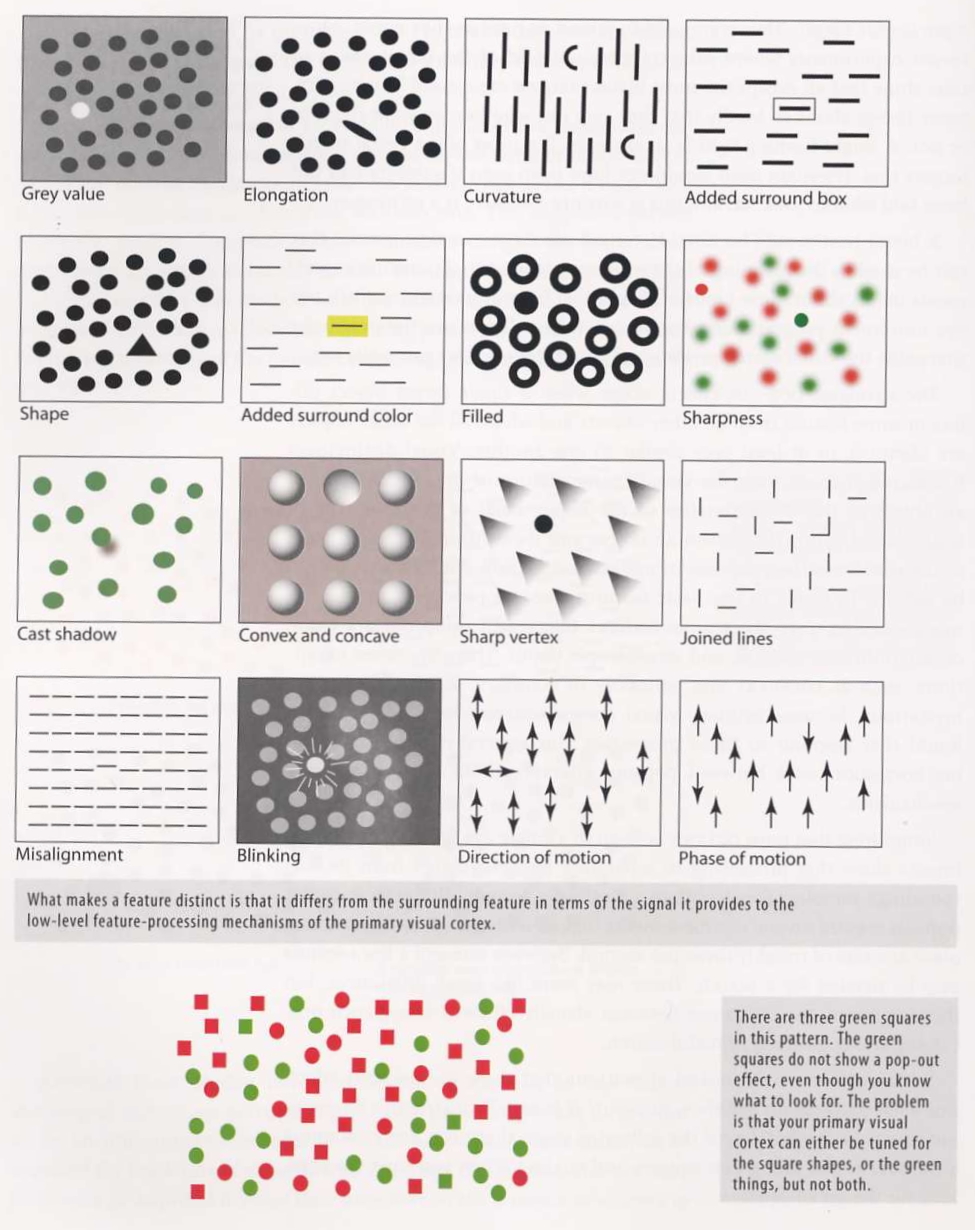
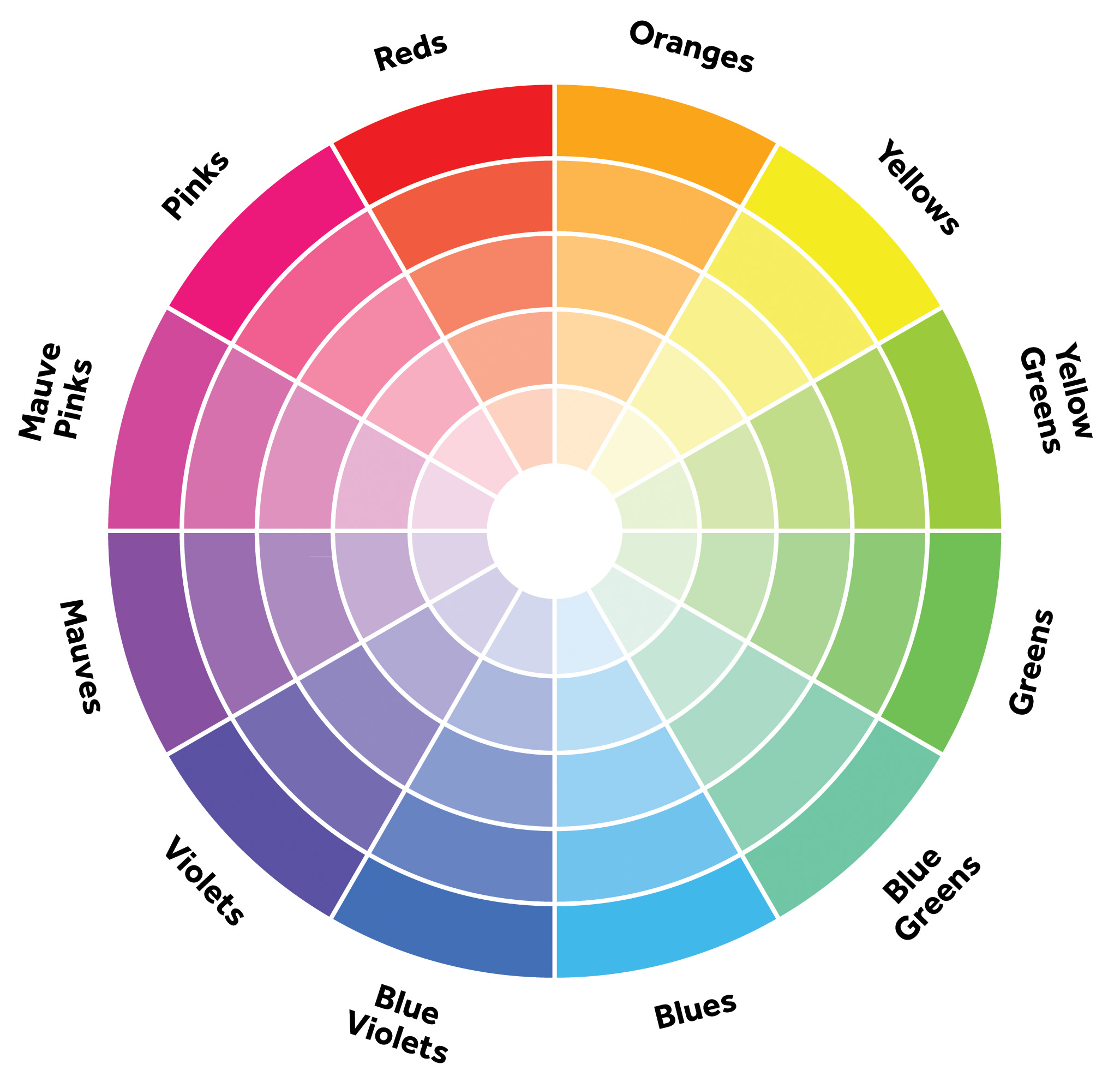
Color wheel

Color brewer is a good resource for color selection: http://colorbrewer2.org/
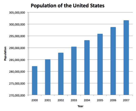
This is the bar charts of the population of the USA over the last 8 years. The left chart shows how 3D hurts the visualization. The right chart is a less fancy but much more effective in 2D.

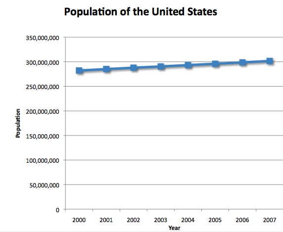
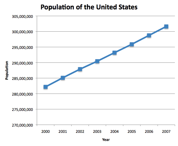
Here is an example how visualization lies: from Time Magazine (4/9/79) via Tufte. Please avoid this.

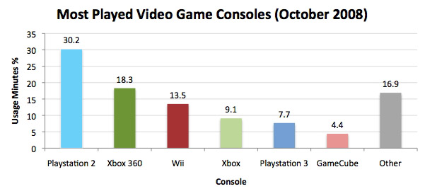
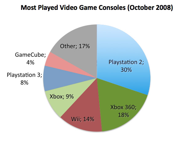
These examples are charts from a recent version of Excel. 3D distorts the view making it more difficult (less accurate as well) to read the visualization.
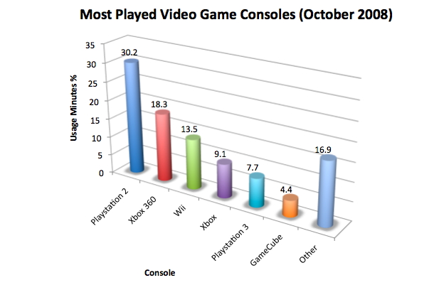
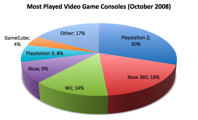
A 2D version is much better. Picking up the right colors is also helpful: we could use colors to relate consoles. For example, Playstation 2 and Playstation 3 are both in (darker and lighter) blue.
Here is another bad example from Fox news:

A
good site for more bad examples
References:
Things that Make us Smart by Donald Norman,
Information
Anxiety by Saul Wurman,
The Visual Display of
Quantitative Information by Edward Tufte,
Designing the
User Interface 3rd Ed. by Ben Schneiderman,
The
Psychology of Human-Computer Interaction by Stuart Card and
friends
Human-Computer Interaction 2nd Ed by Alan Dix and
friends
User Interface Design by Andrew Johnson
8 Golden Rules for Better Interface Design by Ana Santos