Entry Name: "TTU-Vuong-MC2"
VAST Challenge 2019
Mini-Challenge 2

Team Members:

Ngan Vuong, iDV Lab, Texas Tech University, ngan.v.t.nguyen@ttu.edu   PRIMARY
Tommy Dang, iDV Lab, Texas Tech University, tommy.dang@ttu.edu

Student Team: YES

Tools Used:

HTML, CSS, JavaScript
D3.js
GitHub:
https://github.com/iDataVisualizationLab/N/tree/master/VAST19/mc2
Web demo:
https://idatavisualizationlab.github.io/N/VAST19/mc2/

Approximately how many hours were spent working on this submission in total?

100 hours

May we post your submission in the Visual Analytics Benchmark Repository after VAST Challenge 2019 is complete? YES

Video

https://idatavisualizationlab.github.io/N/VAST19/mc2/video.html


System Overview

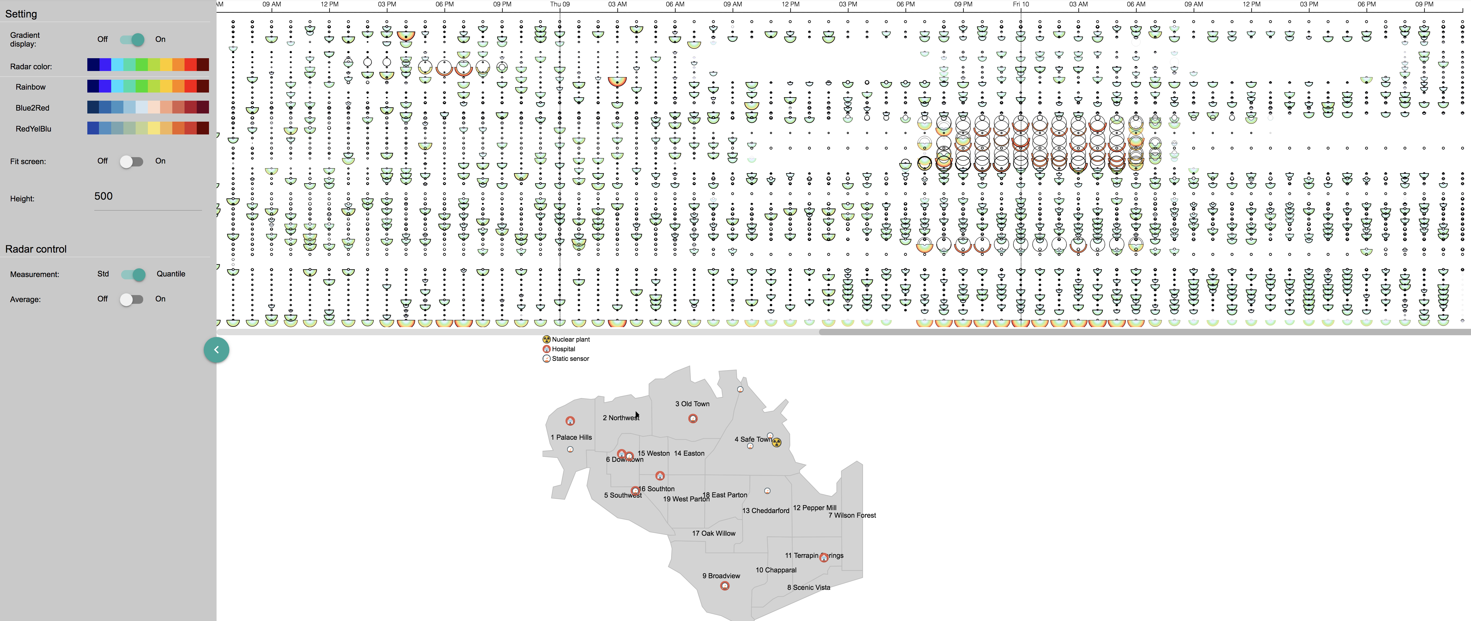
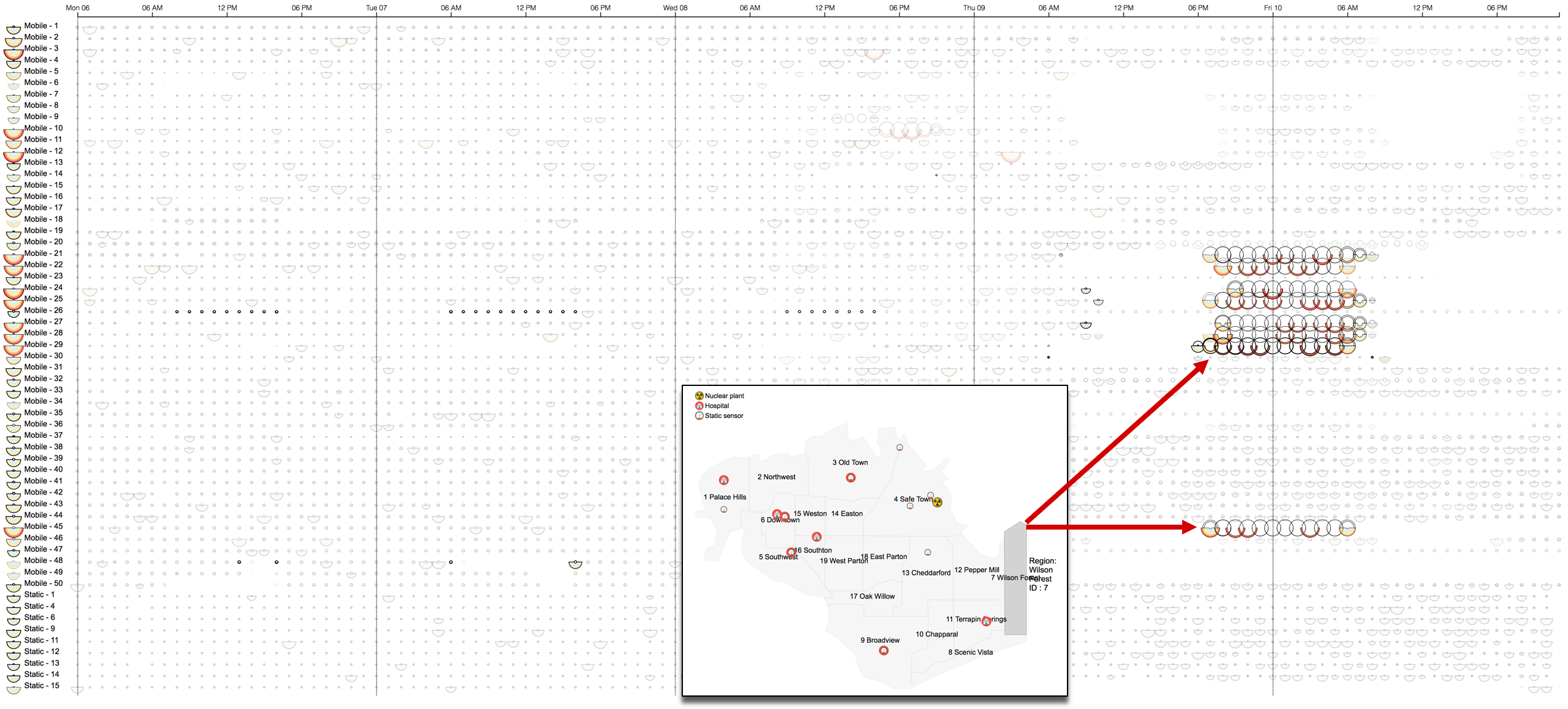
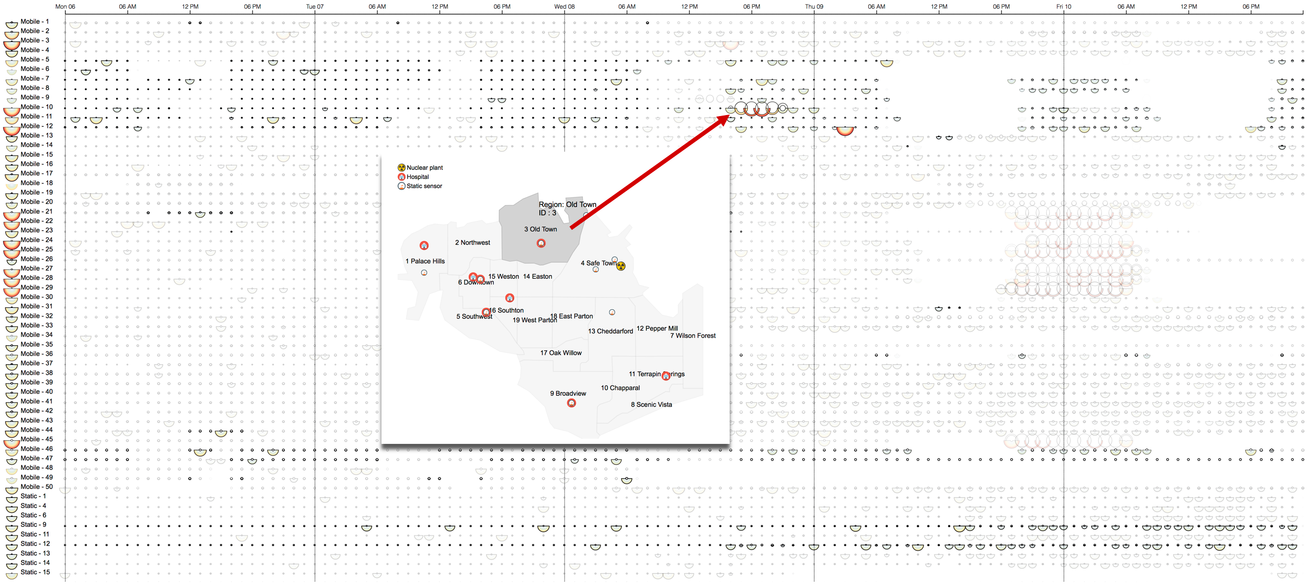
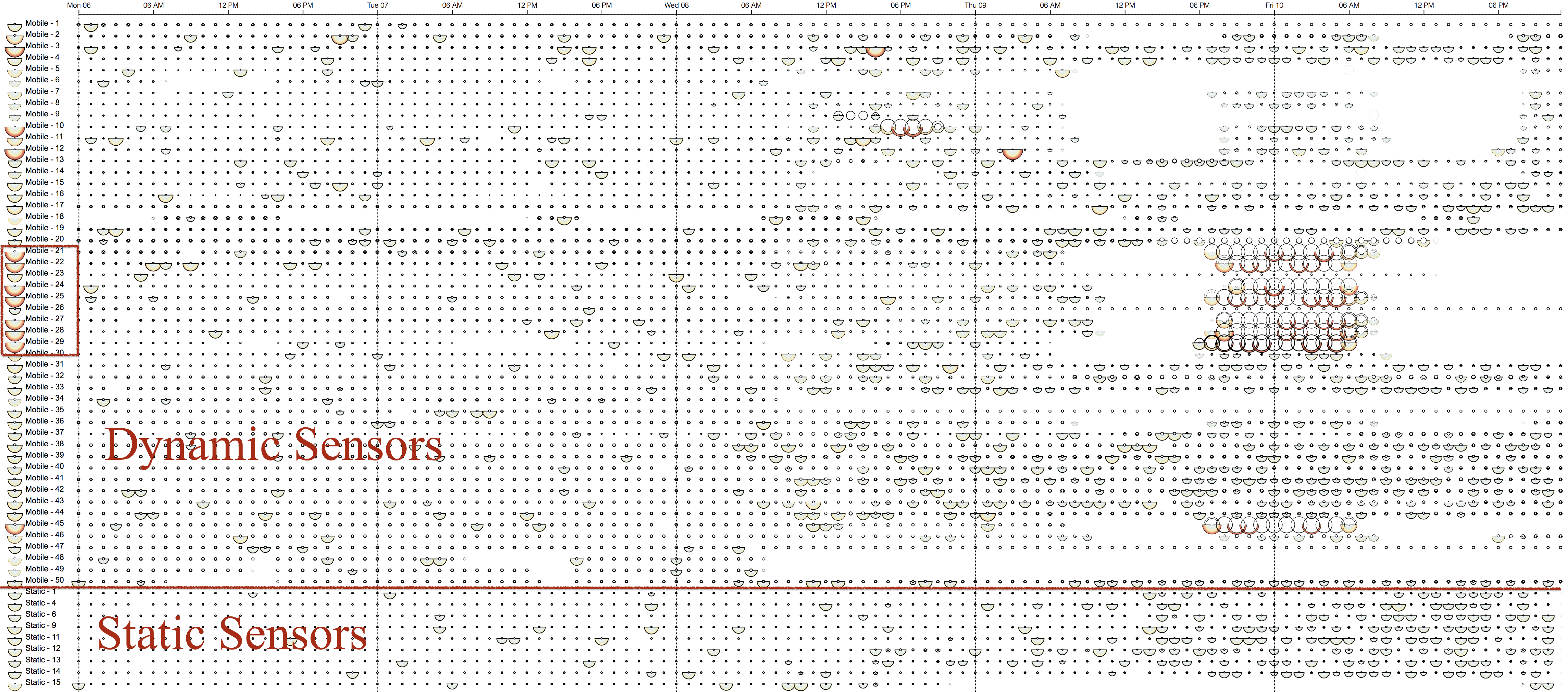
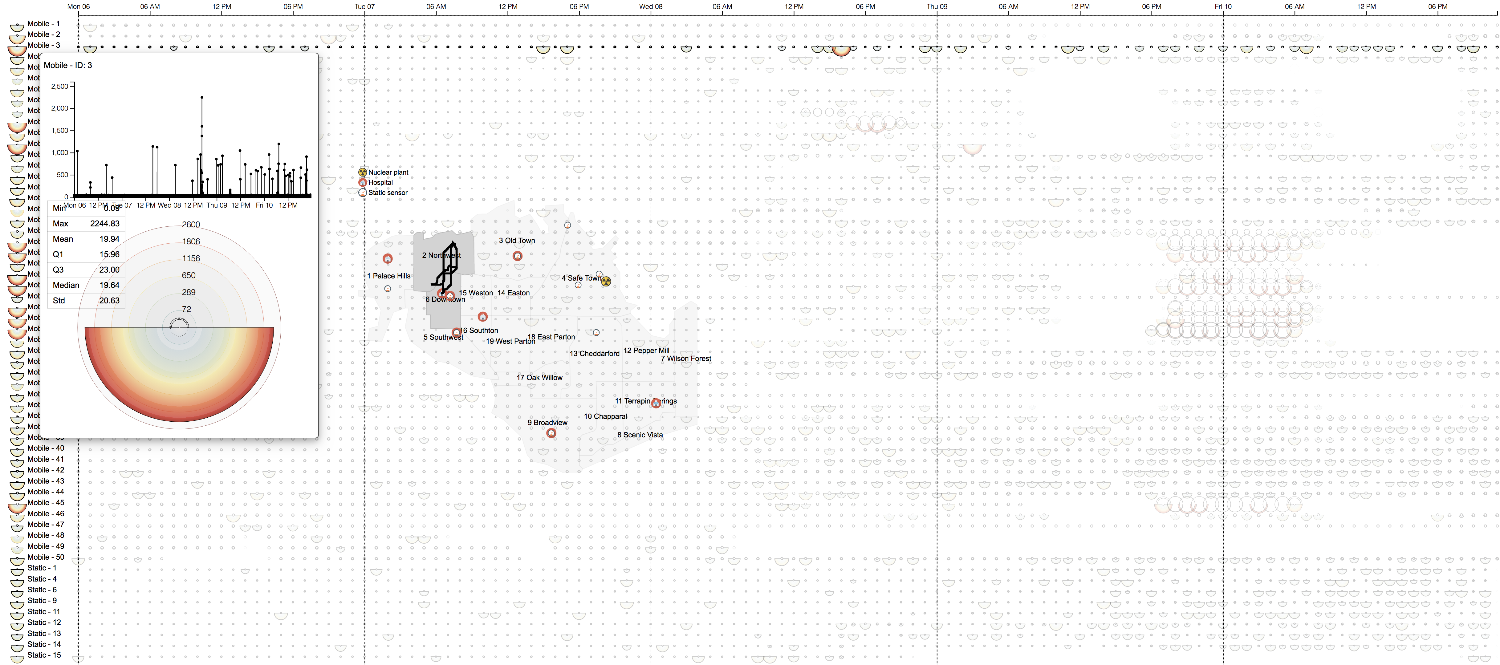
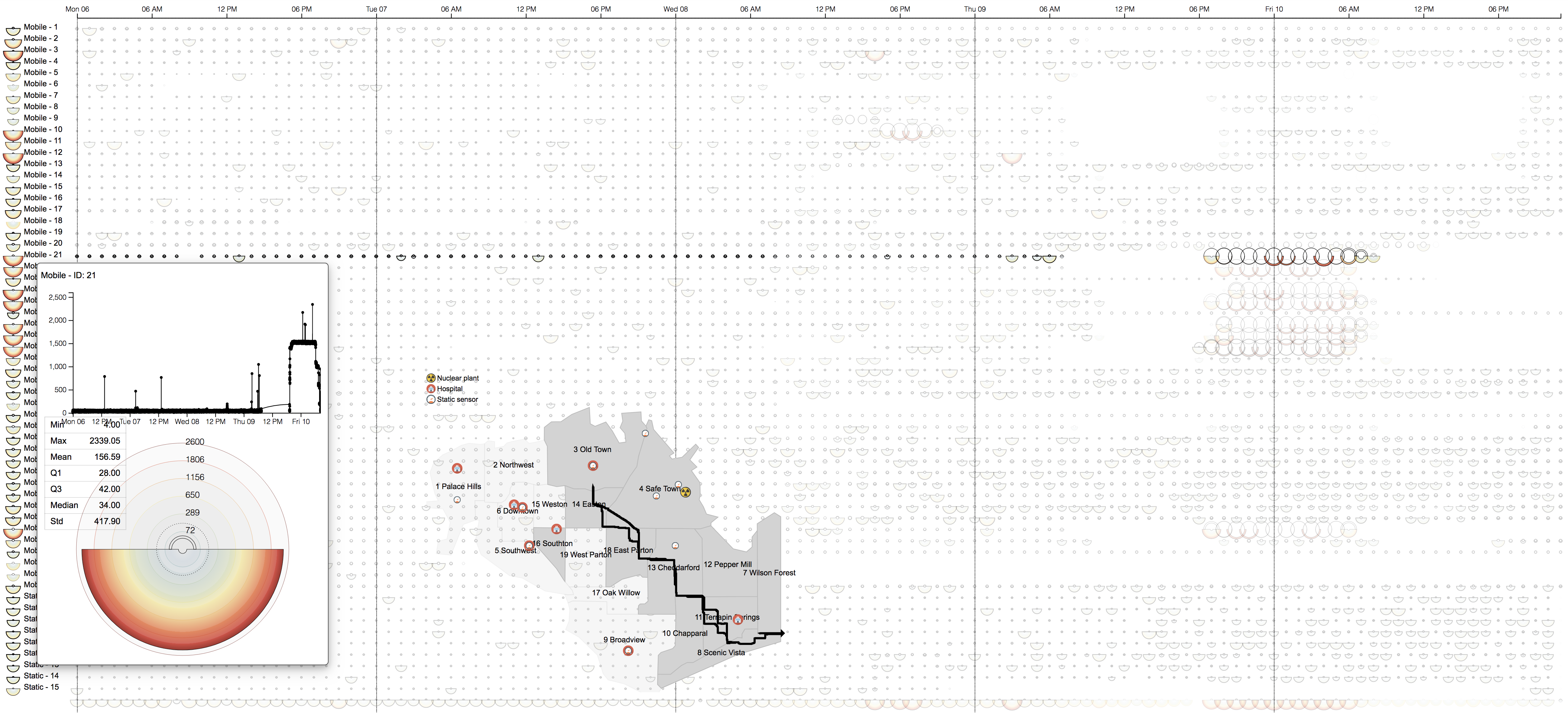
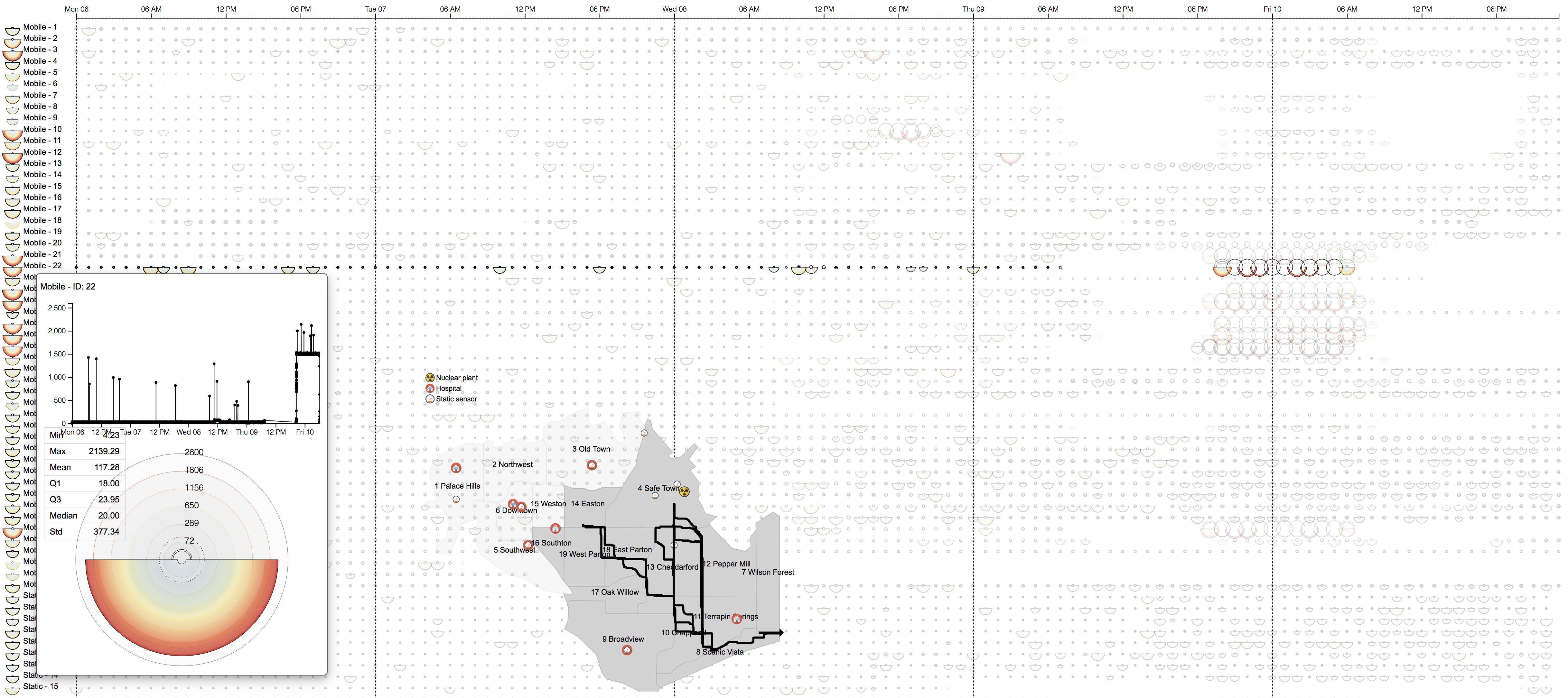
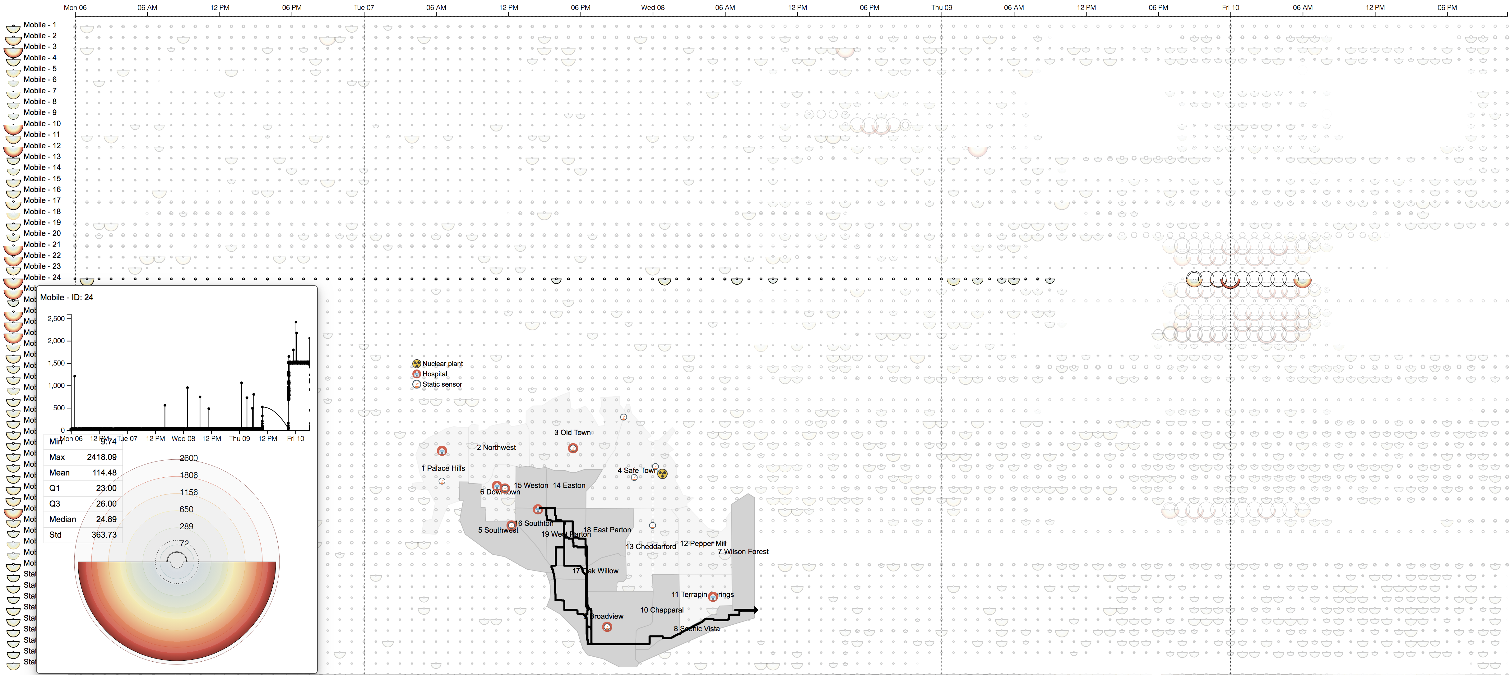
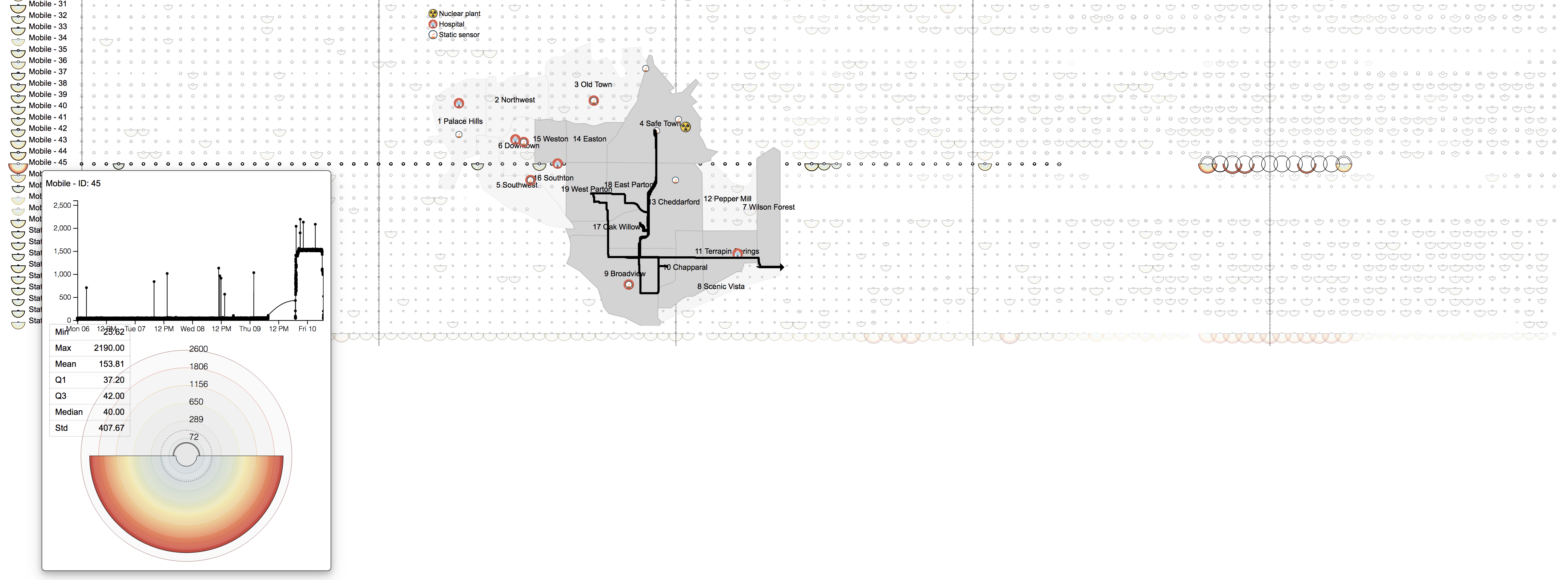
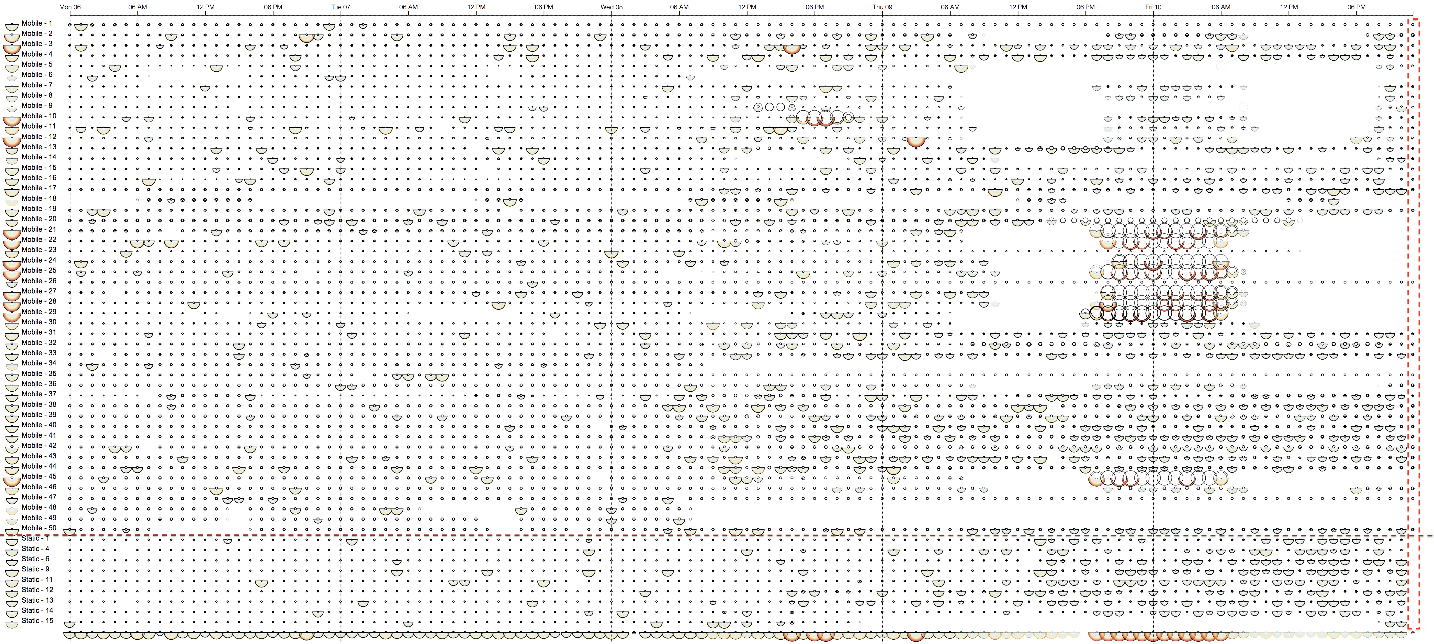
Figure 1. Our visual interface: (left) control panel, (top) Main view, and (bottom) St. Himark map
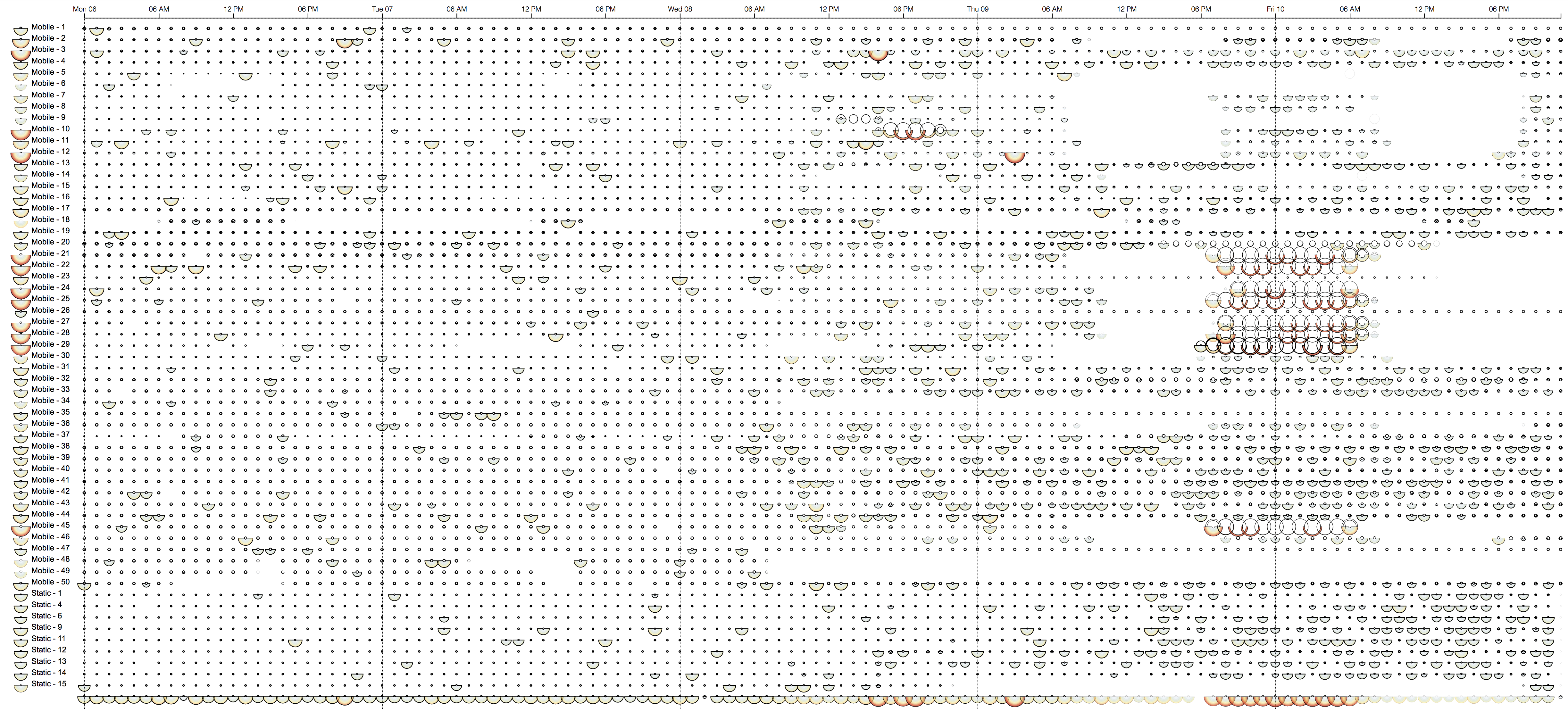
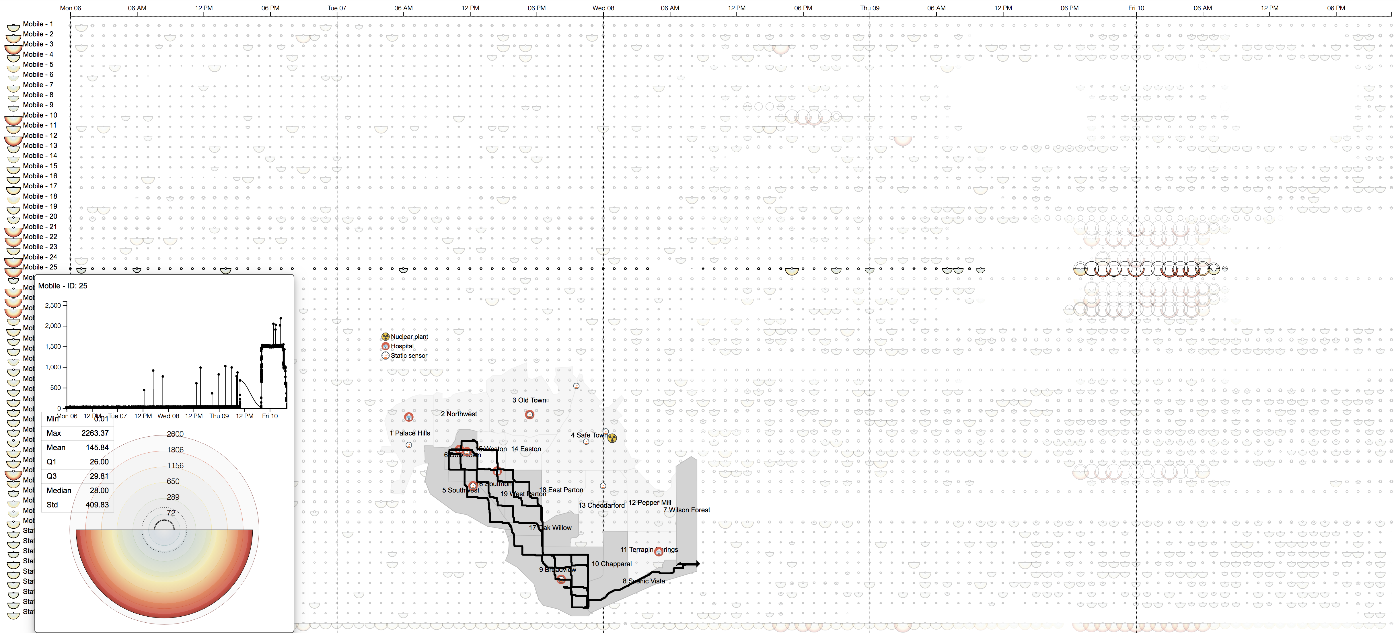
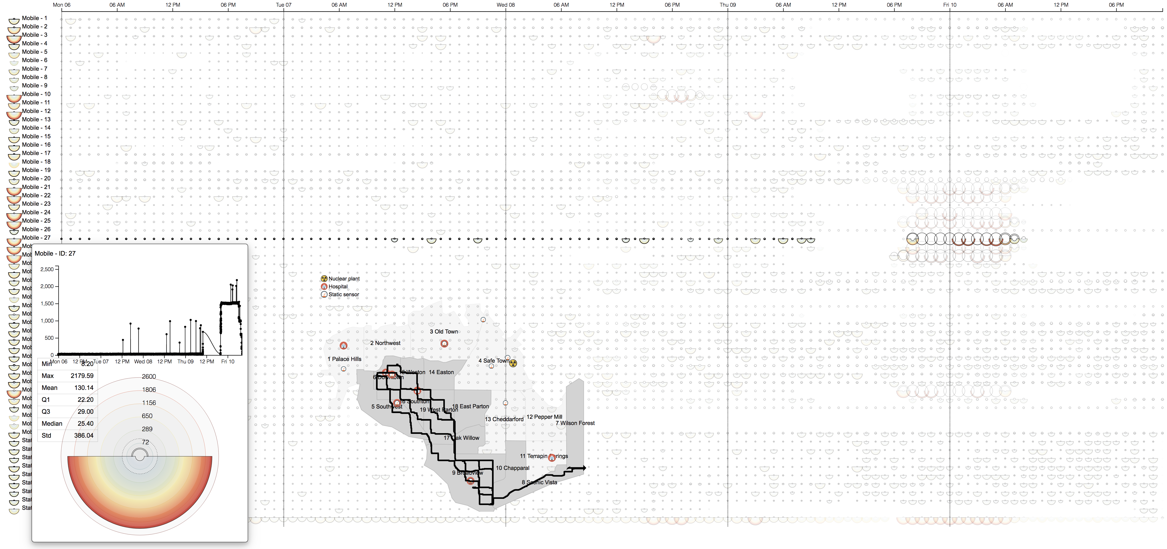
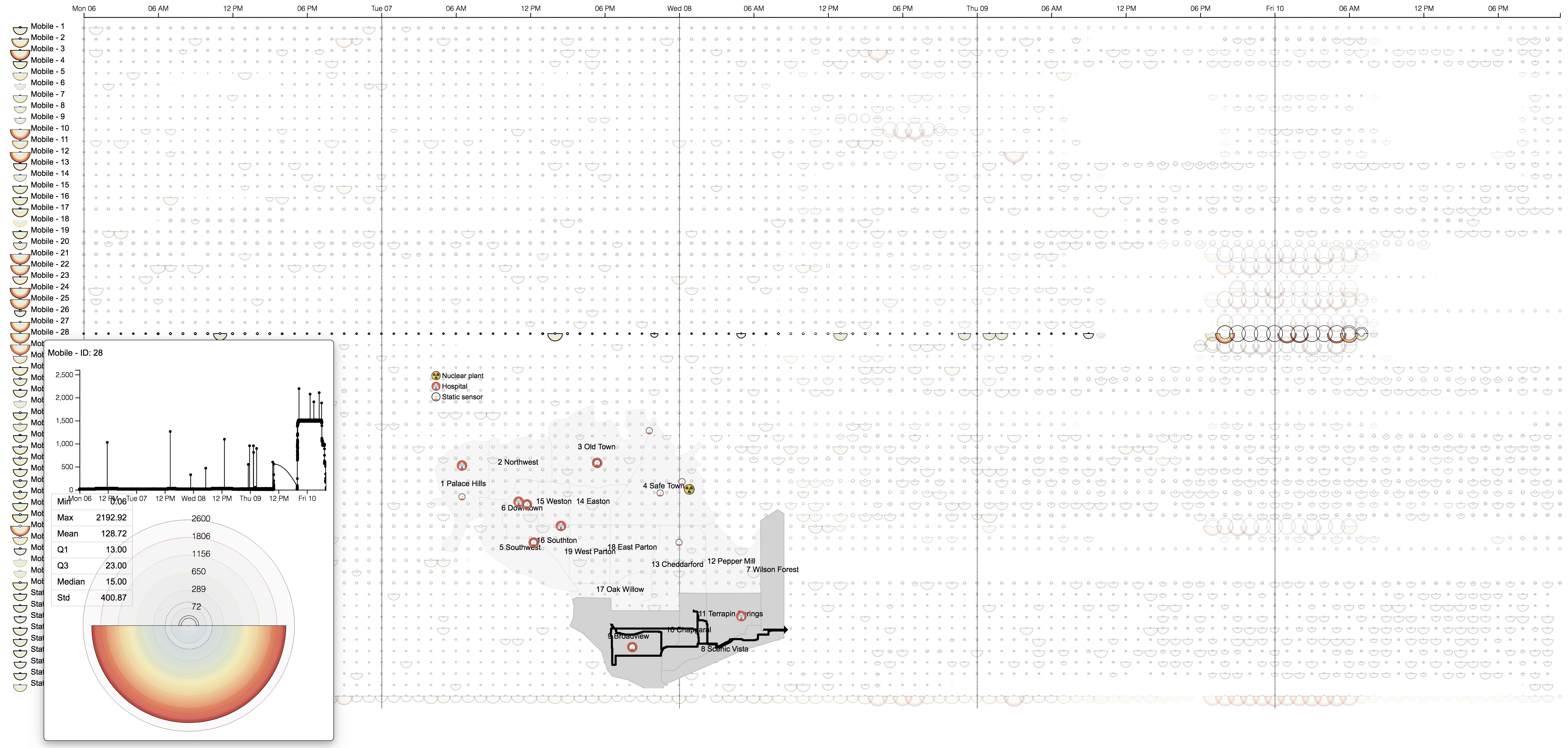
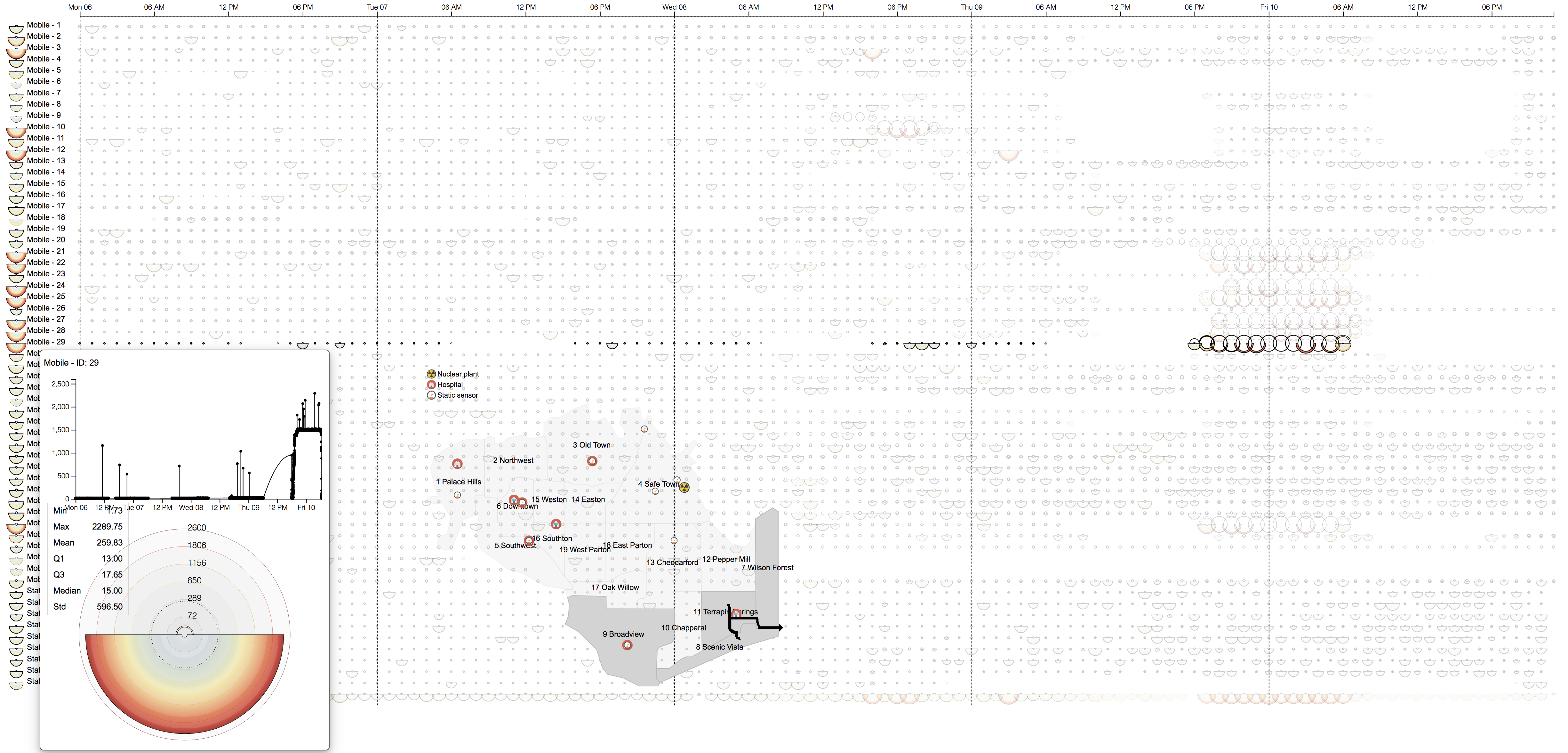
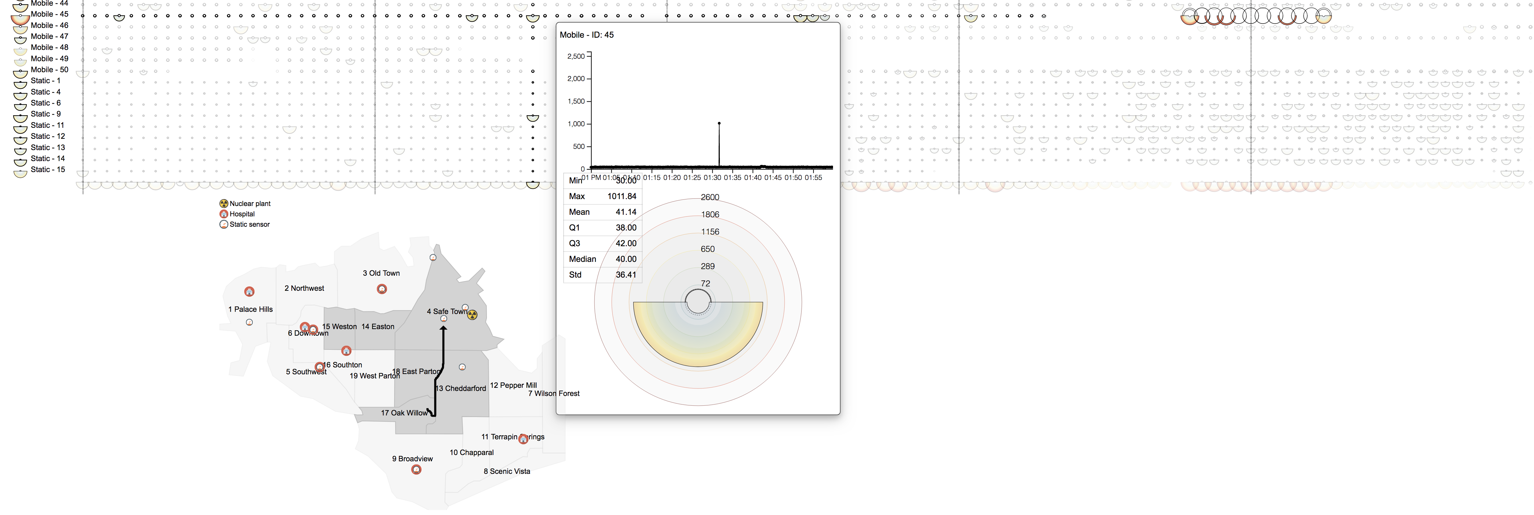
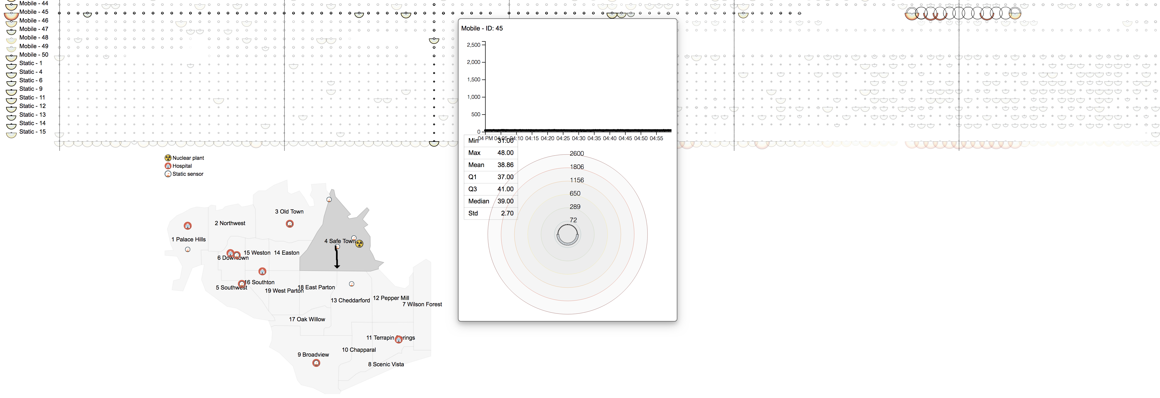
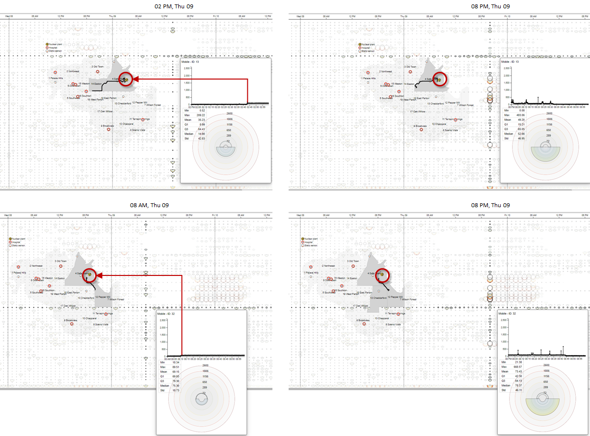
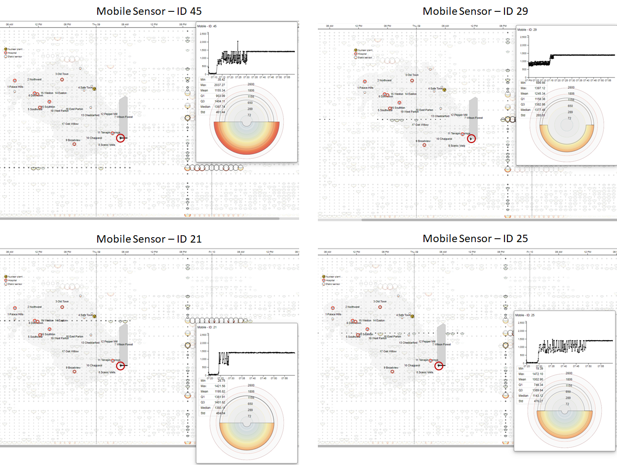
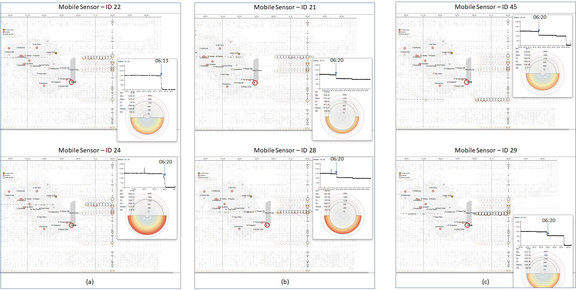
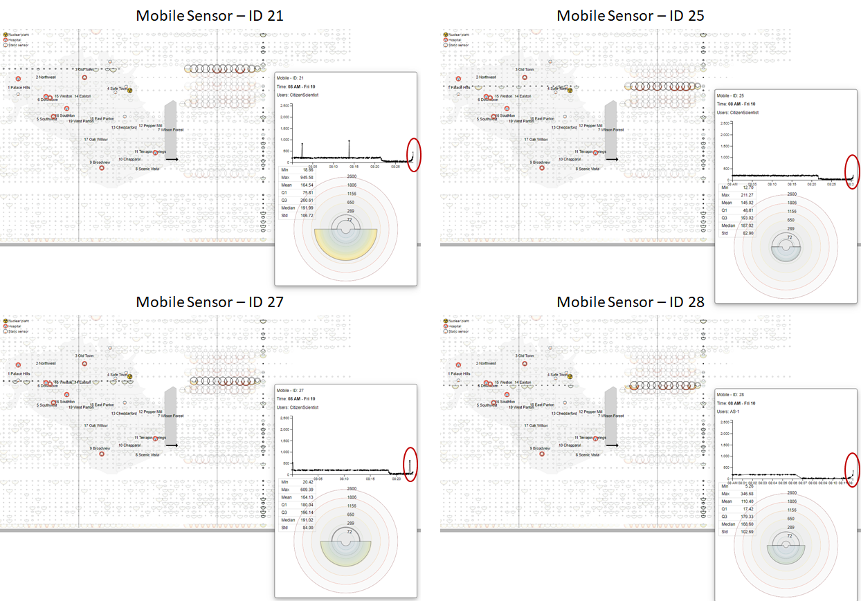
Radar chart design:

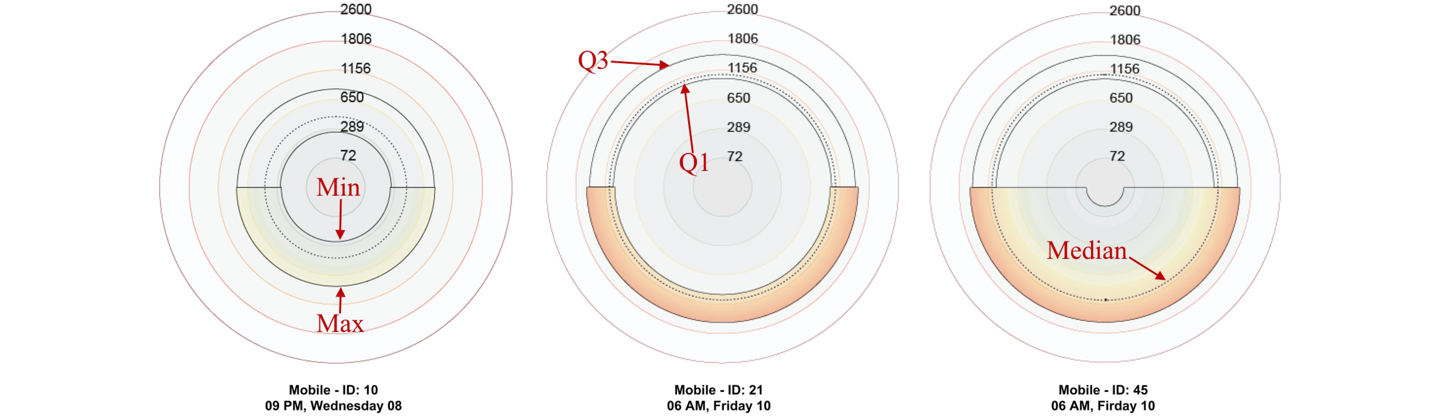
Figure 2. Examples of circular chart design for hourly summary of 3 mobile sensors: mobile sensor 10, mobile sensor 21, and mobile sensor 45.

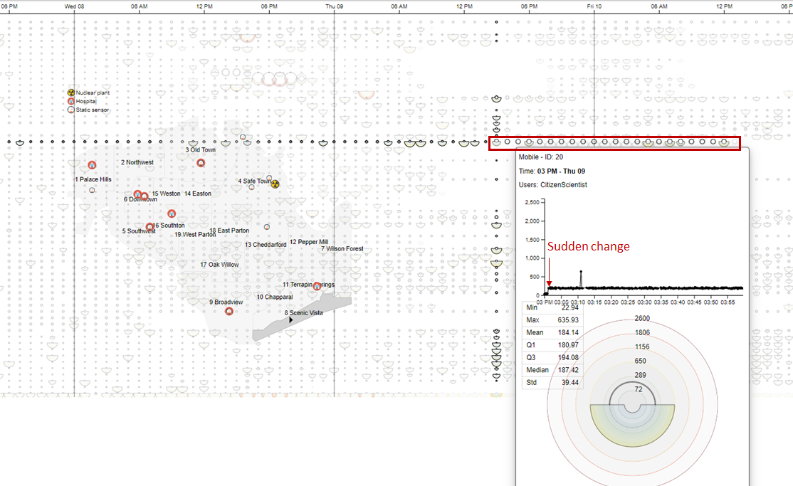
Due to a large number of sensor readings, we revise the Rosemary chart to embed the transformed color scale directly into the inside area of the pies. Our customized chart adopts the box plot layout which shows the five-number summary: minimum (inner ring), first quartile (Q1), mean (dashed curve), third quartile (Q3), and maximum (outer ring). This allows users to quickly spot the ranges of sensor readings as depicted in Figure 2. The examples in the report will show the hourly summary (from left to right) of various sensors (top-down) of St. Himark

Questions

1- Visualize radiation measurements over time from both static and mobile sensors to identify areas where radiation over background is detected. Characterize changes over time.

Figure 3. Overview of all regions, both dynamic and static sensors for the entire time span.

Figure 3 shows the overview of St. Himark for the entire time span (5 days). Regions are listed top-down. The last row summarizes all sensors by hour. We can easily notice the high sensor readings connected to the earthquakes.

Figure 4. Sensor readings for Wilson Forest.

When users mouse over a region on the map, all sensor readings for that region will be highlighted in the main view. Figure 4 is an example when Wilson Forest is selected.

Figure 5. Sensor readings for Old Town.

Figure 5 is an example when Old Town is selected. The arrow points to 4pm on Wed 08 with the high readings of the dynamic sensor 10.

2 - Use visual analytics to represent and analyze uncertainty in the measurement of radiation across the city.
a. Compare uncertainty of the static sensors to the mobile sensors. What anomalies can you see? Are there sensors that are too uncertain to trust?
b. Which regions of the city have greater uncertainty of radiation measurement? Use visual analytics to explain your rationale.
c. What effects do you see in the sensor readings after the earthquake and other major events? What effect do these events have on uncertainty?

Figure 6. Overview of all sensors by every hour.

To show the uncertainty in the data, we refine the Rosemary chart to show min vs. max (at the bottom) and Q1 vs. Q3 (on the top). As shown in Figure 6, 50 dynamic sensors are listed on the top and statics and 8 static sensors are listed at the bottom, the thumbnails next to the sensor ids summarize the sensor reading over the entire time span. The larger bands indicate a higher variance in the sensors reading over the given period of time. The static sensors tend to be more reliable than the dynamic sensors by looking at the thumbnails or the time series charts. A group of high values and high variances sensors are highlighted in the red box on the left.

Figure 7. Details view of Dynamic sensor 3.

By investigating such sensors, we found out that the dynamic sensor 3 is not reliable as it often has fluctuated readings as shown in the line graph within the popup window. The trajectory of the car is also printed on the St. Himark map.

As also shown in Figure 4 and Figure 5, Wilson Forest and Old Town have high sensor readings, and high variance from 3 pm to 9 pm on Wed 08 and from 6 pm on Thu 09 to 6 am on Fri 10 respectively. These are also the time periods of 2nd and the 3rd earthquakes occurred to St. Himark. Therefore, earthquakes may have negative impacts on radiation levels.

3 - Given the uncertainty you observed in question 2, are the radiation measurements reliable enough to locate areas of concern?
a. Highlight potential locations of contamination, including the locations of contaminated cars. Should St. Himark officials be worried about contaminated cars moving around the city?
b. Estimate how many cars may have been contaminated when coolant leaked from the Always Safe plant. Use visual analysis of radiation measurements to determine if any have left the area.
c. Indicated where you would deploy more sensors to improve radiation monitoring in the city. Would you recommend more static sensors or more mobile sensors or both? Use your visualization of radiation measurement uncertainty to justify your recommendation.

Figure 8. Detailed readings of 8 dynamic sensors (with high readings): sensors 21, 22, 24, 25, 27, 28, and 45.

Figure 8 shows the details of 8 sensors with high readings on Fri 10. Here are some observations:
- They all have similar routes at the end: passing through Scenic Vista and then Wilson Forest.
- Sensor 45 visited Safe Town, close to the Always Safe plant, and may carry some radiation from there. Sensor 45 might be attached to the contaminated car. We investigate this in the next figure.

"When an earthquake strikes St. Himark, the nuclear power plant suffers damage resulting in a leak of radioactive contamination. Further, a coolant leak sprayed employees’ cars and contaminated them at varying levels". We think that the car carrying sensor 45 potentially carried the radioactive contamination to Wilson Forest which contaminates other cars.

Figure 9. Detailed readings of sensor 45: (top) visit the Always Safe plant and (down) leave the Always Safe plant.

Figure 9 shows the car attaching sensor 45 visited the Always Safe plant at 1 pm Tue 07 and left around 4 pm of the same day.

Figure 10. Detailed readings of 2 dynamic sensors (with high readings): sensors 13 and 32.

On a separated investigation, Figure 10 shows the details of 2 sensors 13 and 32. They both came in and contaminated, and then leaving on the same day. The radiation contamination is reduced as they left the Always Safe plant.

So, there are 3 cars which may have been contaminated when coolant leaked from the Always Safe plant: sensors 13, 32, and 45.
We decided to look into the hour when the readings started raising, shown in the next Figure (Figure 11).

Figure 11. Detailed readings of sensor 45, 21, 29, and 25 at 7pm, Thu 09.

Figure 11 shows the readings of sensor 45, 21, 29, and 25 at 7 pm, Thu 09. We can see the sudden increase of readings as they entered Wilson Forest. The contaminated location is marked on the map at the red circle.

Figure 12. Detailed readings of sensor 22, 24, 21, 28, 45, and 29.

Figure 12 shows the cars exiting the contaminated area and their reading was reduced significantly. However, a), b), and c) represent very different exit patterns:
a) sudden decrease on the move. This indecates that the cars are moving out of the contaminated area
b) decrease while standing in the same location for the entire hour. This indecates that the radioactive contamination has been collected and carried out of the current location, and
c) reduce by levels (ladder pattern). This might indecates that the radioactive contamination has been partially collected.

The city should deploy more static sensors along Scenic Vista to Wilson Forest since this is the contaminated route of many cars (shown in Figure 8).
- This area is far from the city center and received less attention.
- This area is frequently affected by the earthquake.

Figure 13. Mobile sensor 20 with unsual high readings.

Figure 13 highlights sensor readings which suggested that the radioactive contamination was inflated by the earthquake at 3pm on Wed 08. The car was stucked in Scenic Vista (as we investigate the later hours).

4 - Summarize the state of radiation measurements at the end of the available period. Use your novel visualizations and analysis approaches to suggest a course of action for the city. Use visual analytics to compare the static sensor network to the mobile sensor network. What are the strengths and weaknesses of each approach? How do they support each other?

Figure 14. The last hour of sensor readings.

Figure 14 shows the last hour of the readings. Dynamic sensor readings are low while static sensors readings are missing.

Figure 15. The last hour of sensor readings for dynamic sensors 21, 25, 27, and 28. We highlighted the increasing trend of the readings toward the end of the available period.

For the cars exiting Wilson Forest, we observe an increasing trend of radiation readings toward the end of the available period. Figure 15 shows the last hour of the readings of sensors: 21, 25, 27, and 28. This suggests that these cars/trucks collected the radioactive contamination from Wilson Forest and dump those in a remote area outside of the St. Himark limits.

The city should deploy the following course of actions:
- Automatically detect high sensor reading fluctuation. For example, if the sudden increase of readings is consistent, there should be a mechanism to notify the city officers for further investigation and timely actions.
- Combine dynamic and static sensor readings. If the cars drive a nearby a static sensor, we should perform cross-validation to possibly (1) remove or auto-correct the malfunction sensors (could be dynamic or static) (2) use the static sensor to verify if dynamic sensor and the car is contaminated (3) The crosstalks can be also applied for dynamic to dynamic sensors: the two cars visit the same locations at small time interval (does not need to be at the same time).

5 - The data for this challenge can be analyzed either as a static collection or as a dynamic stream of data, as it would occur in a real emergency. Describe how you analyzed the data - as a static collection or a stream. How do you think this choice affected your analysis?

Switching to real-time data does not affect our visual analytics solution since the charts for every hour are built independently. For the current hour, the data can be accumulated in real-time and the five-number summary (minimum, Q1, mean, Q3, and maximum) can be updated and re-plotted on-the-fly without effecting historical data and drawings.
Therefore, we think that this choice would not affect our analysis.

THE END