Entry Name: "TTU-Nhat-MC1"
VAST Challenge 2019
Mini-Challenge 1

Team Members:

Nhat Le, iDV Lab, Texas Tech University, nhat.le@ttu.edu   PRIMARY
Tommy Dang, iDV Lab, Texas Tech University, tommy.dang@ttu.edu

Student Team: YES

Tools Used:

HTML, CSS, JavaScript, D3.JS

Approximately how many hours were spent working on this submission in total?

200 hours

May we post your submission in the Visual Analytics Benchmark Repository after VAST Challenge 2019 is complete? YES


Video:

https://idatavisualizationlab.github.io/VAST19_mc1/


Questions

1- Emergency responders will base their initial response on the earthquake shake map. Use visual analytics to determine how their response should change based on damage reports from citizens on the ground. How would you prioritize neighborhoods for response? Which parts of the city are hardest hit? Limit your response to 1000 words and 10 images.


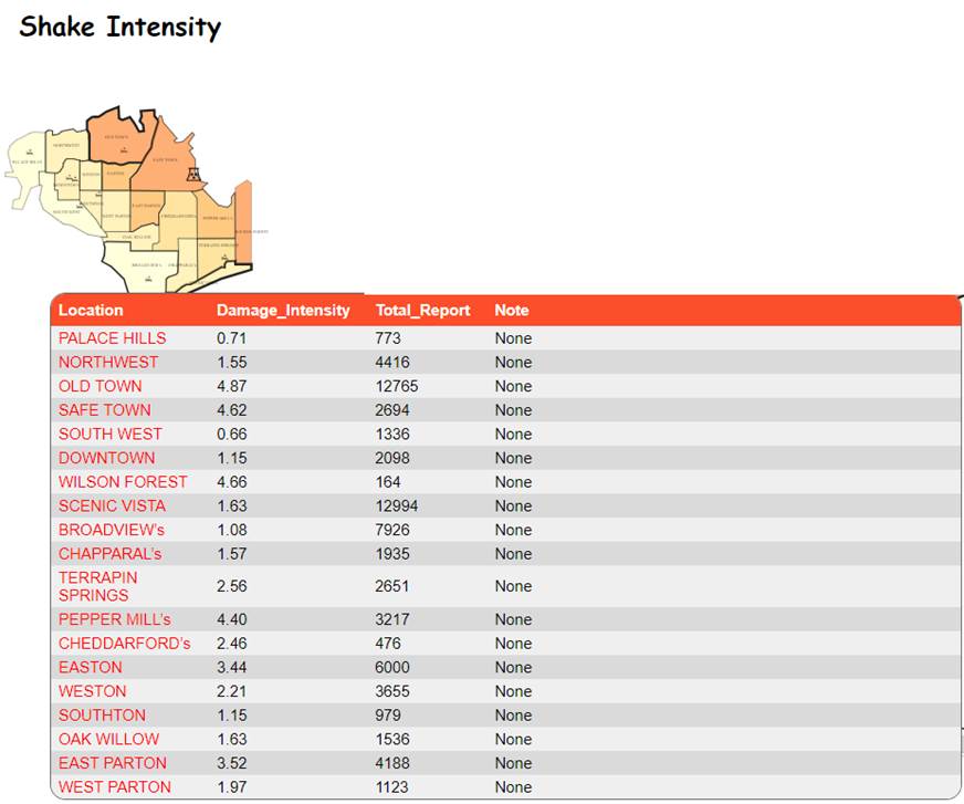
Based on the major earthquake shake map, the center of the quake is in North East side of the city. Safe Town and Old Town are two locations closes to the earthquake center and are impacted significantly. The response should change and prioritize neighborhood based on the number of report and average level of damage for each location. 
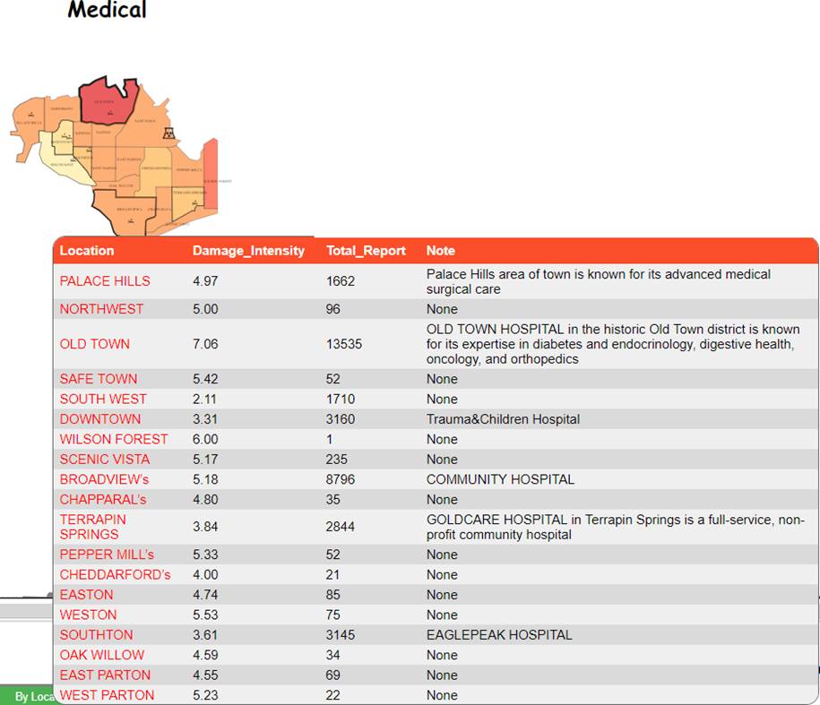
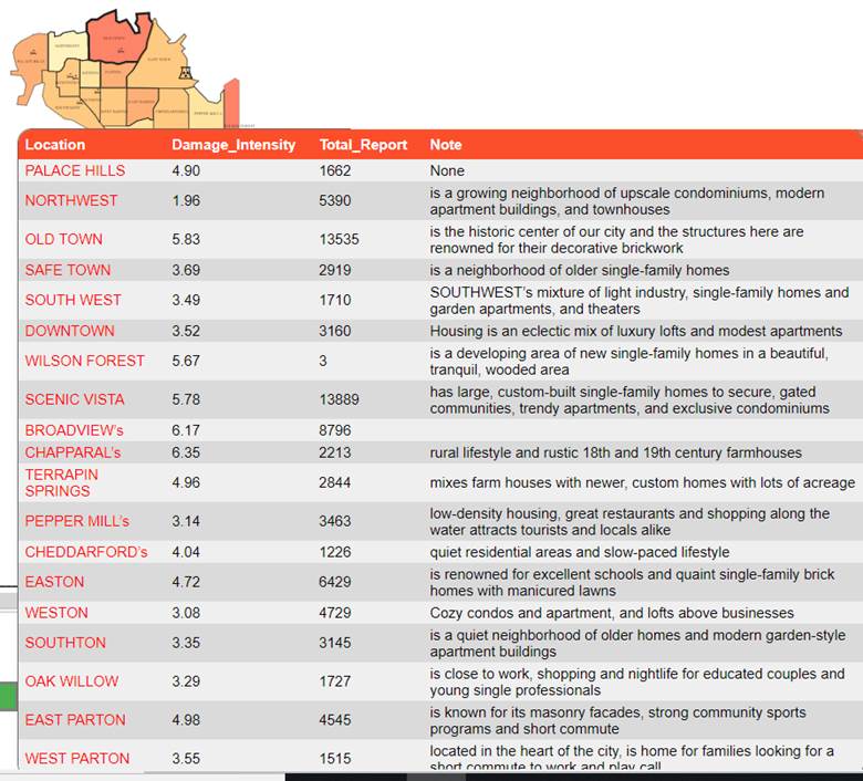
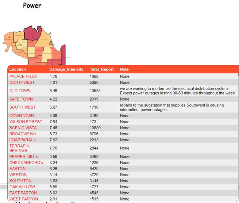
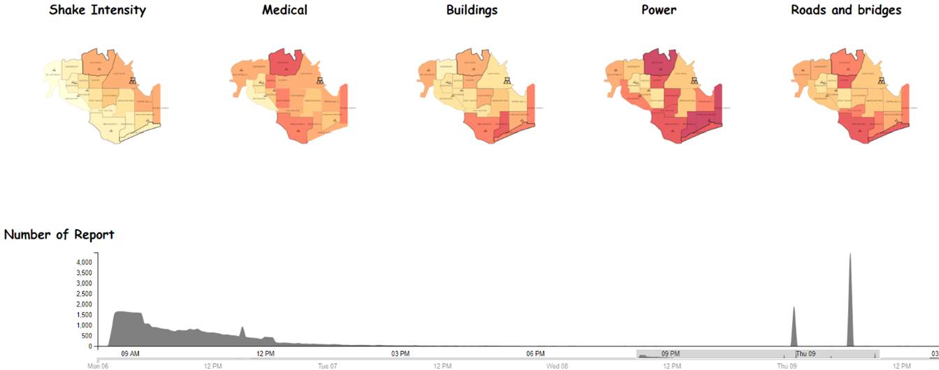
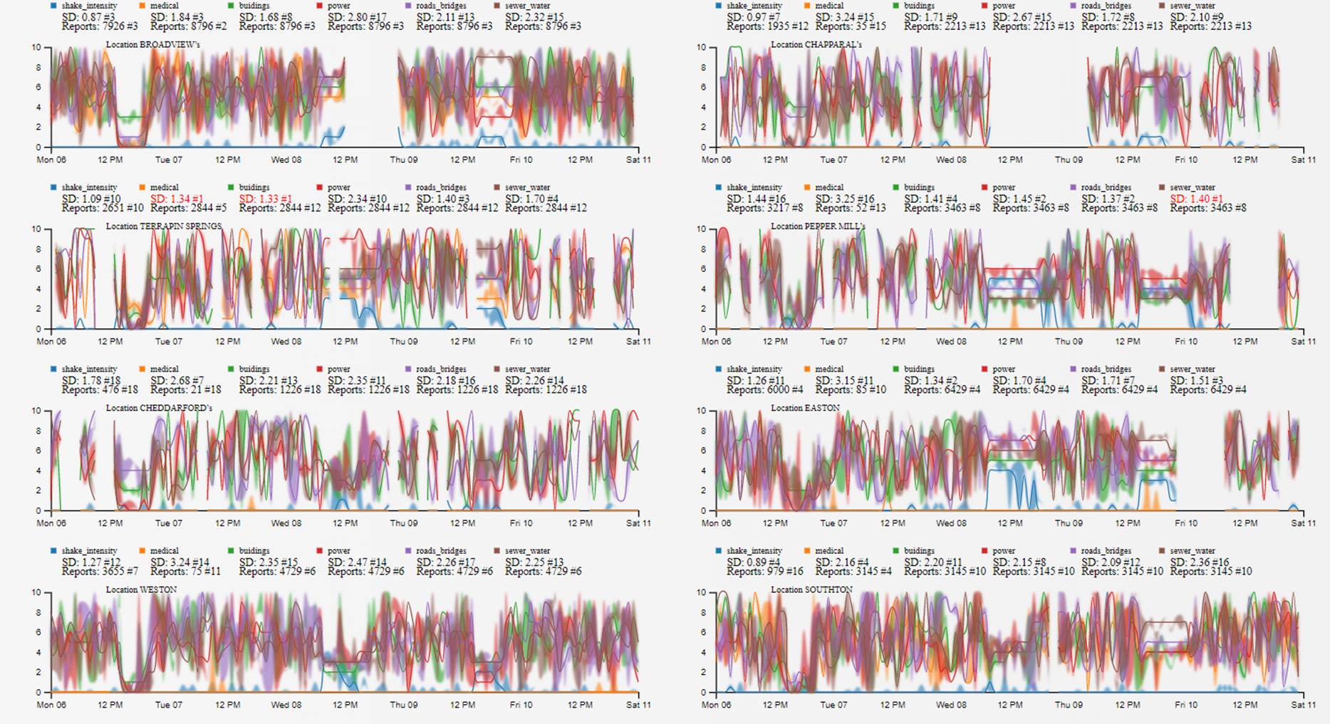
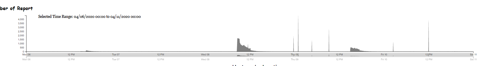
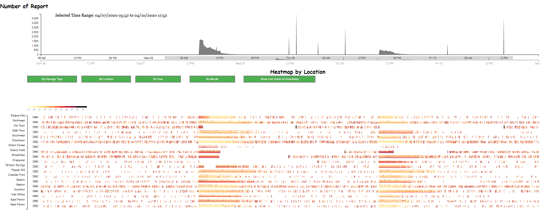
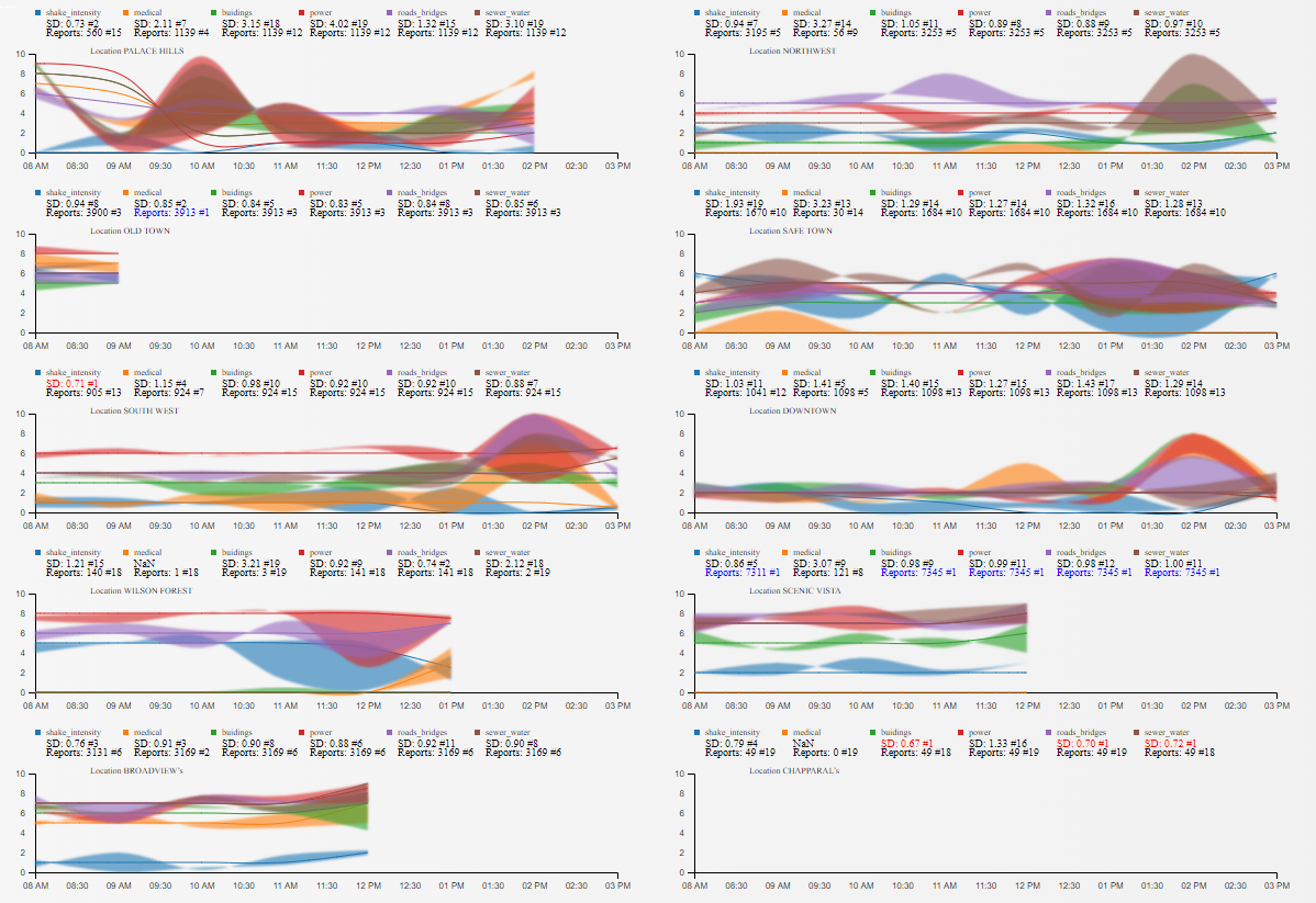
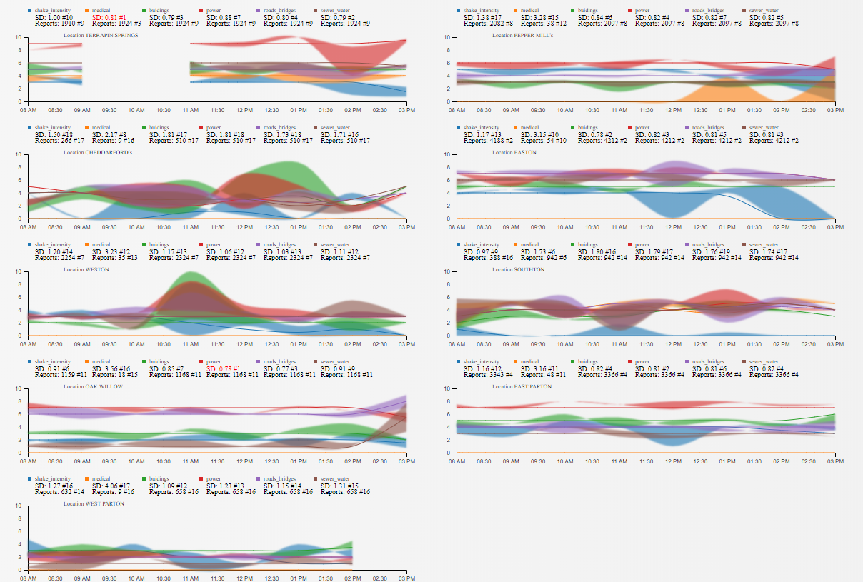
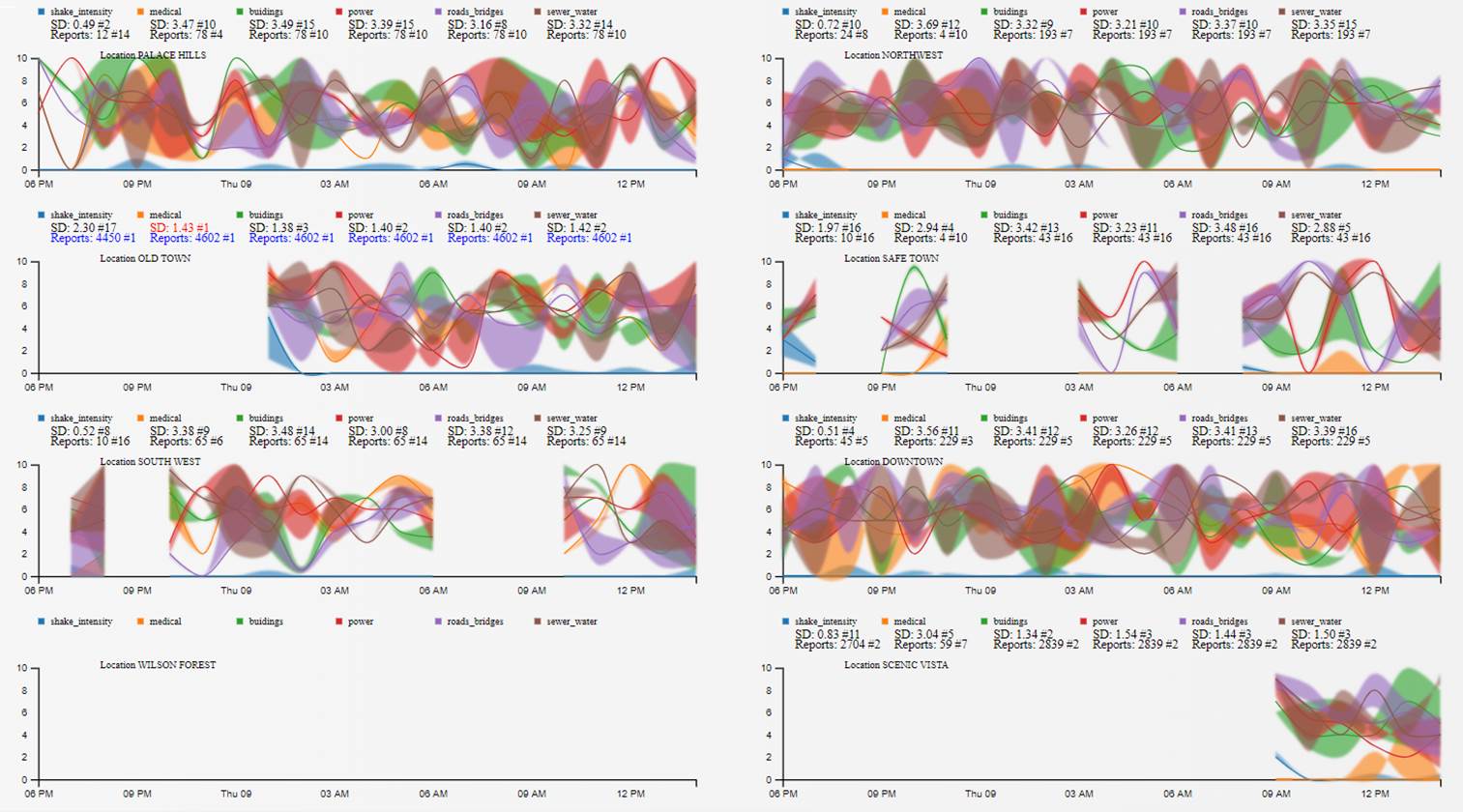
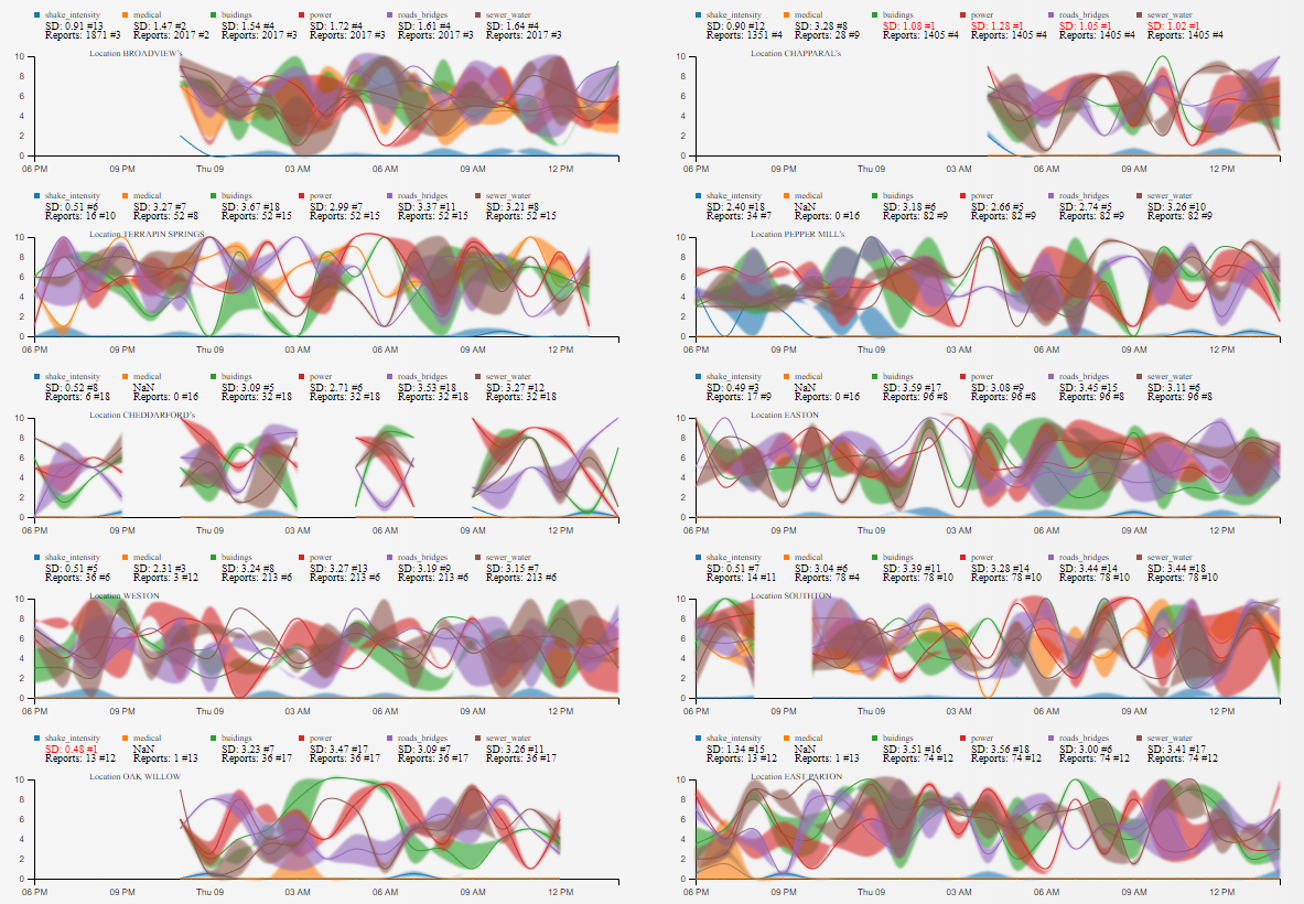
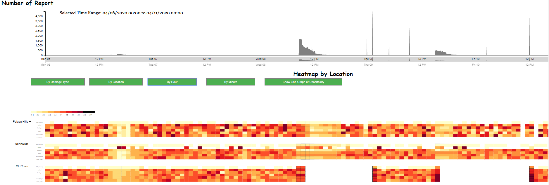
According to the 6 geospatial graphs of 6 types of damage, responders can observe the event in a selected time range by using brush in the line graph (number of report).
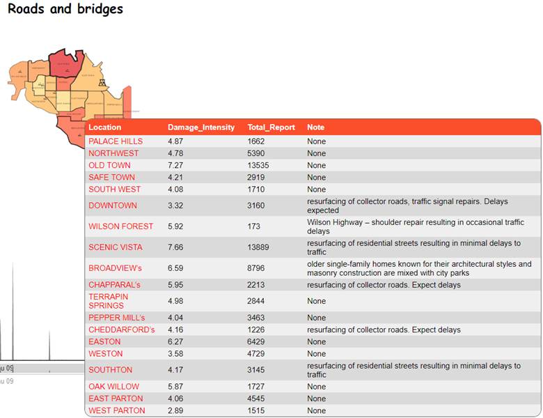
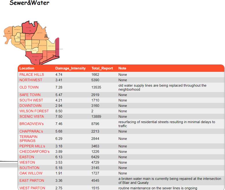
- By clicking on each geo graph, it will show the summary table which contains the number of report and level of damage of each location.
- The table also shows the current project in each location, this will give enough information for responder to prioritize neighborhood for rescue.

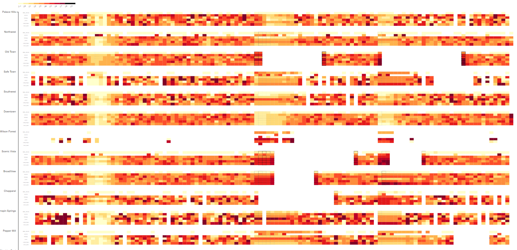
Since it’s the earthquake disaster, therefore, I assume that the most valuable damage report is shake_intensity. I choose the option to observe the heatmap By Hour and then select Damage Type to filter the view showing only shake_intensity data. According to Figure 1, the responder can detect there are three major events in which the earth quake happens. In the heatmap below, each row of the heatmap represents for the event happen at one location. The responder can click on each rectangle to get further detail about the number report, level of damage and name of neighborhood. Highlight area 1 show the pre-quake, 2 show the first major-quake and 3 show the second major-quake.

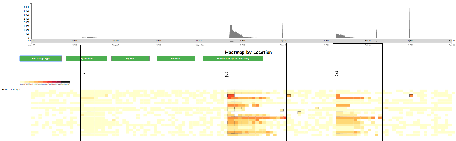
Figure 1. Illustrate the shake_intensity of 19 location during the earthquake.

In Figure 2, it shows that OLD TOWN has the highest shake intensity average damage level (4.87) and also very high number of report (12,765), therefore, we can assume that this place is hit very hard by the earthquake. The responder should consider this location for the first priority.
In Figure 3, the OLD TOWN and BROADVIEW both have high number of report and high average level of damage. The locations which have high number of report and medical damage all have hospital.
In Figure 4, OLD TOWN, SCENIC VISTA, BROADVIEW should be in the top list of priority to response as for Building Damage.
In Figure 5, the OLD TOWN currently has project related to power and it will expect power outages situation. SCENIC VISTA again has a very high number of report and power average damage level.
In Figure 6, the responder should prioritize the location which has current road and bridge project, these projects might be impacted significantly during the earthquake resulting in the high number of report and high level of damage. SCENIC VISTA, BROADVIEW, OLD TOWN are highly damaged.
In Figure 7, the responder can prioritize the areas which have current water&sewer projects including OLD TOWN and BROADVIEW, EAST PARTON.

Figure 2. Shake Intensity Average Damage Level

Figure 3. Medical Average Damage Level

Figure 4. Building Average Damage Level

Figure 5. Power Average Damage Level

Figure 6. Road and Bridge Average Damage Level

Figure 7. Sewer and Water Average Damage Level

According to Figure 8, the responder can select different time range to observe the whole event including the number of report and average level of damage in each location in generally. After that, responder can decide which location they should rescue for and which resource they need to provide for that location.

Figure 8. Observe Average Damage Level of All Location in selected time range. (04/08/20 8:20 to 04/09/20 2:50)

Hardest hit location?:
Old Town is the location which have the second highest number of report (13,535 reports , the 1st highest number of report is Scenic Vista 13,889 reports) and highest average level of damage in Shake intensity, Power and Medical. Furthermore, Old Town also closes to the center of earthquake based on the major-quake shake map. Therefore, we can conclude that Old Town is the hardest hit location.
2 - Use visual analytics to show uncertainty in the data. Compare the reliability of neighborhood reports. Which neighborhoods are providing reliable reports? Provide a rationale for your response. Limit your response to 1000 words and 10 images.
Using the line graph showing standard deviation and quartile 1, quartile 3, median of the event including 6 types of damage of each neighborhood over time, it helps answering the uncertainty questions. The smaller value of standard deviation and the smaller difference between quartile 1 and quartile 3, the more reliable of the report data during a specific time range.
In the Figure 9, each neighborhood line graph shows SD: (Sample Standard Deviation), the ranking of the Standard Deviation (#1 means the lowest SD value) also mentioned next to the Standard Deviation value. Below the SD value, the number of report and its ranking (#1 means the highest number of report).
Based on the mentioned analysis, these following neighborhoods are considered providing reliable reports.
• Terrapin Springs
• Pepper Mills
• Scenic Vista

Figure 9. Uncertainty visualization of 7 neighborhoods

Figure 10. Uncertainty visualization of 7 neighborhoods

3 - How do conditions change over time? How does uncertainty in change over time? Describe the key changes you see. Limit your response to 500 words and 8 images.
According to the Figure 11, it shows that the condition changes over time. There are 8 time ranges when the number of report spiked up.
Studying in the following heatmap:
• Each location is represented by (6xN) heatmap, n is the number of time step, in this case, one time step is one hour. Furthermore, each column contains 6 rectangle, each rectangle represented for one type of damage. One column represented for the average report data in one hour. Total number of report is represented by stroke-width of the rectangle and the average level of damage is represented by the color of rectangle.
• The lighter the color, the lower average level of damage
• The bigger of stroke-width of each rectangle, the higher number of report at that time step
Based on Figure 11,12,13 the list of event can be described as following:
• Apr 06 13:00 to Apr 06 21:00: Most of the location have low average level of damage in 6 types of damage. The total number of report is also low in the time range.
• Apr 08 8:00 to Apr 08 15:00: There is the significant increase in number of report as well as high average level of damage in Northwest, Old Town, Scenic Vista, BroadView, Terrapin Springs, Pepper Mills, Easton, Weston, Southon, Oak Willow, East Parton, West Parton. According to that information, we can assume that the first earthquake happens in this time range.
• Apr 08 23:45: BroadView has high number of report and average level of damage.
• Apr 09 1:00: Old Town has high number of report and average level of damage.
• Apr 09 4:40: Chapparal has high number of report and average level of damage.
• Apr 09 9:15: Scenic Vista has high number of report and average level of damage.
• Apr 09 15:00 to Apr 09 20:40: All of locations except Old Town and Wilson Forest.
• Apr 10 2:30: Scenic Vista has high number of report and average level of damage.
• Apr 10 12:00: Old Town has high number of report and average level of damage.

Figure 11. Total number of report at each time step during the earthquake, the time range is corresponding to time step in the heatmap below

Figure 12. Heatmap show the average level of damage in every one hour of each neighborhood, the timeline is corresponding to the timeline in line graph of number of report

Figure 13. A visualization show corresponding event in heatmap match with timeline in line graph number of report

Examine these mentioned milestones to observe the change in uncertainty. According to Figure 14 and Figure 15, from Apr 08 8:00 to Apr 08 15:00, Pepper Mills, Easton, Oak Willow, East Parton, Terrapin Springs, South West, North West provide reliable of report based on the Standard Deviation and Quartile 1, Quartile 3, Median visualization.

Figure 14. Uncertainty visualization from Apr 08 8:00 to Apr 08 15:00

Figure 15. Uncertainty visualization from Apr 08 8:00 to Apr 08 15:00

According to Figure 16 and Figure 17, from Apr 08 18:00 to Apr 09 15:00, most of the location provide unreliable report in this time range because of the higher number in standard deviation comparing with the previous examined time range.

Figure 16. Uncertainty visualization from Apr 08 18:00 to Apr 09 15:00

Figure 17. Uncertainty visualization from Apr 08 18:00 to Apr 09 15:00

4 - The data for this challenge can be analyzed either as a static collection or as a dynamic stream of data, as it would occur in a real emergency. Describe how you analyzed the data - as a static collection or a stream. How do you think this choice affected your analysis? Limit your response to 200 words and 3 images.
For this challenge, I analyzed the data as a static collection. After getting the data of the whole event from Apr 06 to Apr 10, the data is stored in array. I think that analyzing the data as a static collection is simple comparing with analyzing the data as dynamic stream.
Indeed, in a real emergency, the data is likely in dynamic stream since the responder keep getting report from civilian via the app. In this case, the analysis becomes more difficult and the uncertainty in report might be hard to predict.
For example, in Figure 18, from Apr 08 9:15 to Apr 09 1:00 and from Apr 09 15:00 to Apr 10 12:00, Old Town does not receive any report. It does not mean that there is no damage or event happens at Old Town at that time.
I observed that before the discontinue of report sending, there are only the raising in number of report and average level of damage. I supposed that Old Town was damaged significantly, the power system might be down, therefore, after the power is on again, the system receives a huge number of reports in only 5 minutes.

Figure 18. Finding in Old Town