Entry Name: "TTU-Jian-MC2"
VAST Challenge 2019
Mini-Challenge 2

Team Members:

Jian Guo, iDV Lab, Texas Tech University, jian.guo@ttu.edu   PRIMARY
Tommy Dang, iDV Lab, Texas Tech University, tommy.dang@ttu.edu

Student Team: YES

Tools Used:

HTML, CSS, JavaScript
D3.js
GitHub:
https://github.com/iDataVisualizationLab/VAST19_mc2
Web demo:
https://idatavisualizationlab.github.io/VAST19_mc2/

Approximately how many hours were spent working on this submission in total?

300 hours

May we post your submission in the Visual Analytics Benchmark Repository after VAST Challenge 2019 is complete? YES

Video

https://idatavisualizationlab.github.io/VAST19_mc2/report.html


System Overview

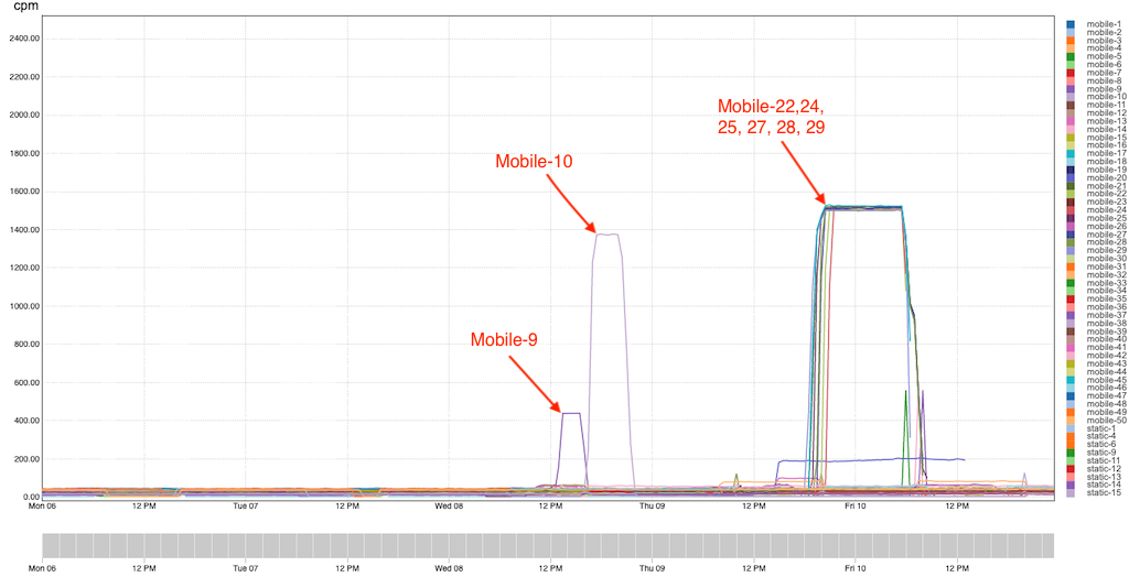
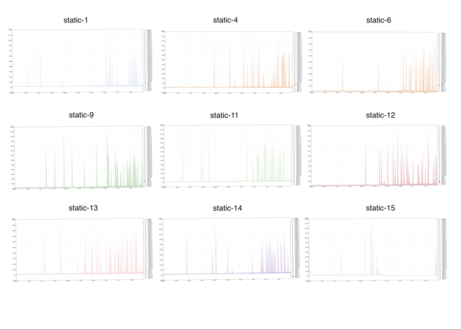
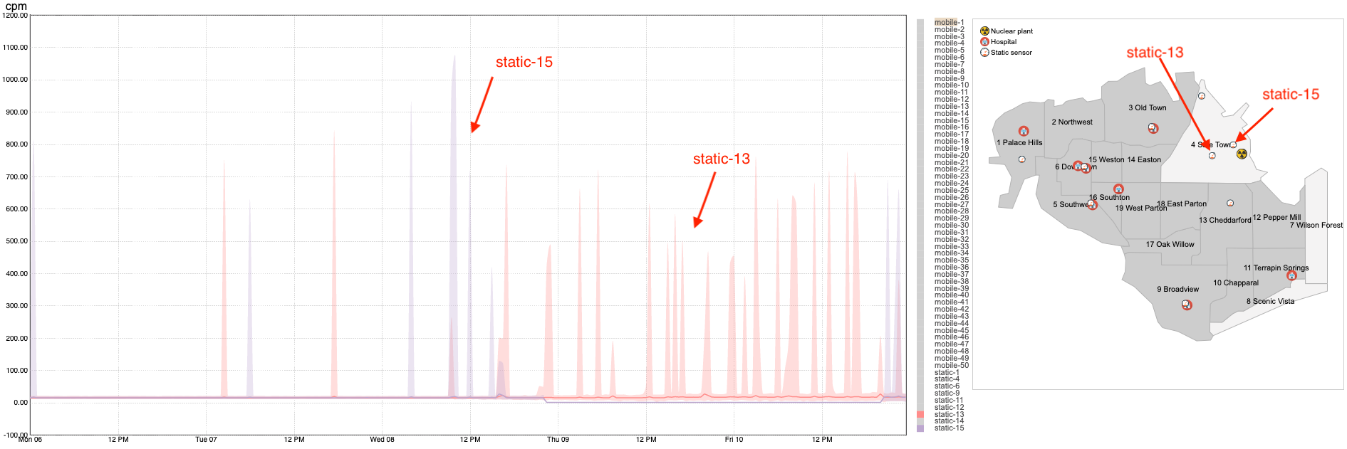
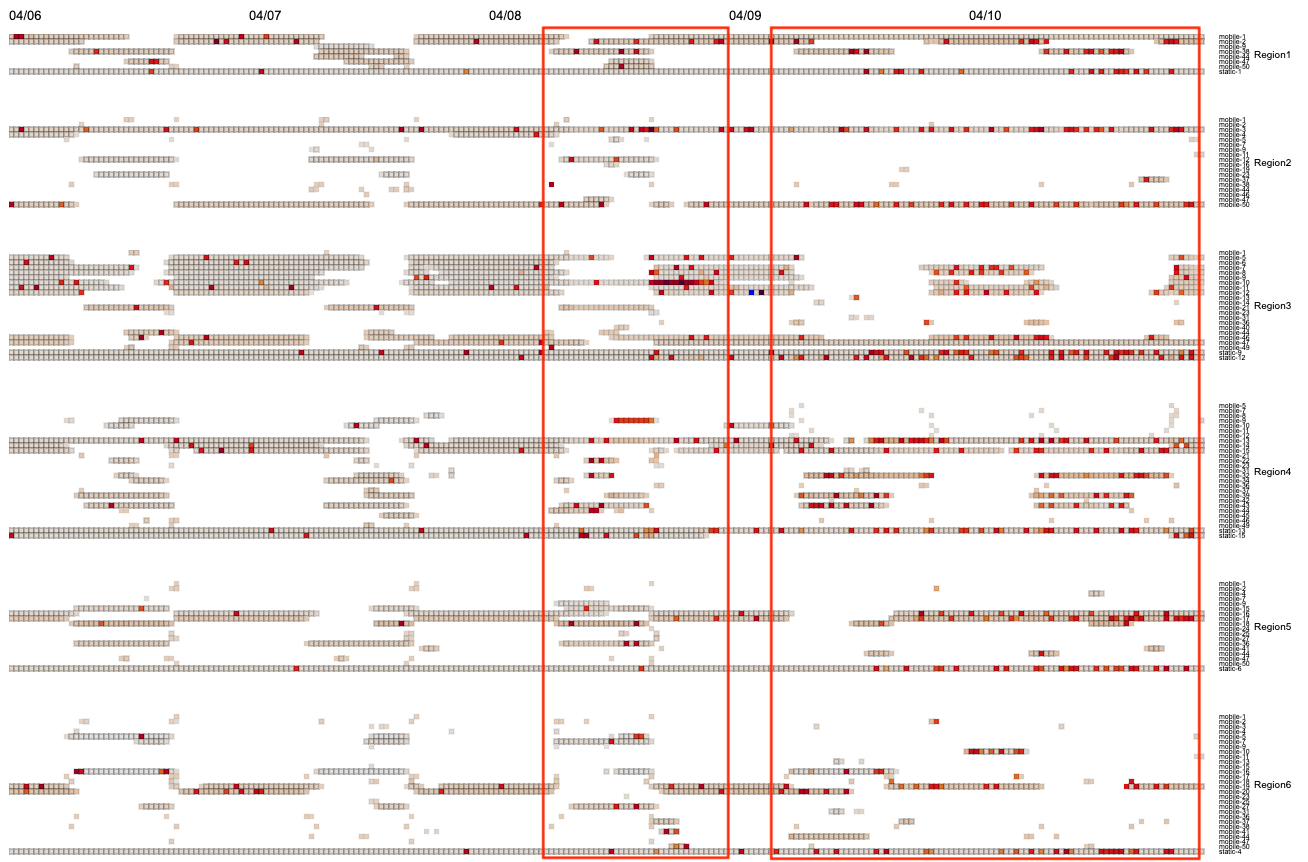
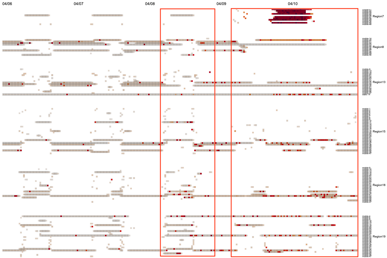
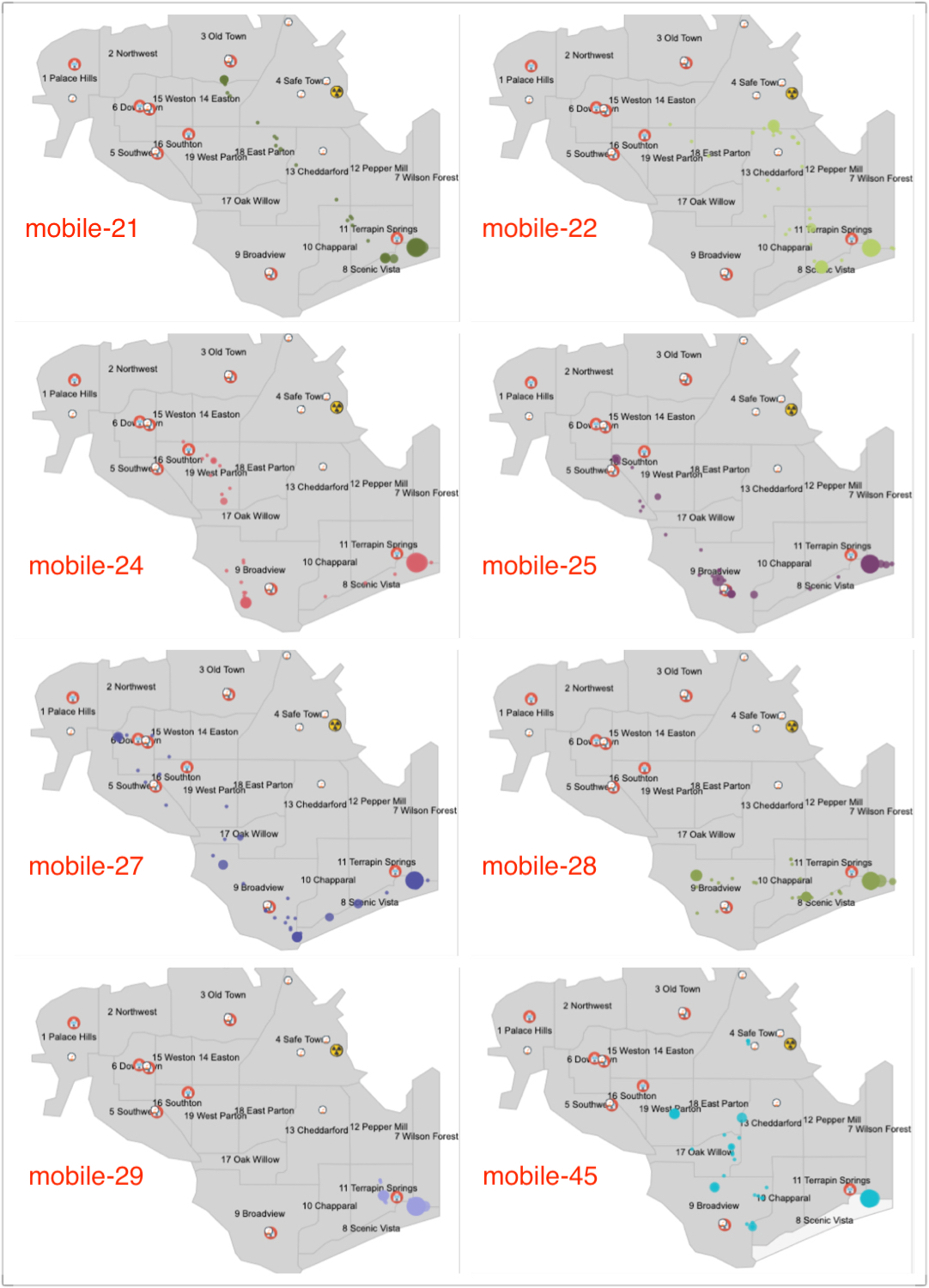
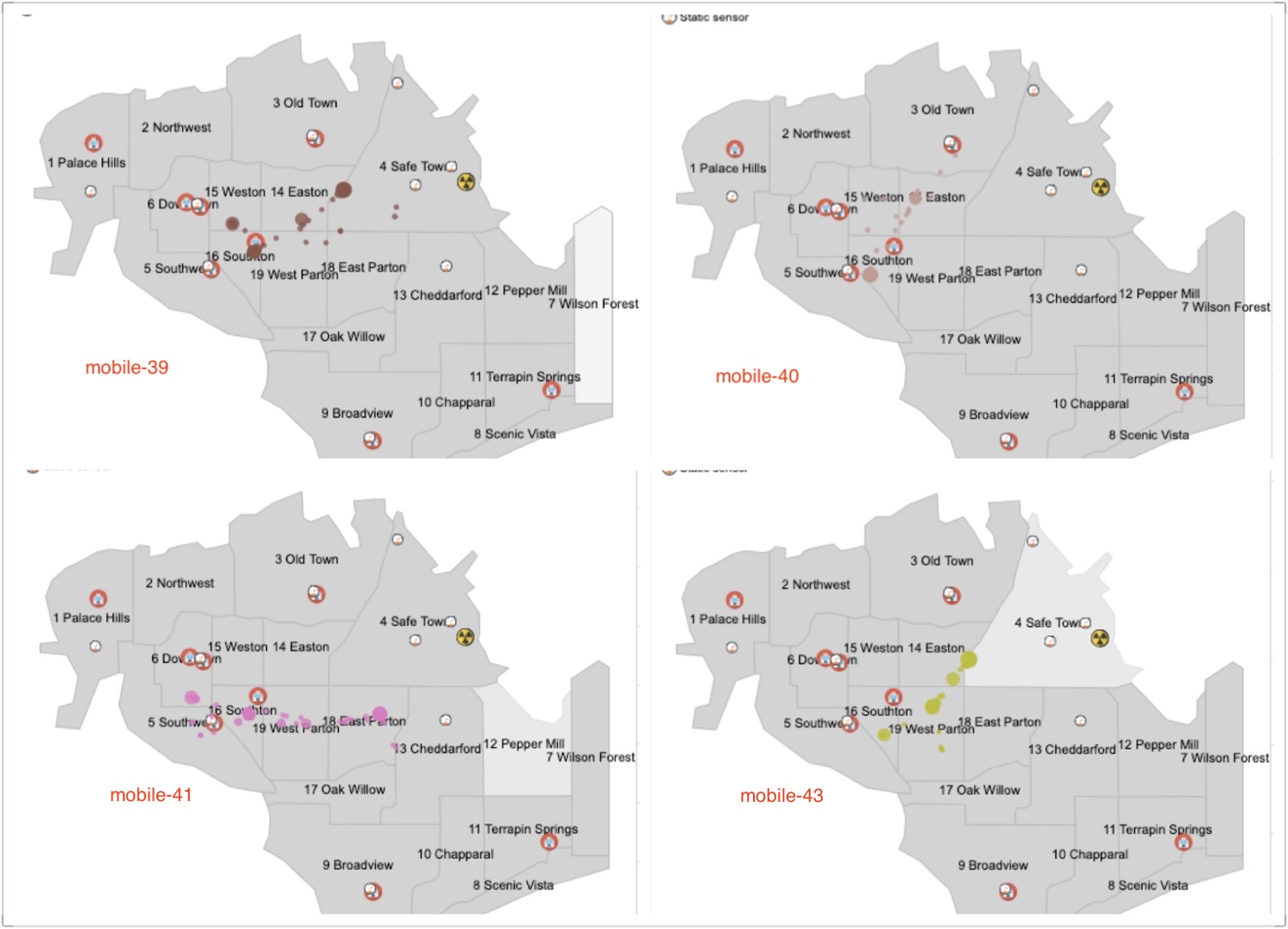
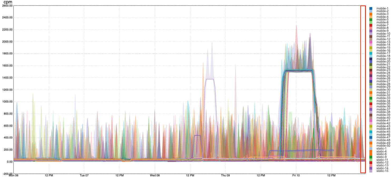
Our visualization application includes four parts: The heat map, the St. Himark map, the control panel and the time series chart.The heat map shows the readings of all the sensors that have appeared in a region for the entire five-day time span (April 4 to April 10). The x axis of the heatmap represents time and y axis represents different sensor readings, including mobile sensors and static sensors in a certain region. A square represents the maximum reading of a certain sensor in 30 minutes period. The opacity of the border from 0 to 1 shows the number of readings from 0 to 360 in that period. The map shows all 19 regions in St. Highmark. Each region can be clicked to show/hide the corresponding heat map. Multiple regions can be selected to compare. The control panel shows the color scale of the heat map, and selection options for easily controlling both the heat map and the time series chart. The map and the control panel can be dragged conveniently. Finally, the time series shows the reading of all 50 mobile sensors and 9 static sensors spanning over the entire 5 days. The x axis represents timestamps of 30 minutes interval in 5 days. The y axis represents the average values for the readings. The legend of the time series can be highlighted and clicked. Toggling the legend box will show/hide the corresponding line. Toggle-clicking a line will show the area between the line's maximun and minimum values. This could give us a big picture of the value range.

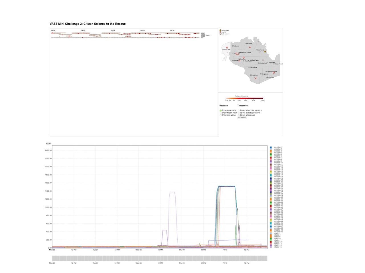
Figure 1. Our visual interface: (left) Heat map, (upper-right) St. Himark map , and (bottom-right) Control panel;

Questions

1- Visualize radiation measurements over time from both static and mobile sensors to identify areas where radiation over background is detected. Characterize changes over time.

Figure 2. Overview of all sensors for the entire time span.

The time series chart in Figure 2 shows an overview of the average values of all sensors for the entire time span (5 days). Sensors are listed top-down. The last 9 sensors are static sensors. As is shown, mobile sensor 9, 10, 21, 22, 24, 25, 27, 28, 29 and 45 tends to have very high average readings. These readings may result from high radiation level around the sensor.

Figure 3. Overview of static sensor readings.

Figure 3 shows readings from all 9 static sensors over the entire time span. A pattern can be detected that all static sensors except static-13 tend to have clustered high readings around 3pm on April 9th until the end of April 10th. Which indicates that they constantly detected radiation during that period. On the contraty, static sensor 15 almost has no readings at all during this period. We will look into this in the next question.
2 - Use visual analytics to represent and analyze uncertainty in the measurement of radiation across the city.
a. Compare uncertainty of the static sensors to the mobile sensors. What anomalies can you see? Are there sensors that are too uncertain to trust?
b. Which regions of the city have greater uncertainty of radiation measurement? Use visual analytics to explain your rationale.
c. What effects do you see in the sensor readings after the earthquake and other major events? What effect do these events have on uncertainty?

Figure 4. Comparison between static-13 and static-15.

As described above, there is contrary readings between static-13 and static-15. We can see in figure 4 that static-13 is the sensor that is closest to the nuclear plant among all the 9 static sensors. If there is a radiation leak, this sensor should be the first to detect it. However, compared to static-15,the second closest static sensor to the nuclear plant, its reading is abnormal. The readings of static-13 during the period when radiation level is mostly detected by other sensors are missing. Therefore, static-13 is too uncertain to trust.

Figure 5. Comparison between static-11 and other mobile sensors in region 9.

Figure 5 shows a discrepancy between static-11 and other mobile sensors in region 9 Broadview. Static-11 shows frequent high reading values from April 9th to the end of April 10th, while there are not enough mobile sensors agree with it. The only available readings during this period from the mobile sensors is mobile-26, however, the readings are all the same value. Given the commonsense that the sensor detector may be affected by many factors, including the condition of the car, the road and the weather, etc., the readings could not stay the same for hours. Therefore, without additional static or mobile sensor readings, it is hard to tell if static-11's reading is reliable or not. Thus, region 9 has greater uncertainty ot radiation measurement.

Figure 6. Overview of sensor readings by region.

Figure 7. Overview of sensor readings by region (continued).

Figure 6, figure 7 shows an overview of most sensor readings by region. We can detect two major intensively high reading periods, one is around 9 am on April 8, the other is around 3:00 pm on April 9. And we assume that these are the times when the two earth quake happened. The second high reading period lasted longer than the first one, indicating that the second earthquake was more intense.
3 - Given the uncertainty you observed in question 2, are the radiation measurements reliable enough to locate areas of concern?
a. Highlight potential locations of contamination, including the locations of contaminated cars. Should St. Himark officials be worried about contaminated cars moving around the city?
b. Estimate how many cars may have been contaminated when coolant leaked from the Always Safe plant. Use visual analysis of radiation measurements to determine if any have left the area.
c. Indicated where you would deploy more sensors to improve radiation monitoring in the city. Would you recommend more static sensors or more mobile sensors or both? Use your visualization of radiation measurement uncertainty to justify your recommendation.

Figure 8. Similar routes for mobile sensors.

Figure 9.Mobile sensors in region 7.

Figure 8 and 9 shows that mobile sensor 21, 22, 24, 25, 27, 28, 29 and 45 in region 7 has extremely high values from 7:00pm April 9th to 8:am April 10th. In addition, they all have similar routes and destinations which is region 7. Because they are pretty far away from the nuclear plant, it is not likely that this region is contaminated directly by the leak. An assumption is that one or some of these sensors got contaminated by the coolant and passed it to this region, then contaminated other sensors.

Another observation is that mobile-24, 25, 27, 28 and 45 have all been to region 9. As we pointed out above, region 9 has greater uncertainty for lack of enough sensor readings. Therefore, adding more static sensors to this region might improve the radiation monitoring in the city.

Figure 10.

From the map, we assume that first, once there is a leak, region 4 is the first region to be contaminated because the nuclear plant is in this region. Then, other possible regions that might be contaminated could be its neighbourhood regions: region3, 14, 18, 19, 12, and 13. And all the cars with mobile sensor in region 4 have high possibility of being contaminated by the coolant leak. With this in mind, we explored and found that: The car with mobile sensor 39 mignt have been contaminated in region 4, and brought the contamination to region 16, this can be verified by tracing its route on the map. Mobile-39's final location is in region 16 , at 10:30pm it still has very high value of reading. Similarly, mobile-43 might also have been contaminated in region 4, and brought the contamination to region 19. Therefore, region 16 and 19 might have been contaminated. Mobile sensors passing through these regions have higher chance to be contaminated.
4 - Summarize the state of radiation measurements at the end of the available period. Use your novel visualizations and analysis approaches to suggest a course of action for the city. Use visual analytics to compare the static sensor network to the mobile sensor network. What are the strengths and weaknesses of each approach? How do they support each other?


Figure 11.

As in figure 7, the heat map shows, for most of the sensors, their readings become lower compared to their previous high readings. The strength of mobile sensors are that they are moving constantly so they can monitor a larger range of area. They can dynamically monitor the radiation in differernt regions. The drawback of mobile sensors are that once they are contaminated, they will bring the contamination to unaffected areas and spread the contamination. And their readings might be affected by many external factors such as the condition of the cars, roads, etc. The strenth of static sensors are that their locations are fixed, their performance are less likely to be affected by extenal conditions. The draw back of static sensors are that their coverage is limited. Our suggestion is that the city can further analyze the route of the mobile sensors, find their most frequently visited areas, and if there are regions not covered by the mobiles sensors, we can set some static sensors in that area.

5 - The data for this challenge can be analyzed either as a static collection or as a dynamic stream of data, as it would occur in a real emergency. Describe how you analyzed the data - as a static collection or a stream. How do you think this choice affected your analysis?

Switching to real-time data does not affect our visual analytics solution since the charts for every hour are built independently. For the current hour, the data can be accumulated in real-time and the minimum, mean and maximum values can be updated and re-plotted on-the-fly without effecting historical data and drawings.
Therefore, we think that this choice would not affect our analysis.

THE END