Van Vung Pham, IDV Lab, Texas Tech University, vung.pham@ttu.edu, PRIMARY
Tommy Dang, IDV Lab, Texas Tech University, tommy.dang@ttu.edu
Student Team: YES
A software developed using HTML, CSS, JS, d3.js, and Plotly.js – Git: https://idatavisualizationlab.github.io/VAST2018/
Approximately how many hours were spent working on this submission in total?
280
May we post your submission in the Visual Analytics Benchmark Repository after VAST Challenge 2018 is complete? YES
Video
https://idatavisualizationlab.github.io/VAST2018/
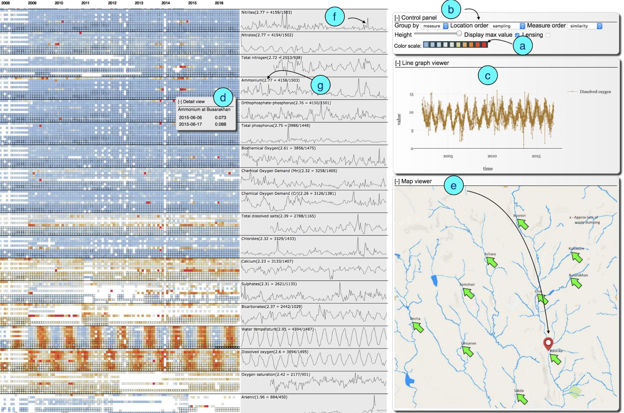
Main features of our system
The main solution is a heat-map which is defined as a grid of cells (Figure 1). A row represents a measure at a location over the time. A cell is a representation of the measured values in a particular month for a particular location. There are several individual extremely large values but hard to confirm if they are outliers, so circles are used to represent these values. The color of a cell represents the averaged measured value with the color scale shown in (a). The thickness of the border of a cell represents sampling frequency (number of samples per element per month per location), the thicker the border is the higher the frequency.
There is a control panel (b) to set the view such as grouping options (location or measure), options to order the locations (alphabetical, similarity, down-stream, distance from the dumping place, or sampling frequency), options to order the measures (alphabetical, similarity, or sampling frequency). Since there is a large number of cells and cannot fit all of them into one single screen, there is an option to set the height of the cells to a smaller number to have an overview of all elements or to set it to larger number to have a clearer view.
There are also some other floating panels to assist the analysis, such as a Line graph viewer, a Detail view, and a Map Viewer. The Line graph viewer (c) on which user could drag and drop one or more rows to show the distribution of measure(s) over time for further investigation when needed. Once a user clicks on a cell it displays all the details on the Detail view (d). Once a user mouseovers a cell, a pin is highlighted on the corresponding location on the map (e) to show that is the place the data in the cell was collected.
To quickly view the overall trend of all groups (a measure from all locations while grouping by measure or all measures from a location while grouping by location), overview line graph is provided for each group to provide the “signature” of the group (f). In addition, since the sampling frequencies are not consistent, we also put the average number of samples per month per measure per location in the group overview section (g).
Figure 1. System Description
Questions
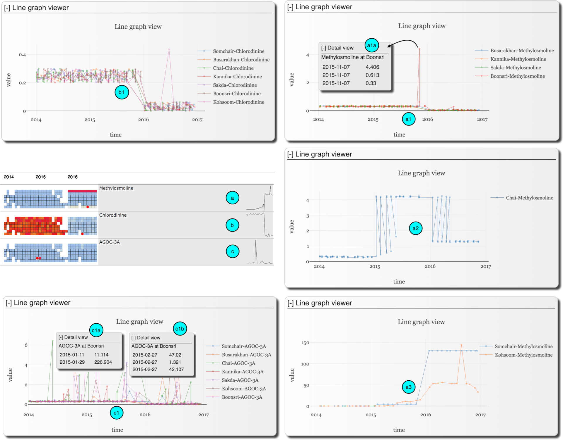
Methylosmoline, Chlorodinine, and AGOC-3A are the chemical elements of concern. Their trends were highly correlated (positively between Methylosmoline and Chlorodinine and negatively between AGOC-3A and the other two) as they come together in our visualization when we group the elements by their similarities. This could be explained by the fact that AGOC-3A is the environmental-friendly replacement of the other two. For all these elements, the data collection started in 2014 and the main change happened at the end of 2015 and early 2016. Their general trends overall locations (signatures) could be seen from (a), (b), and (c) of Figure 2.
Figure 2. AGOC-3A, Methylosmoline, and Chlorodinine Trends
Chlorodinine was dropped at the end of 2015 and early 2016 and remained to level after that, see (b) for its signature, this behavior was somewhat consistent among all the locations, except for one extreme value in June 2016 at Kohsoom (b1).
The overall trend of Methylosmoline was increasing (a), however, it behaved differently at different locations. Its behavior could be classified into three main groups as dropping (a1), increasing (a2), and rapidly increasing to an extremely high level (a3).
At Busarakhan, Kannika, Sakda, and Boonsri, Methylosmoline was dropping (a1) and behaved similarly except at Boonsri on November 2015. However, this could just be an outlier since 3 measures made on that and two were quite close to the overall normal value and only one is at very high (a1a). At Chai, Methylosmoline was fluctuating but mainly increased in 2015 and reduced to a relatively high level in 2016 (a2).
One suspicious point that we discovered is that Methylosmoline was increasing starting in 2015 and became extremely high in 2016 onward at Somchair and Kohsoom (a3). These extremely high values suggested us to look for some anomalies and/or mis-report issues, however, we could not find any strong evidence of such from the data. Therefore, we could suspect that companies dump Methylosmoline in these places in 2015 and very much in 2016 and early 2017 led to an extremely high level of Methylosmoline in these places.
Regarding AGOC-3A, except for the extremely high values at Boonsri on Jan 11, 2015, this probably due to outlier or mistake (see (c1a) and (c1b) for further details), its values were fluctuating but the main trend was dropping by the end of 20015 and early 2016. This is suspicious since AGOC-3A should be increasing as it is an environmental-friendly replacement for Methylosmoline and Chlorodinine.
All in all, Chlorodinine was reduced as expected, but the suspicious behavior is that at the end of 2015 and early 2016, AGOC-3A was reducing and Methylosmoline was increasing. This could suggest that companies were getting back to using Methylosmoline instead of AGOC-3A starting from 2015.
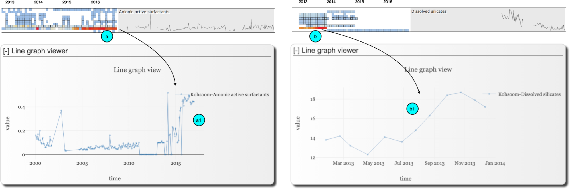
Figure 3. Trends of Anionic active surfactants and Dissolved silicates
The visualization also suggests other interesting trends (Figure 3). The first one is the continuous increment of Anionic active surfactants (AAS) at Kohsoom from early 2015 onward (a). This suggested us to look into the details of this element (a1) and confirmed the increment. AAS are found commonly in detergents or washing agents, AAS are toxic to humans and marine organisms, so its continuous increment would introduce ecotoxicological impact on the river organisms at Kohsoom and so affect the bird distribution there. Similarly, our visualization also noticeably suggests another the increment of Dissolved silicates at Kohsoom in early 2013 (overview (b) and details (b1)), this could be explained for some construction/building activities there, unfortunately, the data was discontinued after that.
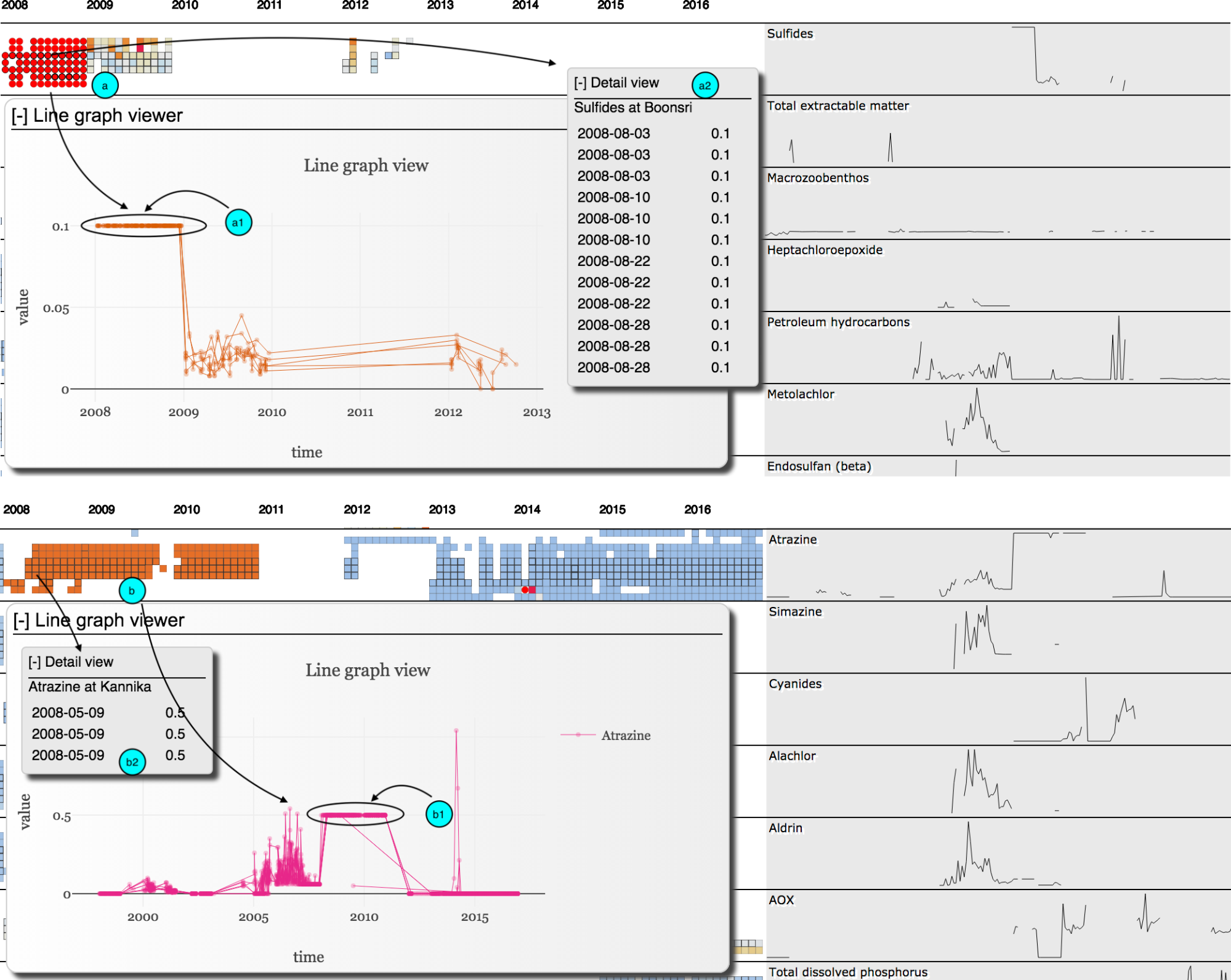
Figure 4. Constantly high values of Sulfides and Atrazine
As in Figure 4, the visualization spots out consistently high values at all locations in the whole year 2008 for Sulfides (a) and continuous 3 years for Atrazine (b). However, it is also worth to consider that all these measures were at the same constant value of 0.1 for Sulfides for the whole year 2008 (a1) and of 0.5 for Atrazine for 3 continuous years 2008, 2009, and 2010 (b1) at all locations. This is very similar behavior for Mercury to be at a constant high value of 1.0 in the whole year 2008 at Achara. On the other hand, these were measured several times in a month for each measure at each location, as the thick borders of the cells in (a, b). For instance, in August 2008, Sulfides was measured 12 times but resulted in the same constant value of 0.1 (a2) and Atrazine at Kannika was measured for 3 times on May 05, 2008 and resulted in a constant value of 0.5 (b2). These, at the same time, may also suggest that these constantly high values might be accurate. All in all, though all these are at very high values might imply issues, being at constant values for a long time may suggest data sampling anomalies. Therefore, further investigation is needed in order to make a conclusion.
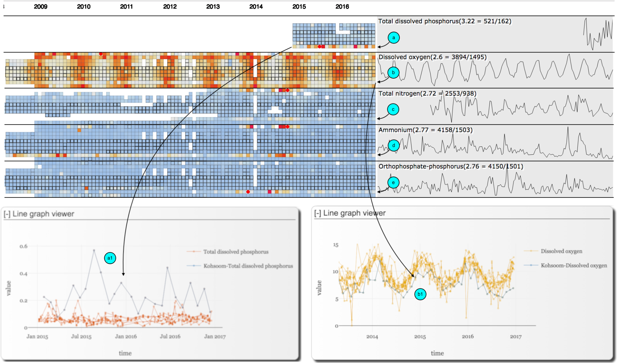
Figure 5. High values of Phosphorus and low values of dissolved oxygen
As in Figure 5, the visualization also highlights the high values of Total dissolved phosphorus with more orange to red cells (a) and low values of Dissolved oxygen with close to blue-steel cells (b). These suggested us to look into the details distribution of these elements in all locations and found out that the Total dissolved phosphorus was high (a1) while the Dissolved oxygen was relatively low (b1) at Kohsoom comparing to the other locations. Similarly, it is noticeable that several other values are being relatively high in several years at Kohsoom comparing to other locations such as Total nitrogen (c), Ammonium (d), Orthophosphate-phosphorus (e) and several more. All these imply that Kohsoom a suspicious place.
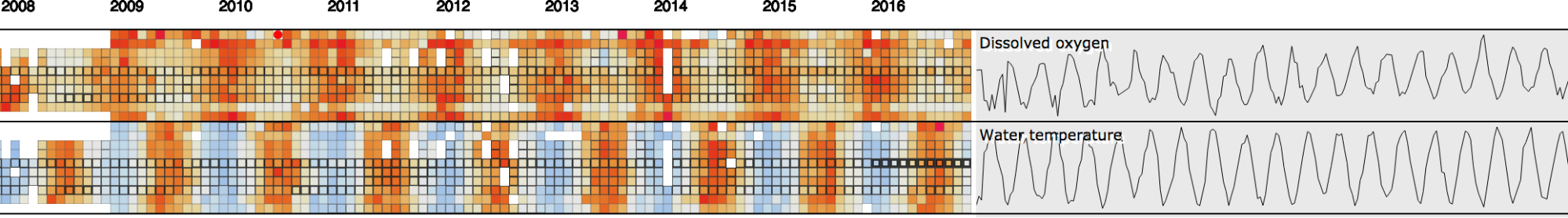
Figure 6. Seasonal pattern of Dissolved oxygen and Water temperature
As in Figure 6, the visualization also points out the seasonal pattern of Water temperatures and Dissolved oxygen. This pattern shows the negative correlation between Water temperature and Dissolved oxygen.
There are some issues with the dataset which affected our analysis of the potential problems. These are missing data, misreporting of elements, suspicious values remained constant for a long time, and inconsistent in sampling frequencies (number of measures per chemical element per unit of time per location).
The missing data is shown in the visualization as many white cells, especially, in several cases, the measurements were increasing to a high level then suddenly missing. For instance, in Figure 3 (b), Dissolved silicates at Kohsoom was increasing in 2013 and suddenly missing from 2014 onward.
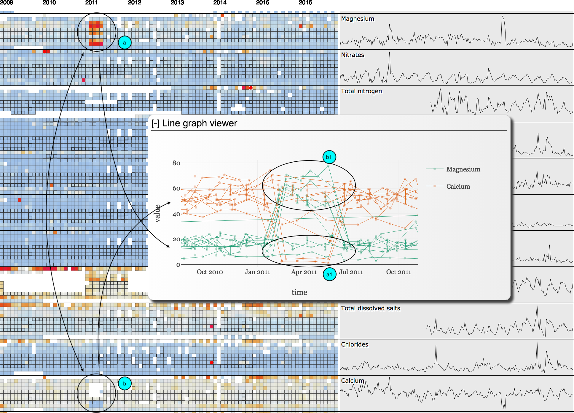
Figure 7. Misreport between Magnesium and Calcium
As in Figure 7, the visualization highlights an anomaly for Magnesium with a region with many red cells from Feb 2011 to May 2011 (a) and suggests a similar pattern as missing data or low values in the same period for Calcium (b). Then further exploration confirmed the misreport of Magnesium as Calcium (a1) and Calcium as Magnesium (b1) in our line graph views.
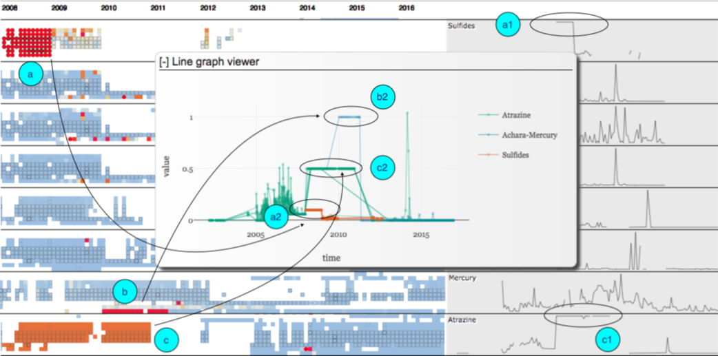
Figure 8. High but at constant value anomalies
As in Figure 8, the visualization suggests several issues such as high levels of Sulfides in 2008 (a), Mercury in 2010 (b), and Atrazine in 2008, 2009, and 2010 continuously (c). However, their constant colors over the periods and their overall signatures (a1, c1) suggested us to look into their detail distributions (a2, b2, c2). These show that Sulfides was high but being at a constant value of 0.1 for the whole year 2008 at all locations, Mercury was high but remained at 1.0 for the whole year 2010 at Achara, and Atrazine was high at 0.5 in 3 continuous years 2008, 2009, and 2010 at all locations. These would create difficulty to confirm if these are issues (as of the high values) or might just be data sampling issues (as values remained the same for a long time at all locations).
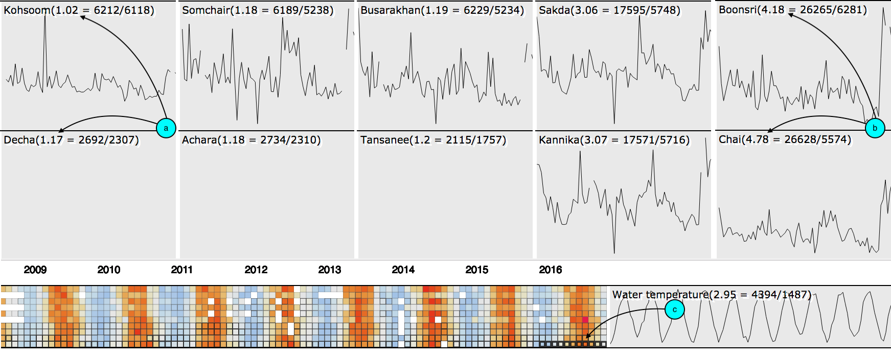
Figure 9. Inconsistent sampling frequencies
As shown in Figure 9, some places such as Boonsri and Chai data was sampled several times per month per chemical element as they contain more cells with thicker strokes in our Visualization, the average frequencies were 4.18 and 4.78 correspondingly (b). Meanwhile, in other places, there was mostly only one sample per chemical element per month for almost all chemical elements such as at Kohsoom and Tansanee (a). For instance, most of the elements at Kohsoom were only sampled once in a month, on the other hand, in 2016 at Chai, Water temperature was sampled for many times per month as many as 36 and 37 times (c).
All in all, water contaminations are not as stable as they are in the soil, as our visualization shows many individual red cells (high values) then the cells get back to normal in the next months (normal values). It is difficult to confirm if this increment was real then got swept away in the water flow or it was just an anomaly in data sampling. Therefore, if it is possible higher sampling frequency is expected. In addition, the sampling frequencies should be consistent among locations. Finally, there should be some tools to detect and see if a value is suspicious (e.g., being high and/or being the same for a long time) and in that case more care should be taken.
AGOC-3A was supposed to be used to replace Chlorodinine and Methylosmoline. This means, ideally, Methylosmoline and Chlorodinine should be decreasing and AGOC-3A should be increasing. However, AGOC-3A was dropped at the end of 2015 and early 2016 and remained low, at the same time Methylosmoline was increasing in several places (high at Chai and extremely high at Somchair and Kohsoom). This would suggest that Methylosmoline was used again instead of AGOC-3A starting at the end of 2015 and the end of 2016 (as shown in Figure 2). The use of Methylosmoline might be impactful to bird lives in the nature preserve.
Anionic active surfactants were increasing starting in early 2015 and remained high at Kohsoom (as shown in Figure 3), this would be the result of industrial deterrents and would affect the animal lives here since this would introduce the ecotoxicological impact on the river organisms at Kohsoom and so affect the bird distribution there.
Relatively high values of Total dissolved phosphorus, Total nitrogen, Ammonium, Orthophosphate and several other elements and the low values of Dissolved oxygen at Kohsoom may impact organisms at Kohsoom and as a result, this would impact the Pipit or other wildlife there.
High values of Sulfides in 2008, Mercury in 2010, and Atrazine in 2008, 2009, and 2010 continuously (as shown in Figure 8), if these values are confirmed as accurate data, these would have introduced toxically impacts to the lives at the reserve.
All these findings imply that Kohsoom is a suspicious dumping place and this introduced ecotoxicological impact to the organisms at this place, especially during the year 2015 onward.
It is also worth noticing that the increasing level of Methylosmoline in early 2015 and very high values of it at the end of 2015 and early of 2016 at Somchair (as shown in Figure 2 (a3)), would suggest that Somchair was also a suspicious dumping place for Methylosmoline. Therefore, further attention and monitoring to this place are expected.
Regarding the sampling strategy, several suggestions are made with explanations in section 2 of this report and are summarized as followings. More frequently data sampling is expected as contaminations in the water is not as stable due to the water flow. In addition, the sampling frequencies should be consistent among locations. Finally, there should be some tools to detect and see if a value is suspicious (e.g., being high and/or being the same for a long time) and in that case more care should be taken, and the data would be more reliable.