Geospatial-temporal visualizations
Related publications:
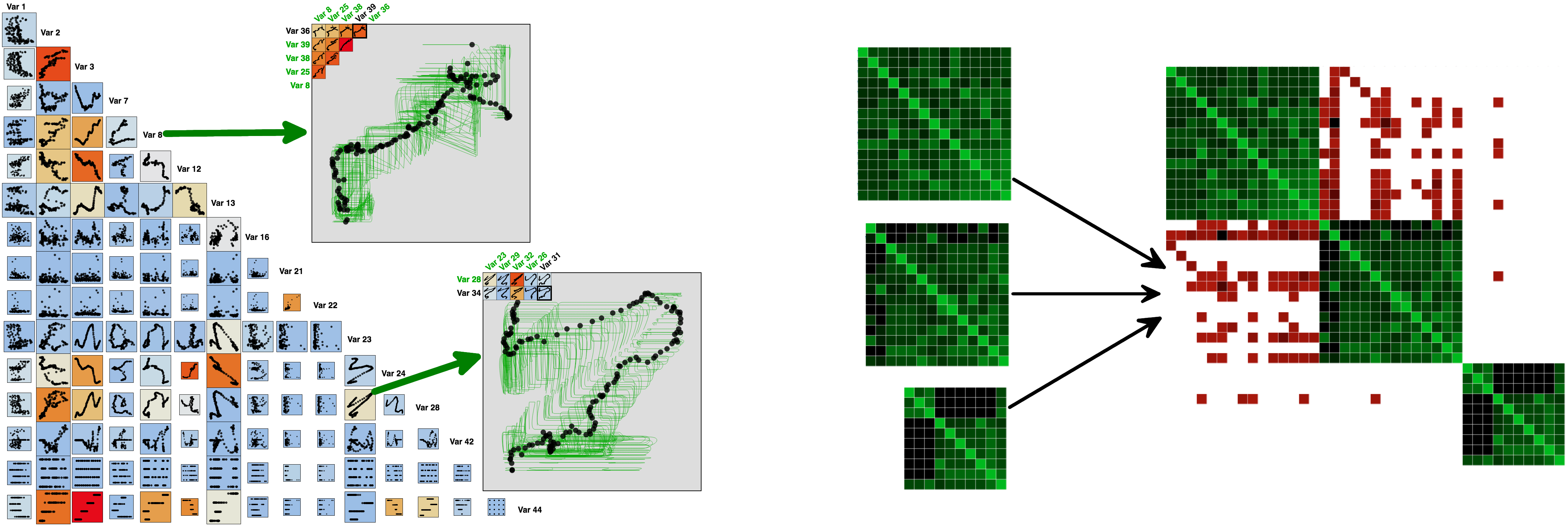
  • Tuan Dang, Leland Wilkinson, and Anushka Anand. Stacking Graphic Elements to Avoid Over-Plotting. IEEE Transactions on Visualization AndComputer Graphics 16(6), InfoVis 2010. DOI
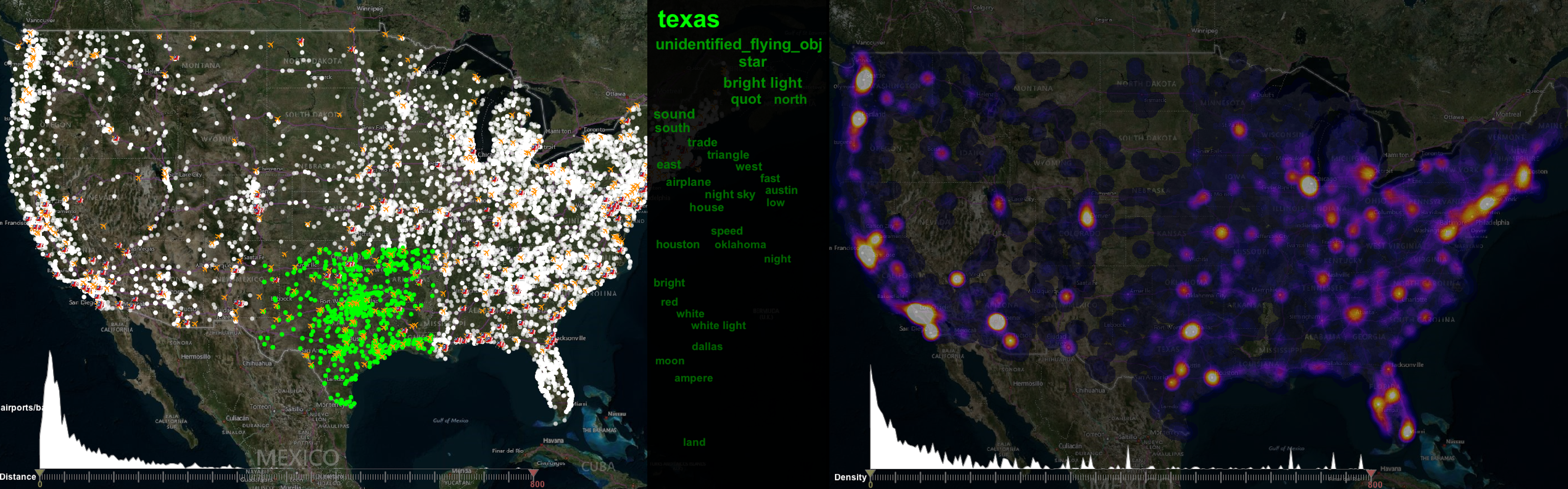
Visualizing UFO sightings on a 2D map: This project uses data from the National UFO Reporting Center available here. The goal here is to give the user a higher level view of where different types of sightings occur, and to detect patterns/trends of these sightings over time.
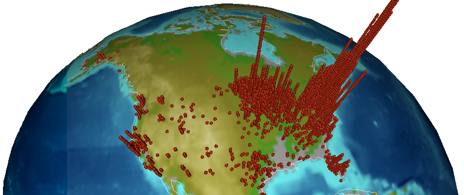
Visualizing the distribution of Lyme diseases in 3D reported in the U.S. in 2005, 2006, and 2007 by the CDC. One might argue that a county-level choropleth map would be a suitable presentation. Nevertheless, it would be hard to argue that a county-level choropleth map using hue or brightness could reveal the threefold increase in Lyme disease cases centered around New England vs. the Midwest.
Networks and structures
Related publications:
  • Tommy Dang, Paul Murray, Ronak Etemadpour, and Angus Forbes. Visualizing Structure and Connectivity in Complex Hierarchical Datasets. IEEE Transactions on Visualization and Computer Graphics. (in submission)
  • Tommy Dang and Angus Forbes. CactusTree: A Tree Drawing Approach for Hierarchical Edge Bundling. Proceedings of the 10th IEEE Pacific Visualization Symposium, PacificVis 2017.
  • Tommy Dang, Paul Murray, Jillian Aurisano, and Angus Forbes. ReactionFlow: An Interactive Visualization Tool for Causality Analysis in Biological Pathways. BMC Proceedings 9(6), BioVis 2015. DOI


Visualizing hierarchical structures and prey-predator relationships of mammals (left) and birds (right). Each animal is presented as a green leaf node. Red links are prey-predator relationships between them.
Visualizing causal relationships of 20 popular diseases (left) from reactome and HIV life cycle (right): Gradient links indicate causalities between biochemical reactions.
Dynamic network visualization
Related publications:
  • Tommy Dang, Nick Pendar, and Angus Forbes. TimeArcs: Visualizing Fluctuations in Dynamic Networks. Computer Graphics Forum 35(3), EuroVis 2016. DOI

Major events from nearly 100,000 political blogs in last 10 years were automatically detected in our visualization: Links connect popular terms appeared in the same blogs.
Matrix visualization
Related publications:
  • Tommy Dang, Hong Cui, and Angus Forbes. MultiLayerMatrix: Visualizing Large Taxonomic Datasets. The seventh international EuroVis workshop on Visual Analytics, EuroVA 2016. DOI
  • Tommy Dang, Nico Franz, Bertram Ludäscher and Angus Forbes. ProvenanceMatrix: A Visualization Tool for Multi-Taxonomy Alignments. International Workshop on Visualizations and User Interfaces for Ontologies and Linked Data, VOILA 2015. DOI
  • Tommy Dang, Paul Murray, and Angus Forbes. PathwayMatrix: Visualizing Binary Relationships between Proteins in Biological Pathways. BMC Proceedings 9(6), BioVis 2015. DOI
  • Tommy Dang, Anushka Anand, and Leland Wilkinson. TimeSeer: Scagnostics for High-Dimensional Time Series. IEEE Transactions on Visualization and Computer Graphics 19(3), TVCG 2012. DOI
Visualizing the alignment of taxonomic classifications: Gymnospermae sec. Weakley (2010) vs. RAB (1968)
High-dimensional data are represented by a small subset of variables in the US unemployment rates (left) from BLS and in the Asteraceae taxonomy (right) of 2,048 characters.
Image analysis
Related publications:
  • Tuan Dang and Leland Wilkinson. PixSearcher: Searching Similar Images in Large Image Collections through Pixel Descriptors. Proceedings of the 10th International Symposium on Visual Computing, ISVC 2014.
  • We extended Scagnostics features to handle pixels and then cluster images as shown on the left. This technique has also been applied on half million of SETI waterfall plots. The right clusters provide a summary of this SETI collection, as well as highlights some outlier plots which may contain signals from unknown sources.