
Entry Name: "TTU-Vuong-MC3"
VAST Challenge 2019
Mini-Challenge 3
VAST Challenge 2019
Mini-Challenge 3
Team Members:
Ngan Vuong, iDV Lab, Texas Tech University, ngan.v.t.nguyen@ttu.edu PRIMARYTommy Dang, iDV Lab, Texas Tech University, tommy.dang@ttu.edu
Student Team: YES
Tools Used:
HTML, CSS, JavaScriptD3.js
GitHub: https://github.com/iDataVisualizationLab/N/tree/master/VAST19/mc3
Web demo: https://idatavisualizationlab.github.io/N/VAST19/mc3/
Approximately how many hours were spent working on this submission in total?
100 hoursMay we post your submission in the Visual Analytics Benchmark Repository after VAST Challenge 2019 is complete? YES
Video
https://idatavisualizationlab.github.io/N/VAST19/mc3/video.htmlReport
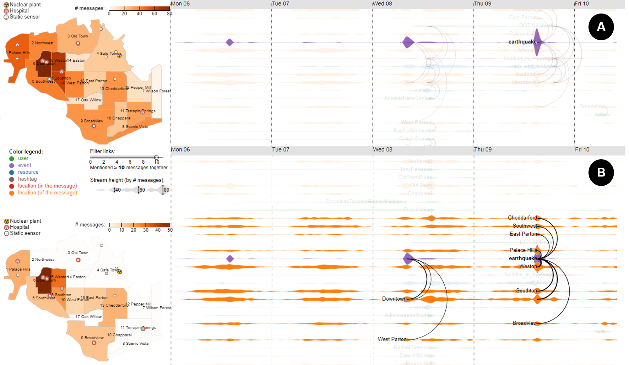
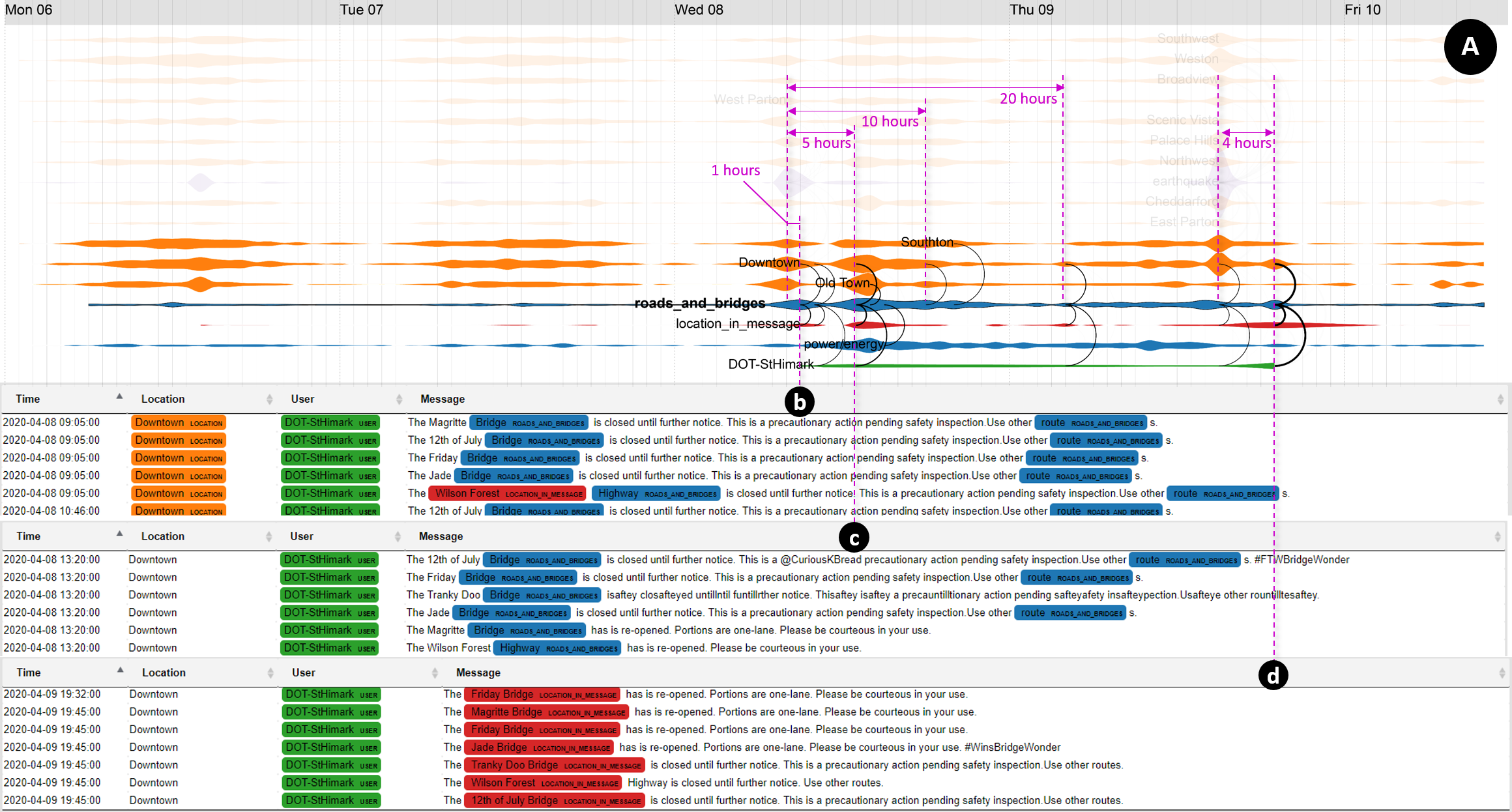
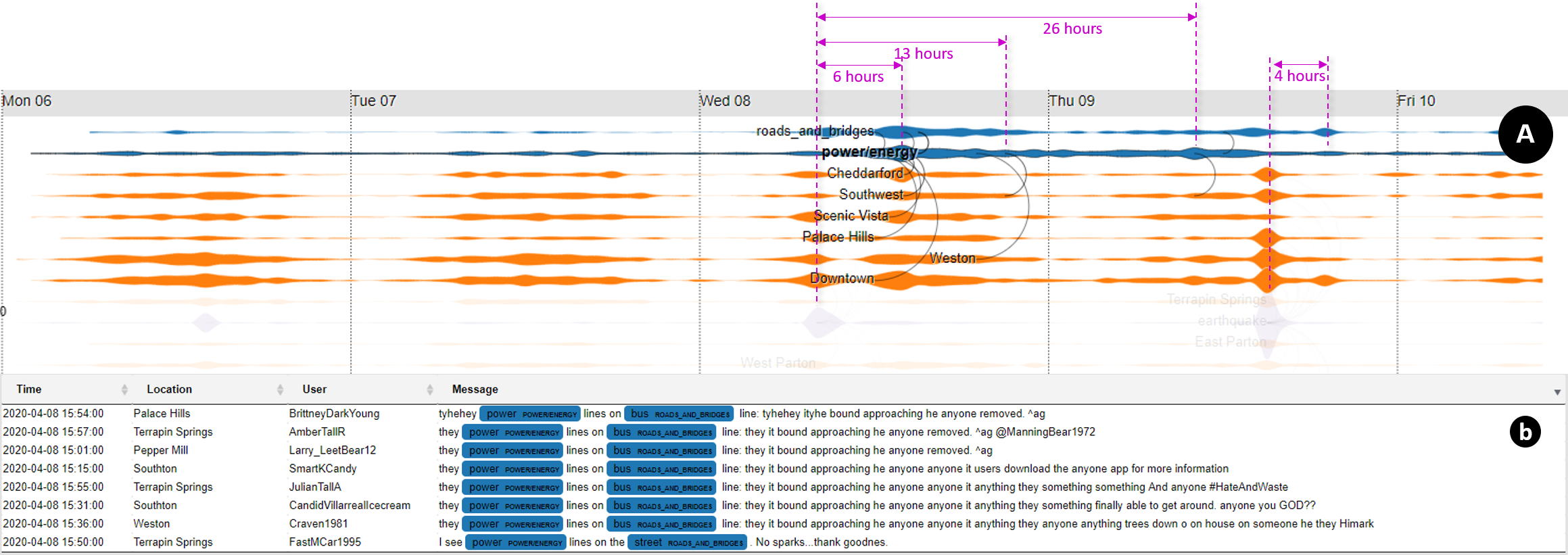
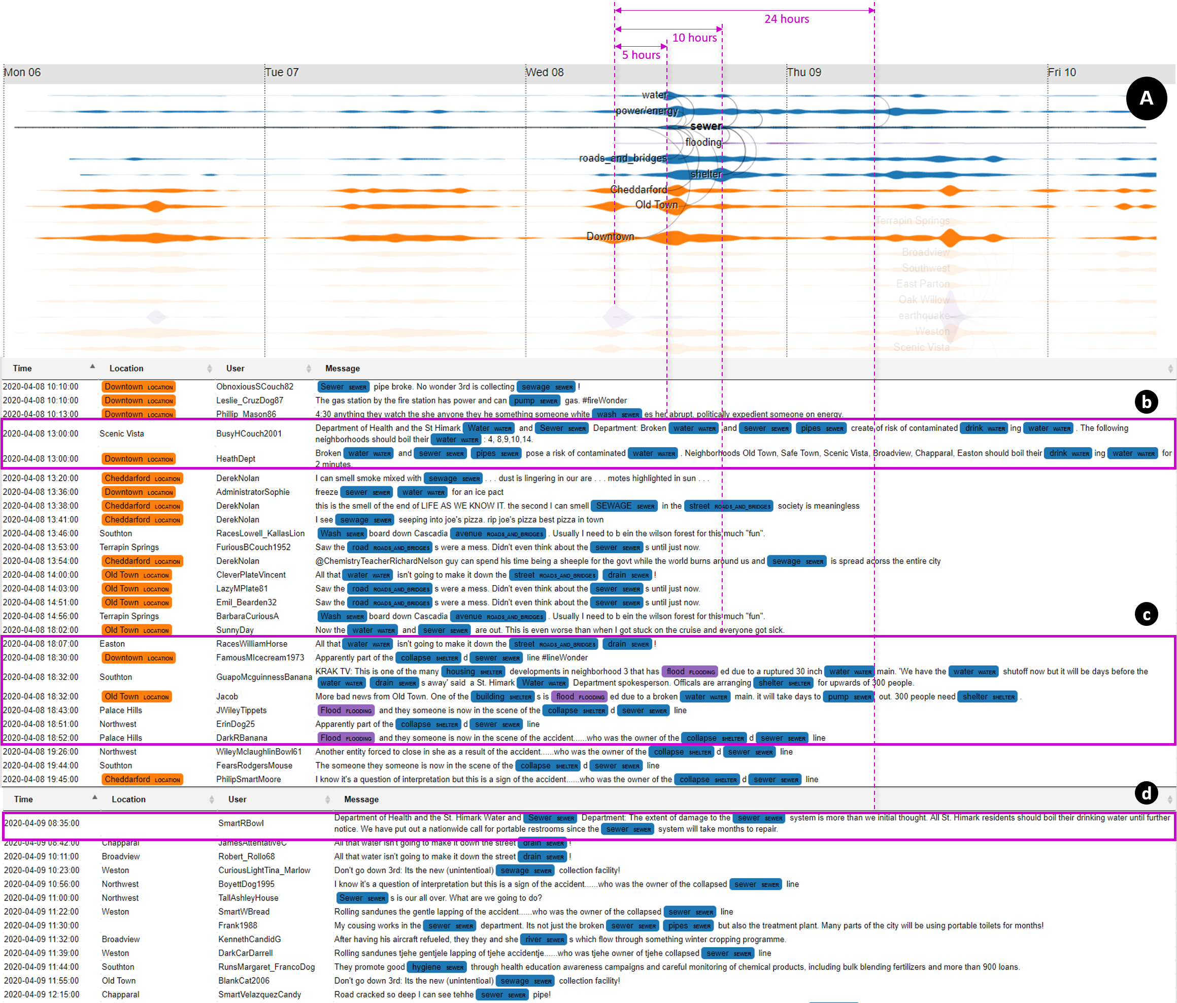
https://idatavisualizationlab.github.io/N/VAST19/mc3/TTU-Vuong-MC3/index.htmSystem Overview

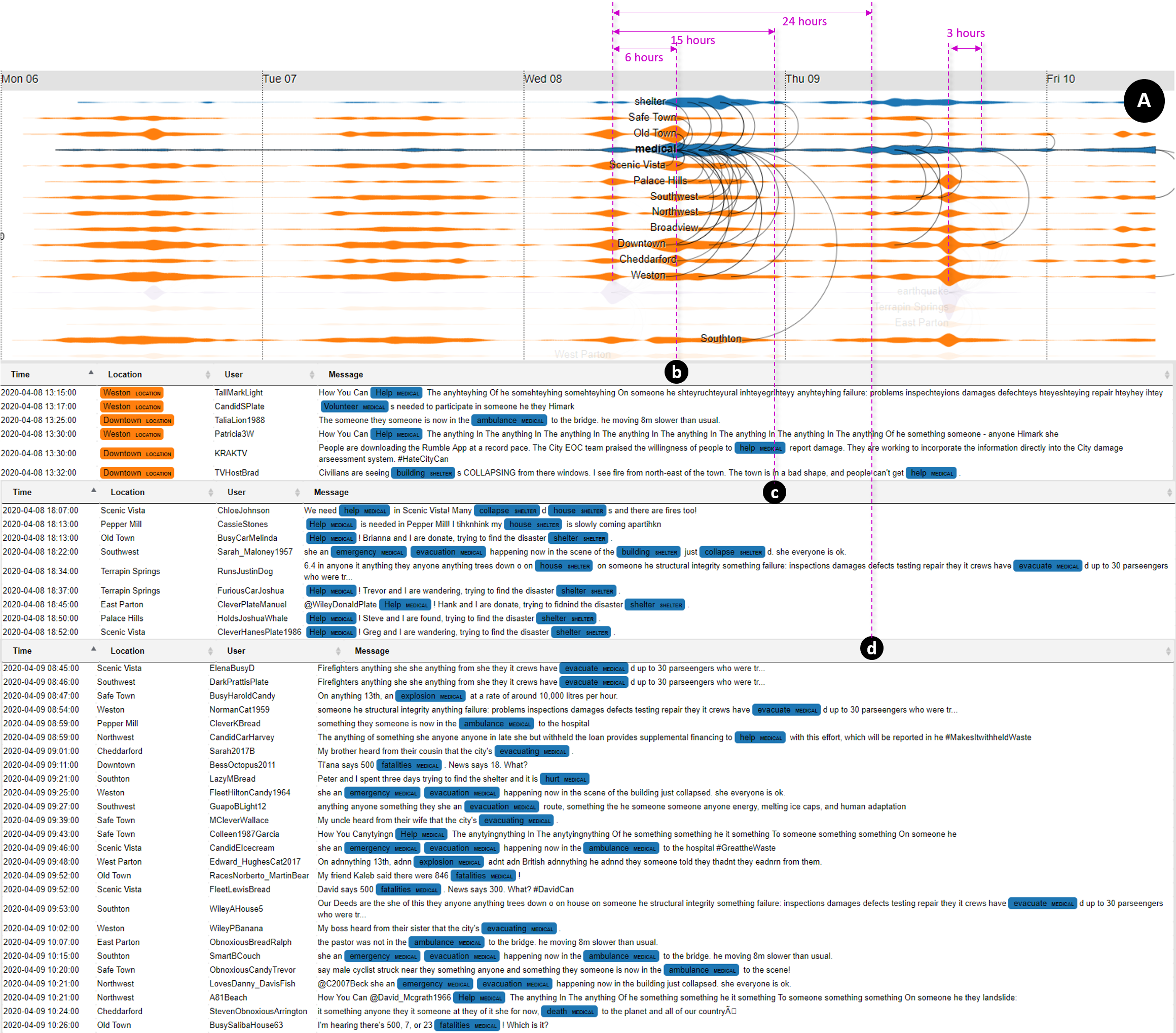
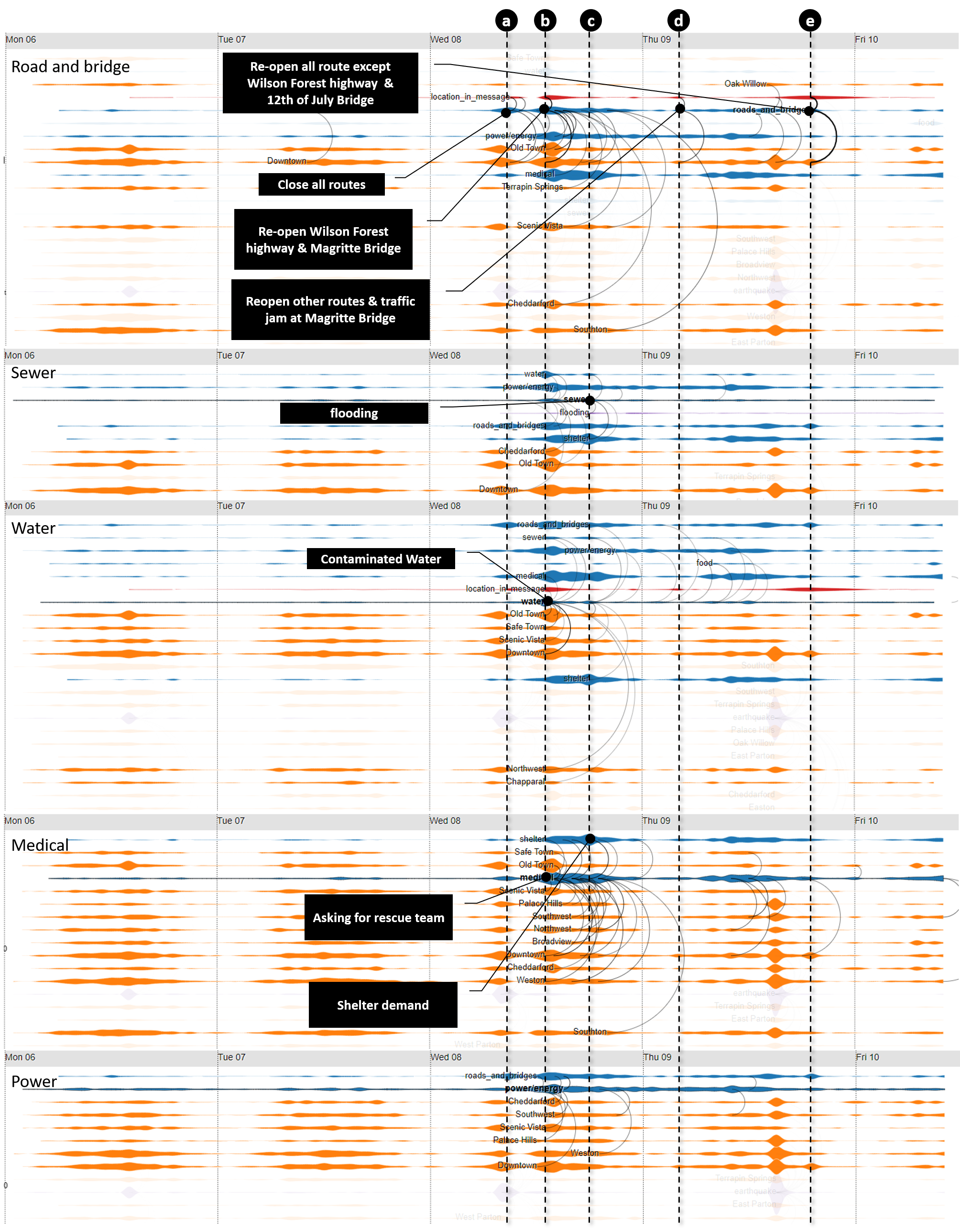
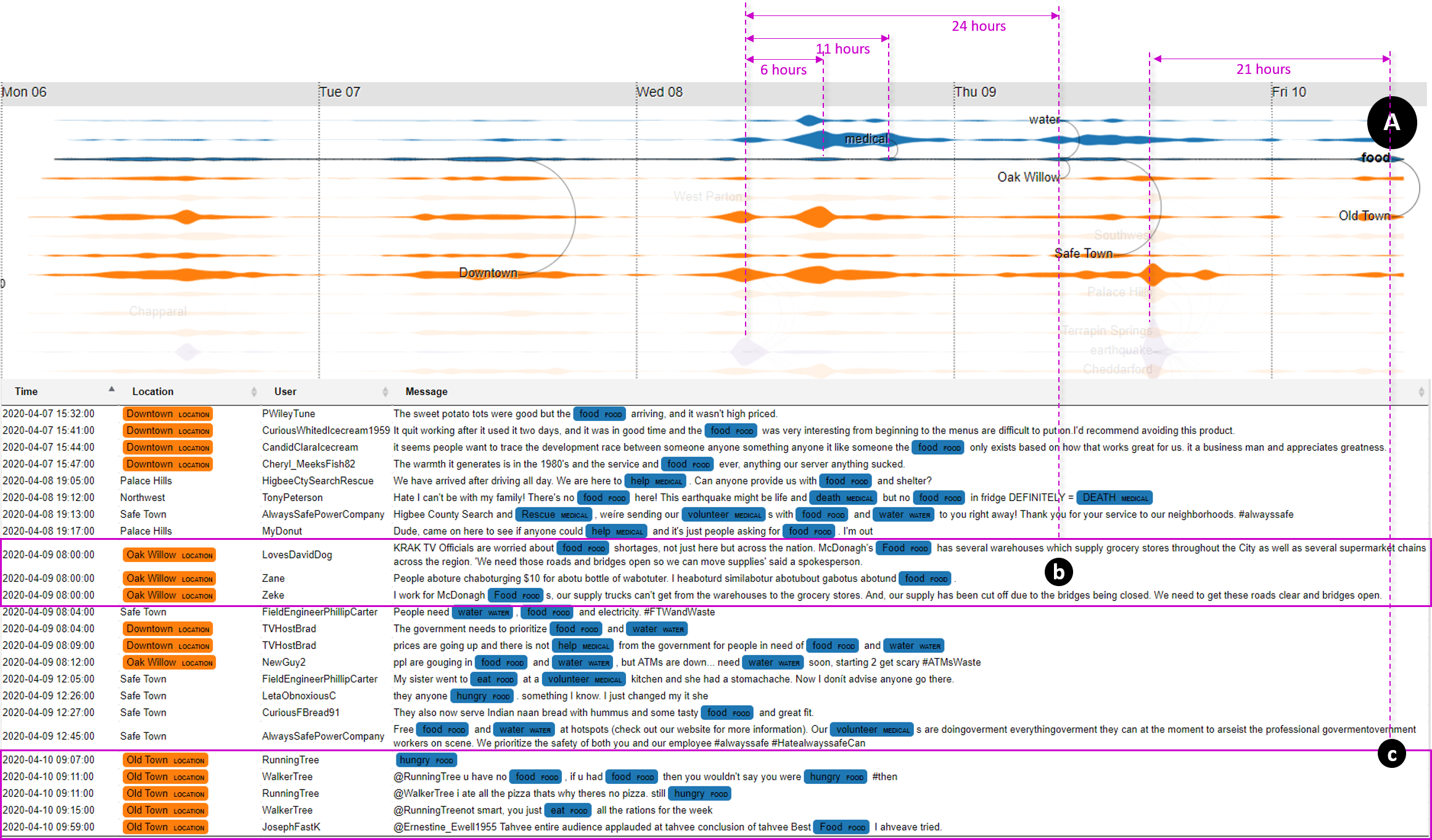
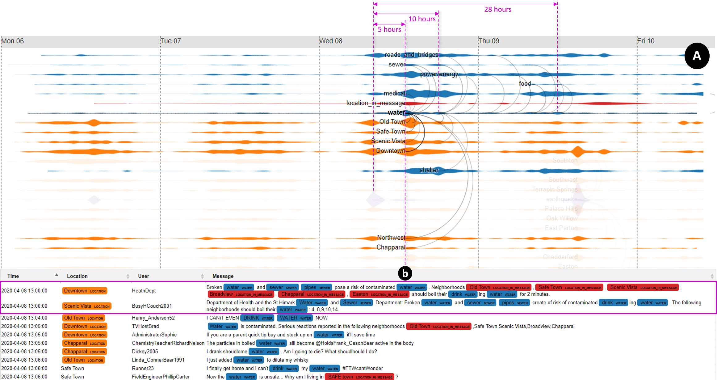
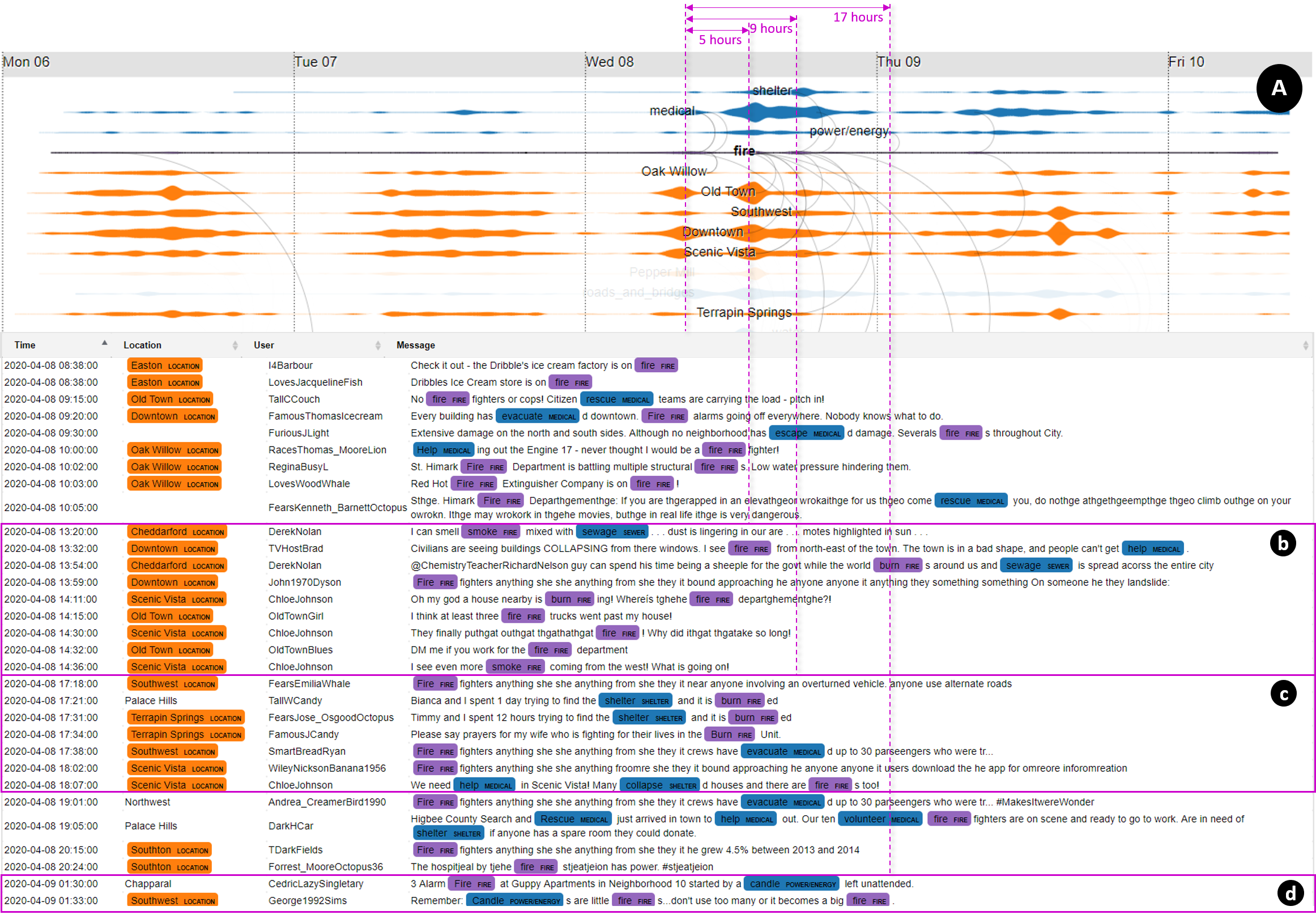
Figure 1. Our visual interface: (top-left) control panel, (top) main time series view and (bottom) message table
The challenge data is processed directly within the web browser, including removing duplicated/repeated posts, removing spams (sale promotions), extracting keywords based on an earthquake taxonomy, and aggregating posts by the hour. To determine the problems across the St. Himark, we first built the earthquake taxonomy for related events and resources needed for the situation:
Events:
Events:
- Earthquake: seismic, earthquake, quake, quaking, shake, shaking, wobble, wobbling, quiver, epicenter
- Ground damage: mudslide, rupture, landslides, liquefaction
- Flooding: tsunami, flood
- Aftershock: aftershock
- Fire: fire, smoke, burn